Table of Contents
In today’s data-driven world, powerful tools are essential for effective analysis. ChartFast positions itself as an AI data analyst that simplifies this process. With its innovative features, it promises to turn complex data into intuitive visuals. In this ChartFast review, we dive into what makes this tool a game changer for data enthusiasts and professionals alike.

ChartFast Review
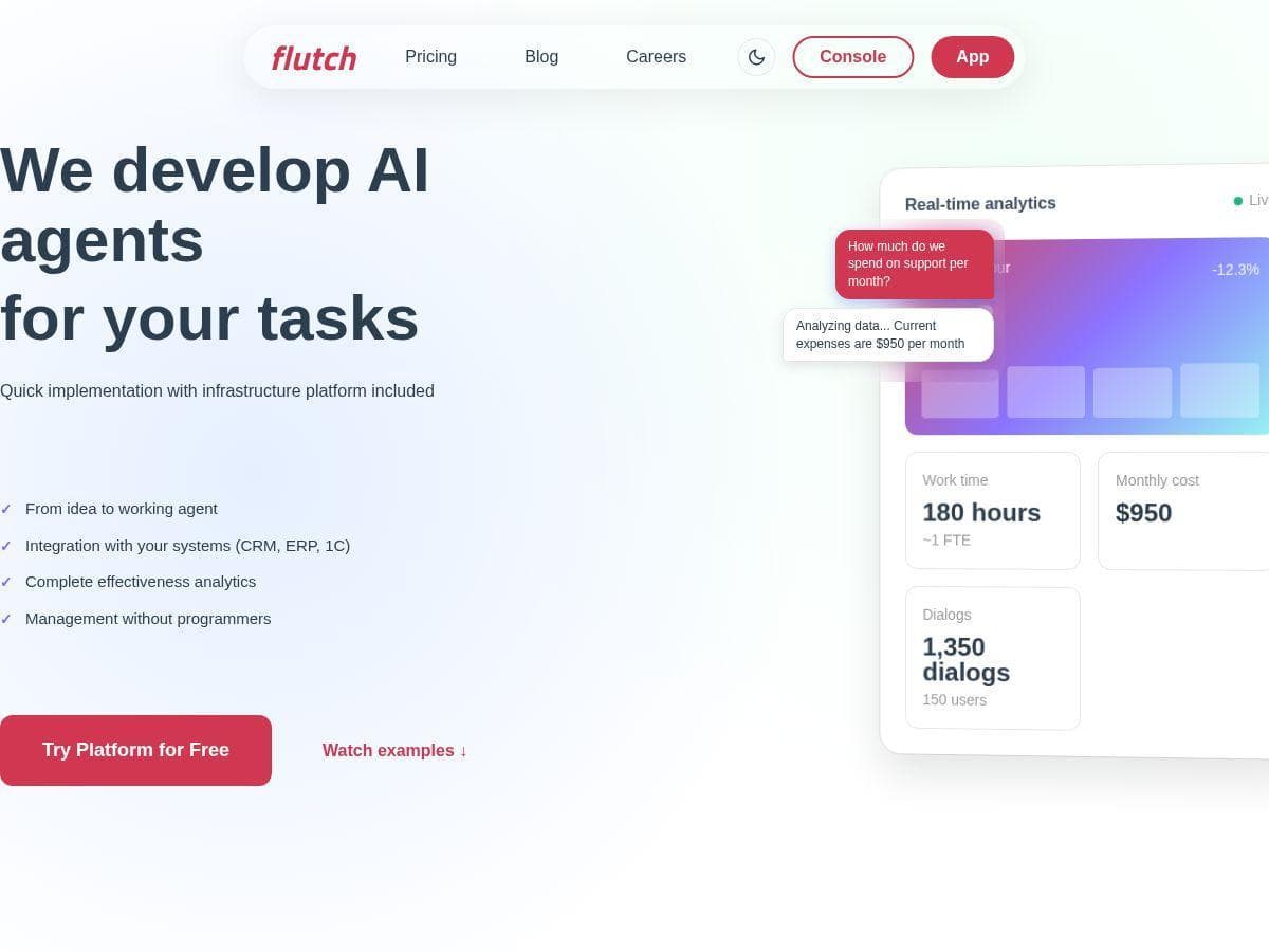
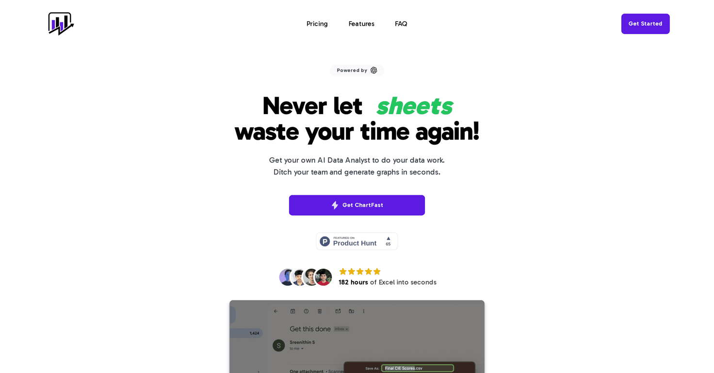
ChartFast is an AI-powered data analytics tool that takes the pain out of data visualization and analysis. It is designed to automate the tedious aspects of data work, allowing users to produce high-quality graphs and visualizations in mere seconds. One of the standout features is its specialized plotting capabilities, which utilize dedicated libraries tailored to your unique data needs. Whether you’re a novice or a data expert, ChartFast can make your job significantly easier and faster.
Furthermore, the ability to run Python scripts on a dedicated server for custom visualizations adds a layer of depth for users wanting to dive deeper into their data analysis. Interactive data queries let you ask specific questions and receive insightful answers, which is invaluable for thorough investigations. Quick data export options also mean you can get your visualizations out to your colleagues without hassle, making collaboration a breeze.
Key Features
- Plotting Specialist for complex graph generation
- Customizable Visualization Code using Python scripts
- Interactive Data Queries for real-time insights
- Quick Data Export in CSV or Excel formats
Pros and Cons
Pros
- Significantly reduces time spent on data analysis
- Easy access to diverse visualizations
- Instant export options for sharing visualizations
- Interactive querying boosts exploration
- Lifetime access available with purchase
Cons
- Basic features limited in the starter plan
- Potential higher costs for dedicated server needs
- Initial learning curve to fully utilize features
Pricing Plans
ChartFast offers two pricing tiers: The Starter Plan at $9/month (originally $29/month) includes lifetime access and allows 50 generations/month, with a limit of 5 files at a time. The Advanced Plan, now $12/month (originally $45/month), offers 200 generations/month, unlimited file uploads, and improved performance with larger datasets.
Wrap up
In conclusion, ChartFast is a robust tool that makes data visualization more accessible and efficient. With its unique features, it caters to both novices and experienced data analysts. If you’re seeking a way to streamline your data tasks while gaining valuable insights, ChartFast may just be the solution for you!