Table of Contents
When I’m browsing Amazon for romance, I don’t actually read the blurbs at first. I scan covers. And honestly? The cover is the handshake. It’s the moment where a reader decides, “Yeah, this is for me,” or “Nope.”
In my own testing across a few launches over the last couple of years, I’ve seen the same pattern repeat: a thumbnail that’s sharp and clearly “on trope” gets more clicks than one that’s technically pretty but muddy at small size. It’s not subtle. A cover can look great at 2000px wide—and still fail when it’s shrunk into that grid where people are scrolling fast.
And premades? I’m not talking about random templates that look generic. I mean the kind of premade romance cover systems that get sold in batches, where you can swap typography/text and still keep the overall look cohesive at thumbnail size. That’s why premade romance covers keep showing up more and more as we head into 2026.
⚡ TL;DR – Key Takeaways
- •Premade romance covers are popular because they let you publish quickly while staying visually on-trend—especially with illustrated, gritty, and object/symbol-based styles that still read at thumbnail size (ring, mask, flower, cracked jewelry).
- •For readability, don’t guess—use contrast that actually survives compression. If your title is “light on light” or the symbol blends into the background, it’ll disappear in the search grid.
- •Customize the parts that change click appeal: swap typography (size + weight), adjust accent colors, and make sure the title + main icon/symbol still pop at ~1600px wide and when scaled down to thumbnail size.
- •Avoid “romance stock” vibes unless they match your subgenre. A bright rom-com cover can pull in the wrong readers for dark romance—and that mismatch usually shows up later in reviews and conversion.
- •When you choose a premade, match the cover’s visual language to your story: a timeless symbol (ring/mask/flower) paired with the right current style (neon pastels, grunge texture, retro pop art) is the combo that tends to work best.
Understanding Premade Romance Covers in 2026 (And Why They Still Work)
Premade romance covers are pre-designed covers made by graphic designers and sold on marketplaces like Etsy and BookCoverZone. The big advantage is speed. You buy a layout, edit the text (title/author), and upload—without waiting weeks for a fully custom build.
They’re especially common in self-publishing because they’re affordable and available immediately. If you’re launching multiple books, trying a new trope, or doing a quick rebrand, premades help you keep momentum. And with romance, readers rely on visual cues almost as much as they rely on the blurb—so “current” design language matters.
What Are Premade Romance Covers?
Think of premades as ready-to-use cover templates—often with promo graphics included—where you customize elements like title, author name, and sometimes colors or extra details. You’re not starting from a blank canvas. You’re adapting an existing layout that’s already been designed to look good at small sizes.
In my experience helping authors choose covers, premades tend to shine when you’re juggling more than one release or you have a tight timeline. For example, I’ve worked with authors who needed 3–6 covers within a short window and couldn’t afford to wait. The improvement wasn’t just “pretty.” It was clarity—especially when the cover communicated the trope quickly enough that the right readers clicked.
Here’s the practical point: when a cover signals the subgenre in a split second, you get better alignment with the audience that actually buys. When it doesn’t, you get clicks from the wrong people—or no clicks at all.
Current Trends Shaping 2026 Romance Covers
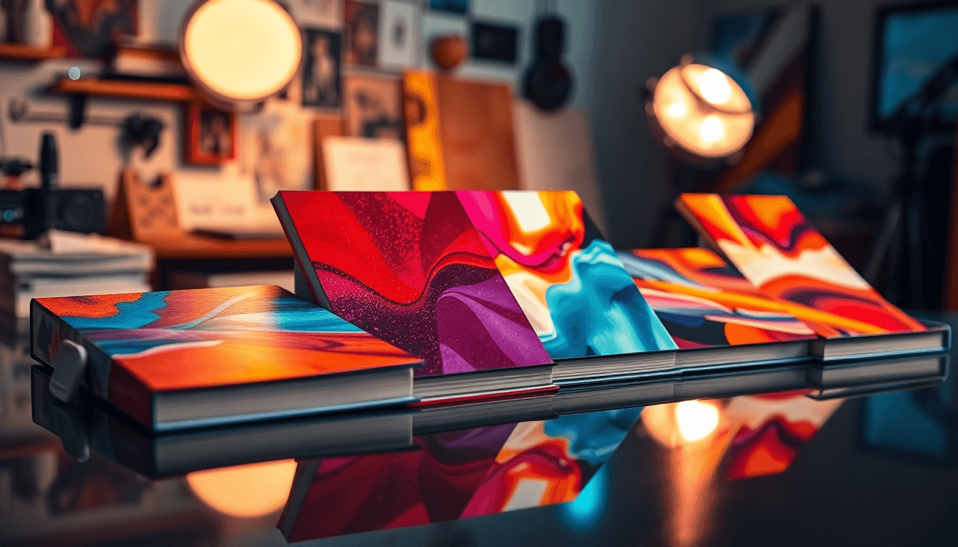
Illustration is still strong, but it’s getting more intentional. The covers I keep seeing lean toward bold, story-forward illustration rather than generic “romance art.” Color palettes are also more deliberate—pastels, neons, and autumnal tones show up a lot in rom-com, contemporary, and romantasy-adjacent covers.
On the darker side, gritty and textured designs are everywhere: dark backgrounds, close-up intensity, and “mood first” composition. You’ll see details like tattoos, torn fabric, or intense gazes in mafia, biker, and paranormal romance niches.
Then there’s the object-based/symbol route—wedding rings, masks, flowers, gemstones. This style keeps coming back because it implies the story without needing a full character illustration. It’s also helpful when you want the cover to feel subtle or emotional rather than explicit (historical romance, some fantasy romance, and indie romance that leans inward).
The common thread in these trends? They’re built for thumbnail visibility: one clear focal point, readable typography, and contrast that doesn’t fall apart when the image gets compressed.

Top Trends and Best Practices for Premade Romance Covers in 2026
If there’s one rule I’d bet on, it’s this: match the cover style to your subgenre. A bright, playful rom-com look can absolutely work for lighter reads. But if your book is dark romance, a cheerful palette will attract the wrong clicks—and you’ll often feel that later in conversion and reader expectations.
Embracing Illustration (With Grit, Not Chaos)
Illustrated covers with vibrant palettes do well because they communicate mood fast. Neon accents can signal high energy and heat. Pastels can signal sweetness, healing, or a lighter emotional tone.
Grit and grunge styles—dark tones, texture overlays, and stark contrast—are especially effective for mafia and biker romance. What I notice most is how the composition handles the “thumbnail problem.” At small size, text must remain readable, and faces/details can’t be so busy that they turn into a smear.
As for “design advice” you might see online: I don’t treat any one designer’s opinion as magic. What matters is whether the hierarchy works when the cover is shrunk and compressed. A solid hierarchy looks like this:
- Title is first. It should be the strongest readable element at thumbnail size.
- Focal element is second. Face/object/symbol should be obvious right after the title.
- Everything else supports. Background texture should add mood, not steal attention from the title or main symbol.
If you want storytelling alignment that pairs well with strong cover signaling, see our guide on writing believable romance.
Using Object-Based and Symbolic Designs (So It Doesn’t Feel Vague)
Object/symbol covers work because romance readers recognize visual shorthand. A wedding ring can suggest commitment, marriage, betrayal, or second chances. A mask can hint at secrecy or mystery. Flowers can signal love, grief, or healing—depending on the palette and style.
Here’s how to keep it from feeling vague: make sure the symbol and styling clearly match the trope. A cracked ring shouldn’t just look cool—it should imply something broke and it matters. A mask shouldn’t just be decorative—it should connect to identity, deception, or hidden feelings.
In my experience, symbolic elements paired with a modern style (gritty texture, clean typography, or trendy illustration) tend to improve click-through because the reader doesn’t have to “interpret” the cover. They get it instantly.
Design Rules for Effective Premades (With Real Thumbnail Logic)
When I evaluate a premade listing, I’m not thinking “Is it pretty?” I’m thinking “Will it survive the scroll?” Here are the decision rules I actually use:
- High contrast (practical definition): the title and main symbol should still look distinct from the background when you squint. If you can’t tell where the letters end and the background begins at thumbnail size, it’s a no.
- Bold typography: heavy weight usually wins because it holds up under compression. If the font is thin/light, it often disappears when scaled down.
- One clear focal point: one main element should dominate. If the cover has five “almost equal” hotspots, the thumbnail turns into visual noise.
- Strategic spacing: don’t place text right on top of the busiest texture. If the background has lots of detail behind the title, the title will fight for attention.
- Subgenre cues: rom-com visuals should feel light/bright and playful (or at least emotionally warm). Dark romance should feel tense, heavy, or shadowed—color and texture should match the promise.
Two quick cover scenarios I’ve seen work (and fail):
- Pass: dark gritty background + bright bold title + one symbol (e.g., cracked ring) placed high contrast behind/near the title. Thumbnail reads instantly.
- Fail: busy background collage + soft pastel title + symbol blended into the texture. At small size, the title becomes “color blocks,” and the symbol loses meaning.
- Pass: clean object/symbol layout (mask/flower) + strong hierarchy + limited palette. Even if it’s simple, it’s legible.
Do that, and the cover is far more likely to signal the right message in search results, ebook storefront grids, and Amazon thumbnail browsing.
How to Find and Select the Right Premade Romance Cover
I usually start on Etsy because you can browse by style fast, and listings often include previews. The listing details matter just as much as the hero image.
As for shop examples: some sellers like Grown With Hart and The Author Buddy are worth checking if you want genre-specific premades and clearer previewing. What I look for in any shop is consistency—do they show the cover at realistic sizes, and do they explain what’s included in customization (not just “text edits”)?
Use filters when you can. Narrow by style, subgenre vibe, and visual category (illustration vs photo vs object/symbol). Then open a handful of listings and compare them side-by-side. It’s faster than falling in love with the first cover you see and then realizing the title won’t read at small size.
Browsing Platforms and Resources
Yes, Etsy has a ton of premades. But the real value is in the listing details: preview accuracy, customization notes, and reviews that mention readability (not just “beautiful cover”). If you’re shopping for romantasy or paranormal romance, pay attention to whether the design “locks in” that vibe—costuming, texture, color mood, and typography style.
Also, check exclusivity terms. Some premades are sold as instant exclusives (limited usage window or contractually limited license). Others are non-exclusive and can be purchased by multiple authors. Don’t assume—read the wording.
For more on cover tools and related workflows, see our guide on coversentry.
Assessing Customization Options (Before You Click “Buy”)
Not all premades are editable in the same way. Before you buy, make a checklist of what you can actually change:
- Text edits: title and author name. Also ask whether font styles are truly flexible or if you’re limited to a few pre-approved options.
- Color adjustments: can they change the palette to match your story tone (or at least swap accent colors)?
- Graphic swaps: do you get options for the symbol/element, or is it locked?
- Thumbnail clarity: will the title still read when scaled down to thumbnail size? This is the big one.
- Safe margins: will text shift too close to edges after resizing?
- File delivery: do you receive layered files (like PSD) or only flattened JPG/PNG? If you plan future revisions, layered files matter.
- Font licensing: if you’re using any fonts you’ll reuse elsewhere, ask what’s included and what’s not.
- Bleed/safe zones: confirm whether the provided template already accounts for Amazon sizing and cropping.
If you need minor tweaks, tools like Canva can help—but don’t let “quick edits” ruin the hierarchy. The goal is to keep contrast and readability intact, not accidentally flatten everything so the title becomes harder to read.
Questions to ask the seller (copy/paste script):
- “Can you confirm the title will remain readable at thumbnail size? Can you show a scaled preview (or tell me what size you tested)?”
- “What exactly can be changed: title text, font weight, accent colors, and symbol position?”
- “Do you deliver layered source files (PSD) or only final flattened images?”
- “Does the design include safe margins so the title won’t get cropped when the image is resized?”
- “What’s included in revisions after purchase? How many rounds?”
- “What does exclusivity mean in your contract—what can be reused after the exclusivity window ends?”
Optimizing Premade Covers for Kindle and Amazon KDP
Metadata and keywords matter, sure—but your cover still has to earn the click. On Amazon, your cover competes in a grid against dozens of other thumbnails, so readability and clarity aren’t optional.
For keyword research, you can use Amazon autocomplete and the Kindle Keyword Search Tool to find long-tail phrases. Then incorporate those keywords naturally into your metadata (title/subtitle, series info, and backend metadata—depending on what you’re allowed to change).
On the design side, keep it practical: make sure the title is legible at small sizes, ensure strong contrast, and place the focal element where it won’t get swallowed by overlays or compression.
Keyword Strategies for Cover Selection (With a Worked Example)
I treat cover selection like expectation-matching. If readers search under a specific subgenre umbrella, your cover should visually match what they expect to see.
Here’s a worked example using a specific trope/subgenre combo: second chance + dark romance.
- Primary term (1–2): “dark romance” + “second chance romance”
- Supporting long-tail terms (2–4): “betrayal romance,” “enemies to lovers,” “mafia romance,” “forbidden love”
Now map those keywords to cover elements:
- “dark romance” → darker palette, heavier texture, shadowed lighting, tense composition
- “second chance romance” → a symbol that implies return/repair (cracked ring, re-worn jewelry, “broken then fixed” visual language)
- “betrayal romance” → subtle fracture cues (cracks, torn fabric edges, split light) so it feels like something happened
- “enemies to lovers” → visual tension (split composition, opposing shapes, intense gaze if you use faces, or contrasting object placement)
- “forbidden love” → restrained typography and moody contrast (avoid overly bright “rom-com” styling)
Mini checklist for this example:
- Can someone tell “dark” from the palette in under a second?
- Does the title stay readable when shrunk?
- Is the symbol clearly tied to “second chance” (not just a random ring)?
- Does the overall vibe match the keywords enough that readers won’t feel tricked?
That’s how you increase the odds your cover attracts the right readers—not just anyone browsing.
Design Tips for Better Visibility (Amazon-Realistic)
If you want a quick visibility checklist, use this:
- Bold colors: use them to create separation between title/symbol and background.
- One focal point: the viewer should “get it” instantly—no hunting.
- Text hierarchy: title should be the strongest element visually.
- Thumbnail test: shrink it mentally. If you can’t read the title in a tiny preview, fix it before launch.
Tools like Kindle Ranker can help you estimate demand and competition, but don’t treat it like prophecy. Use it to guide decisions, then validate with your own results: sales velocity, page reads (if you have access), and ad performance if you run ads.

Common Challenges (And How to Fix Them Without Guessing)
The tough part is you can’t really “wing it” with covers. A premade can look great in a listing image and still underperform if it doesn’t translate to thumbnail size—or if it doesn’t match the reader’s subgenre expectations.
One big issue I see: covers that don’t stand out in a saturated niche. If your category is packed with similar clinch-photo covers, you’ll need a different visual language. Illustration, gritty texture, or object/symbol design can help you differentiate.
Also, don’t rely on generic clinch imagery unless it clearly communicates the trope. If you’re writing something specific (mafia, second chance, secret identity), your cover should signal that quickly. For more on writing and story alignment, see our guide on write romance scenes.
Search Volume and Subgenre Mismatch
If your cover doesn’t match what readers are searching for, you’ll feel it. People click less. Or they click and bounce. And that bounce can hurt ad efficiency and conversion.
Example: a dark, textured background with a tattooed vibe fits dark romance or paranormal romance more naturally than a bright, pastel rom-com look. Ambiguity is expensive. Be specific with visual cues.
Improving Thumbnail Performance (What to Change First)
Thumbnail performance comes down to clarity and contrast. If I had to prioritize, I’d do it like this:
- Bold colors that separate the title from the background
- Strong focal points (one main thing to look at)
- Text readability even when the image is small
Now, about “testing.” You can’t always do classic A/B testing on Amazon like you would on a website platform. But you can still run practical experiments using ads, different launch phases, or by comparing performance after a cover swap—keeping keywords and targeting as consistent as possible.
What to track in Amazon context:
- CTR (Click-through rate): clicks divided by impressions. If CTR is low, it often points to thumbnail/readability or mismatch with the audience you’re targeting.
- Conversion rate: orders (or unit sales) divided by clicks. If CTR is decent but conversion is low, it can indicate the cover is attracting the wrong readers or the listing isn’t matching the promise.
- Time window: don’t judge based on a few hundred impressions. Look at performance over a meaningful sample (for many launches, that’s at least several days of data, and ideally more once you have enough impressions).
- Ad placement/context: CTR can vary by placement. Compare like-for-like where possible.
How I interpret results: if CTR is low, I usually fix hierarchy (title contrast, font weight, focal placement). If CTR is okay but conversion is low, I look at listing alignment (subtitle/series info expectations, and whether the cover vibe matches the book description).
Then iterate one variable at a time. Usually, the biggest wins come from contrast and hierarchy—not tiny decorative changes.
Future Outlook: Industry Standards and Trends for 2026
Design aesthetics keep shifting, and romance is no exception. What I’m seeing is a mix of illustration, object symbolism, and retro pop art—plus a bigger emphasis on clean typography and white space. That clean look isn’t “boring.” It’s easier to read fast.
On the platform side, exclusive/instant premades are becoming more common because authors want speed without sacrificing uniqueness. But exclusivity has to be defined clearly. “Exclusive” should mean something contractually—for example, limited or no reuse for other buyers within a specific time window or under a specific license.
Before paying for exclusivity, here’s what I’d look for:
- What “exclusive” covers: your exact license scope (full cover, elements, promo graphics, etc.)
- Time window: is it exclusive forever or for a set period?
- What’s prevented: can the same design be resold after your exclusivity expires?
- Turnaround expectations: when you’ll receive files and what revisions are included
That’s the difference between marketing language and actual protection for your brand.
Evolving Design Aesthetics
In 2026, I expect more covers that lean into surreal colors, symbolic objects, and emotion-first illustration. The best ones won’t just look trendy—they’ll communicate subgenre instantly. Romantasy covers, for instance, often use fantasy-adjacent color grading and symbolic motifs. Dark romance uses texture, contrast, and tension-forward composition.
Also, strong structural typography and breathing room (white space) are getting more important. It makes covers easier to interpret on screens and in print.
Platform and Market Influences
Market pressure is real: authors want quick turnarounds, and readers want covers that match what they expect in their niche. That’s why premades keep growing as a tool for both new releases and rebrands.
For more on building a romance publishing strategy that matches your content, see our guide on write romance novels.
The practical takeaway? Choose designs that can be adapted quickly, then refine them so the thumbnail does its job.
Expert Recommendations and Final Tips
I’d rather you pick the right premade than chase “perfect.” So here’s how I approach it when I’m advising authors:
- Choose designers who show real previews: not just hero images—look for thumbnails or scaled previews that reflect how it’ll look in the grid.
- Request specific customization: ask what can be changed and what can’t (and whether changes affect readability).
- Protect readability: confirm the title stays legible at small sizes and after any resizing/compression.
- Ask for trope alignment: make sure the symbol/style matches your trope. Don’t accept “vibes.” Ask for 2–3 clear mappings.
When you request a preview or customization, be explicit. For example:
- Font legibility at thumbnail scale: ask if the font is readable when scaled down.
- Safe margins: confirm text won’t get too close to edges.
- 2–3 trope-to-visual mappings: e.g., cracked ring + muted dark palette + bold title (second chance/betrayal); mask + moody gradient + clean hierarchy (mystery/identity); flower + soft illustration + warm highlights (healing/new love).
And yes—iterate. But iterate smart. If you’re running ads or doing a controlled launch, track the metrics that matter: CTR, conversion rate, and—if you have access—page reads/engagement. Those tell you whether the cover is attracting the right readers, not just any clicks.

Conclusion: Choose the Right Premade Cover (And Know When Custom Makes Sense)
Premade romance covers can absolutely be a solid advantage in 2026—especially when you need speed, you’re managing multiple releases, or you want a design built for thumbnail readability.
Before you buy, use this decision framework:
- Pick premade if: you’re on a tight timeline, you need multiple covers, and you can customize text/colors enough to match your trope and keep readability strong.
- Consider custom if: you need full exclusivity, you have a very specific visual concept, or your subgenre is so niche that premades keep feeling “almost right.”
- Always do a final thumbnail check: if the title or focal element doesn’t read instantly, it’s not ready.
If you do that—and then refine based on real performance—you’ll get far more out of premades than just “pretty cover art.”
Frequently Asked Questions
How do I find the best keywords for romance books on KDP?
Start with Amazon autocomplete and the Kindle Keyword Search Tool. Write down the phrases that show up consistently, then choose a mix of a primary subgenre term plus a few long-tail phrases. Put the most important terms into your metadata where they fit naturally (and keep the cover aligned with the vibe those keywords promise).
What are good KDP keywords for romance?
Broad terms like romance, romance books, and romance novels can help, but you’ll usually get better targeting by including subgenre terms like romantasy or dark romance. Aim for keywords with decent demand and manageable competition—then validate with your launch performance.
How can I use Amazon autocomplete for keyword research?
Type a relevant term into Amazon search and pay attention to the autocomplete suggestions. Those suggestions reflect what shoppers are actively searching for, which makes them a strong starting point for your metadata strategy.
What are popular romance subgenres for keywords?
Popular romance subgenres include paranormal romance, romantasy, dark romance, historical romance, and contemporary romance. The best move is to match your cover style and your keyword set so readers feel like they clicked the right book immediately.