
Table of Contents
I’ve seen a lot of book listings that look “fine,” but they don’t really sell. For me, the difference usually comes down to A+ Content: not just pretty visuals, but a clear, reader-first story that makes the value obvious in seconds.
If you’re trying to tighten up your Amazon book page (and you want it to feel more convincing without breaking Amazon’s rules), this is the playbook I use. I’ll walk through what to put in each A+ module, what to avoid for your genre, and a simple testing method you can actually run.
Quick reality check: you’re not writing for yourself—you’re writing for someone skimming on a phone, deciding whether to click “Add to Cart.” So every sentence and image should answer one question: Why should I care?
Key Takeaways
- Lead with benefits, not specs. Swap “200 pages” for outcomes like “a fast, bingeable read” or “a step-by-step guide you can finish in a weekend.”
- Use visuals that match the reader’s mental movie: cover + interior taste + lifestyle/usage shots (when relevant). Keep the style consistent so it feels intentional.
- Pick modules based on what you need to prove. If you’re differentiating formats, use a comparison layout. If you’re building trust, use biography/social-proof style blocks.
- Write in short, scannable chunks. On mobile, one long paragraph feels like a wall. Bullet points and tight lines win.
- Follow Amazon’s content and technical specs closely. If you’re unsure, check the official A+ Content Manager and guideline pages before uploading.
- Test like a grown-up: run small changes (headline text, image order, or one module swap) and watch the metrics in a defined time window before declaring winners.
- Steal patterns, not wording. I like to study 2–3 comparable books and copy the structure (not the copy) that makes their message land.
- Keep it fresh. Quarterly tweaks based on what your audience responds to can prevent your listing from going stale.

1. Make Your Book Listing Stand Out with Effective A+ Content
Creating A+ Content for your book on Amazon isn’t just about adding “more stuff.” It’s about making your value instantly legible. Most shoppers won’t read everything. They’ll scan, pause, and decide.
So I structure my A+ pages like a mini sales funnel:
- Hook (first module): one sentence that matches the genre promise (cozy mystery vibes, practical how-to outcomes, emotional literary themes, etc.).
- Proof (middle modules): visuals that confirm tone + a few benefit bullets that explain what the reader gets.
- Trust (later modules): author credibility, awards/reviews (if allowed), or “what to expect” framing that reduces buyer risk.
- Close (final module): a simple takeaway that nudges action: “If you like X, you’ll love Y,” or “Start here if you want Z.”
And yes—Amazon A+ can meaningfully impact performance, but I don’t like throwing around random “up to X%” claims without context. What I can tell you is this: when you improve clarity, scannability, and relevance, you usually see better engagement signals (more detail page views, higher click-through to the purchase step, and stronger conversion rates over time).
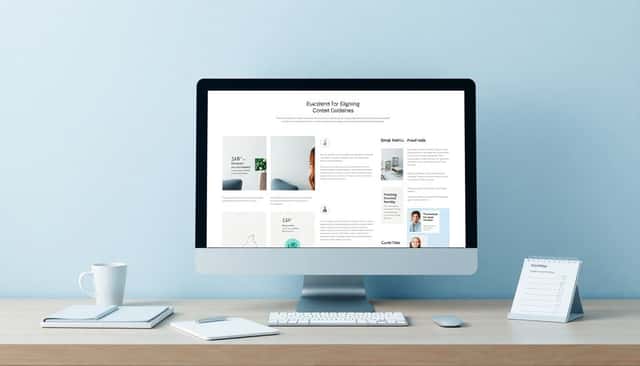
2. Use High-Quality Visuals That Show Off Your Book
Visuals do the heavy lifting—especially because book buying is emotional. A bad image order or blurry interior snippet can quietly kill trust.
Here’s what I prioritize when I build A+ visuals:
- Cover image: crisp, high contrast, and readable even on a small screen.
- Interior “taste”: one or two pages that show formatting, tone, and readability (not tiny text). For nonfiction, I’ll pick a page with headings, diagrams, or a clear layout.
- Vibe/lifestyle: only if it fits your genre. A romance cover might pair well with a mood shot; a cookbook might benefit from real food photography.
- Simple graphics: if you’re making a comparison or listing benefits, use clean icons or short labeled blocks instead of clutter.
On the video side, I’ve had good results with short clips that answer “what is this book like?”—for example, a 10–20 second preview of the book opening, a quick flip-through, or a scene that matches the story’s mood.
One thing I noticed the hard way: if your visuals look like they came from five different designers, the page feels messy. Keep a cohesive aesthetic—same color palette, similar typography, and consistent spacing—so the A+ page looks like a single campaign, not a patchwork.
Amazon’s A+ modules let you combine images, text, and comparison layouts. Don’t just upload everything. Test different visual arrangements to see which sequence makes people linger.
3. Write Clear, Benefit-Focused Text to Attract Readers
Words should do more than describe. They should translate your book into outcomes.
Instead of leading with features, I lead with benefits:
- Feature: “Includes 30 recipes.”
- Benefit: “Cook 30 meals without guesswork—weeknight-friendly and actually doable.”
- Feature: “200 pages.”
- Benefit: “A bingeable read you can finish in a few focused sessions.”
My rule of thumb: every block should fit on a phone screen without turning into a scrolling punishment.
Try this formatting approach:
- 1–2 sentence headline that matches the genre promise.
- 3–5 bullet points with benefits (not a laundry list of claims).
- One short “what you’ll experience” line that adds emotion or specificity.
Also, watch your wording. Amazon can be strict about promotional claims and certain wording patterns. If you’re unsure, keep it factual and benefit-driven—avoid anything that sounds like guaranteed results you can’t support.
4. Choose the Right Templates and Modules for Your Book
Amazon lets you build A+ Content using different module types. The mistake I see most often is using modules because they’re available—not because they’re the best way to communicate your message.
Here’s how I pick modules based on the goal:
- Showcase goal (what it is): use image-first modules that highlight cover + interior taste.
- Differentiate goal (why yours): use a comparison module (paperback vs Kindle, or “what you get” vs “what you don’t”).
- Trust goal (why believe you): use author bio and credibility-focused text blocks (and only include awards/reviews if you’re allowed to do so).
- Expectations goal (what reading feels like): use short story/theme snippets paired with matching visuals.
If you’re selling multiple formats, a comparison layout can be a fast “decision helper.” For example: “Paperback: best for annotating” vs “Kindle: best for portability,” with one line each—no paragraphs.
One practical tip: keep your design cohesive when mixing modules. If your cover visuals are modern and bright, don’t suddenly drop in dark, low-resolution images for your text block. It makes the whole page feel inconsistent.
And don’t forget: you can learn a lot by swapping just one module at a time. If you change everything, you won’t know what worked.
5. Tell a Story That Connects with Your Audience
People don’t buy books like they buy printers. They buy books because they want an experience.
That’s why I like adding narrative context to A+ Content—just enough to feel personal, not so much that it reads like a full blog post.
Here are storytelling angles that tend to work:
- Author “why”: how the book idea started, and what you wanted to give readers.
- Theme promise: what the book explores (grief and healing, ambition and failure, survival and hope, etc.).
- Plot tease: a safe, non-spoiler snapshot of the premise—enough to spark curiosity.
- Reading experience: pacing and tone cues (“fast chapters,” “warm humor,” “slow-burn suspense”).
In my experience, the best A+ story beats are short and specific. “I wrote this book because I love reading” is fine, but “I wrote this for readers who want X without Y” performs better because it speaks directly to a buyer’s pain point.
6. Follow Amazon’s Guidelines for Content and Technical Specs
I’ll be blunt: if you want your A+ Content to stay live, you can’t treat Amazon specs like suggestions.
Amazon’s requirements cover things like image rules, allowed formats, and content restrictions (including how you can phrase certain claims). If you ignore this, you risk rejection, takedowns, or modules that don’t display correctly.
For the technical side, I recommend you confirm the exact banner and image specs directly in Amazon’s official documentation—don’t rely on random blog screenshots.
Here’s the official place I check first:
Also, a note on the dimension claim you’ll often see online: you might hear “970×300” for banner images, but the only safe approach is to verify the current size requirement for the specific module type you’re uploading. If you upload the wrong size, you can end up with blurry images, cropping, or layout issues that make your A+ look sloppy (and that hurts trust).
My practical workflow: I upload a test image set to A+ Content Manager, confirm it renders cleanly, then only roll out to the full listing once I see it look right on mobile preview.
Pro tip: use the A+ Content Manager because it’s designed to help you edit and maintain compliance without guessing.
7. Test and Improve Your A+ Content Regularly
If you don’t test, you’re basically guessing. And guessing is expensive when ad budgets are involved or when rankings shift slowly.
Here’s a testing framework I use that’s simple enough to keep doing:
- Pick one variable at a time: headline text, the order of images, or one module swap.
- Create 2–3 variants: Variant A (current), Variant B (small change), Variant C (alternative small change).
- Run a consistent time window: usually 14–30 days, depending on your traffic volume.
- Track the right metrics:
- Detail page engagement: how often shoppers view and interact with the page.
- Click-through to purchase: movement from viewing to buying (often reflected in conversion rate trends).
- Conversion rate: the biggest “did this help?” signal.
- Decide using direction + consistency: if Variant B improves conversion for the whole window (not just one day), that’s a good sign.
Example experiment (realistic and low-risk):
- Goal: increase conversions for a nonfiction book.
- Variant A: first module headline focuses on “what’s inside” + a generic interior image.
- Variant B: same interior image, but headline shifts to the reader outcome (“Learn the method to do X in under Y time”).
- Variant C: headline stays the same, but the interior image changes to a page with clearer headings and a diagram.
After 3–4 weeks, I’d keep whichever variant improves conversion without hurting engagement. Then I’d run another test on the next module.
Quarterly refreshes are a sweet spot. Not because trends change every week, but because your audience and ad traffic patterns evolve over time.
8. Use Examples of Successful Book A+ Content for Inspiration
I’m a fan of studying what’s working—just don’t copy it word-for-word.
Here’s what I do instead:
- Pick 2–3 comparable books in your genre (same audience, similar price point, similar reading level).
- Look at their A+ structure and make notes on the patterns:
- Where they place the genre promise
- How they use visuals (cover first? interior first?)
- How long the text blocks are
- Whether they use comparison tables or narrative sections
- Translate those patterns into your own module plan and write your own copy.
You can also check real examples inside Amazon programs like:
- Amazon’s Book Store (browse bestseller pages in your category)
- Author Central (where applicable for additional author assets)
One more thing: pay attention to what they don’t do. If a competitor’s page is all fluff and no proof, you can beat them by being clearer and more specific.
9. Extra Tips to Make Your Book Listing Even Better
These are the small touches that can make your A+ feel more “real” and less templated.
- Keep the tone human: friendly, confident, and specific. People buy from authors, not brands.
- Add social proof carefully: awards and reviews can help, but don’t overreach. Only include what you’re allowed to display and make sure it’s accurate.
- Use visuals that support the promise: if your text says “quick, practical steps,” your images should look like quick steps—not moody abstract art.
- Include a short author bio: 3–5 lines is usually enough. Mention relevant credibility (experience, credentials, or why you’re qualified).
- Mobile-first formatting: test at small sizes. If you can’t read it on your phone, your shoppers won’t either.
- Refresh over time: swap in a better interior snippet if you have a second edit, or update the story/theme module if your marketing angle changes.
And no, you don’t need to reinvent everything every month. But you should keep improving the parts that control clarity and trust.
FAQs
Start with a clear genre promise in the first module, then back it up with (1) a strong cover visual, (2) an interior “taste” that shows readability and tone, and (3) short benefit bullets that tell readers what they’ll get. Keep each block scannable on mobile—if it feels like a paragraph, it probably won’t perform.
I’d use a simple set: cover image, one interior snippet (readable, not tiny), and one supporting visual that matches the book’s vibe (lifestyle/usage shot for relevant genres, or clean icons/graphics for benefits). Avoid low-resolution images or designs that look mismatched—trust matters more than “more visuals.”
Use short benefit-led sentences. A solid structure is: one-line promise, then 3–5 bullets that describe outcomes (time saved, skills gained, emotional experience, pacing/tone). Don’t just list features—translate features into what the reader feels or accomplishes. And keep it compliant: avoid exaggerated guarantees you can’t support.
Follow Amazon’s A+ Content Manager rules for approved modules, supported formats, and technical specs. If you’re building banners or image blocks, verify the current dimensions for the specific module type in the official tools—don’t rely on old size numbers from random posts. When in doubt, upload a small test set first and confirm it renders correctly before going live.