
Table of Contents
I’ve had the frustrating experience of watching a book listing get clicks… but not much traction. The cover is there, the description is solid, and yet shoppers still seem unsure. That “wait, what exactly am I getting?” hesitation is real.
That’s why I started using Amazon A+ Content for books. It lets you add more convincing visuals and structured info right on the product page—so readers don’t have to guess. In my experience, when you answer the common questions visually (genre fit, what’s included, who it’s for, what’s different), the listing feels less risky to buy.
In this post, I’ll walk you through what A+ Content actually is, where it shows up, how to set it up in Amazon KDP, and what I’d build module-by-module. I’ll also include a few concrete layout examples (with sample headlines and what to put in each section) so you’re not stuck with generic ideas.
Key Takeaways
- Amazon A+ Content gives your book listing extra formatted sections (images, charts, and richer text) in the “From the Publisher” area.
- Instead of vague claims, I recommend designing A+ to answer buyer questions early: what the book is, who it’s for, and why it’s worth the money.
- Good A+ pages usually follow a simple flow: hook → value proof → details (and then a clear “who this is for” finish).
- Setup is done through Amazon KDP’s A+ Content Manager (or the relevant Amazon tools depending on your account type), where you upload assets and arrange modules.
- Mobile matters. Keep text scannable (short lines, bullets, and minimal clutter), because that’s where most shoppers decide quickly.
- Use genre-appropriate module choices: fiction often benefits from mood/character visuals, while nonfiction leans on diagrams, charts, and author credibility.
- Don’t “set and forget.” I treat A+ like a small marketing campaign—tweak headlines, reorder modules, and swap images based on performance.

1. What is Amazon A+ Content for Books and Where It Shows
Amazon A+ Content for books is basically an upgraded way to present your title beyond the standard product description. Instead of only text and your main product details, you can add formatted modules—with images, side-by-side comparisons, and multimedia-style blocks.
In Amazon’s layout, this enhanced section appears in “From the Publisher,” which sits below the core book info and before the customer review area. That placement matters. It’s right when shoppers are still deciding whether they trust the book enough to click “Buy.”
How do you create it? Through the Amazon KDP A+ Content Manager experience (or the matching Amazon toolset for your account). It’s designed to guide you module-by-module, rather than forcing you to build a custom page from scratch.
Quick reality check on performance claims: you’ll see lots of “up to X%” numbers online. I don’t like repeating those without context. What I can say from working on multiple listings is this: A+ Content tends to help most when your current listing leaves questions unanswered (tone, audience, what’s included, format expectations). When that’s the problem, A+ becomes the fix.
If you’re building your first page, start by thinking about what you’d want to know before buying the book. Then design A+ to answer that—visually when possible.
For writers who want to get the most out of Amazon’s publishing workflow, it also helps to explore the broader setup inside the Amazon KDP platform so your A+ page matches your overall listing strategy.
2. Reasons to Use A+ Content for Your Book Listing
Let’s be honest—most book pages are competing on tiny differences. Same categories. Similar covers. Similar blurbs. If you don’t add more clarity, shoppers move on.
Here’s why A+ is worth it in my experience:
- It improves clarity (and reduces doubt). When your A+ explains what the reader gets—especially for nonfiction or series—it feels safer to buy.
- It supports credibility. A strong author bio, recognizable branding, and professional visuals make your listing look “real,” not like a random upload.
- It keeps people on the page. A well-structured A+ section gives shoppers a reason to scroll instead of bouncing right away.
- It helps you differentiate. Comparison charts or “what’s inside” modules can highlight why your edition (or sequel) is different.
- It’s especially helpful for niche titles. If your book is specific—like a career guide, curriculum, or a genre sub-niche—A+ is where you translate “specific” into “valuable.”
One thing I noticed while testing A+ module order: when the first section answered “what is this?” immediately, conversion improved more than when we started with a “cool” image. It sounds obvious, but it’s easy to get excited about visuals and forget the buyer’s first question.
3. Key Parts and Best Ways to Create A+ Content
If you want your A+ page to actually do its job, don’t think “design.” Think “buyer journey.”
In practice, your A+ Content will usually be built from a few core module types:
1) Hero image / brand opener
This is where you set the tone. For fiction, it might be a mood image or character illustration. For nonfiction, it could be a clean cover shot plus a clear value headline.
- Headline idea: “A Practical Guide to [Outcome]” / “A [Genre] Story Full of [Hook]”
- Image tip: use something that looks good even when the image is scaled down.
2) “What you’ll get” value blocks
These are the modules where you list benefits or features. Keep it scannable.
- Use bullets (3–5 max) instead of paragraphs.
- Match the reader’s mindset: “If you want X, this book helps you do Y.”
3) Comparison charts (editions/series/alternatives)
Comparison modules work especially well for:
- series order clarity
- print vs ebook expectations
- different editions (updated content, bonus chapters, etc.)
In my experience, this is where confusion disappears. If your book is part of a series, don’t make readers hunt for sequence order—show it.
4) Author bio + credibility
Don’t write a bio like it’s a school assignment. Make it feel like a trust signal.
- Include: relevant expertise, publishing credibility (if any), and a human detail.
- Avoid: giant walls of text—Amazon modules have limited space.
5) Layout rules I follow every time
- One idea per module. If you try to cram five messages into one block, it will look messy.
- Mobile-first formatting. Short lines and enough spacing beat dense text.
- Consistent styling. Pick a color palette and stick to it across modules.
- Readability over decoration. Pretty doesn’t help if nobody can read it.
If you’re also thinking about the overall visual branding (fonts, style consistency, cover readability), you can check out best fonts for book covers to make sure your A+ visuals match your cover aesthetic.
4. How to Set Up A+ Content on Amazon
Let me save you some time here. The “how” is easy—what trips people up is eligibility and submission requirements.
Before you start: eligibility + plan requirements
- Make sure your account qualifies for A+ Content (Amazon has eligibility rules that can vary by account type and program).
- If you’re using KDP, verify you can access the A+ Content Manager in your dashboard.
- Have your assets ready: images sized properly and text written to fit module limits.
Step-by-step setup checklist
Here’s the workflow I’d follow:
- Sign into your Amazon KDP account.
- Find the “A+ Content Manager” in your dashboard. If it’s missing, don’t guess—check eligibility or account verification.
- Choose Create New A+ Content.
- Select module types (standard vs premium, depending on what your plan supports).
- Upload images and add copy directly in the module fields.
- Arrange modules so the page flows: hook first, then value, then proof/author, then any comparisons or series order.
- Preview on both mobile and desktop views (this is where you catch text that’s too long or images that look cropped).
- Submit for review and wait for approval. If Amazon requests changes, fix the exact issues they point out.
Common approval pitfalls (the stuff that delays you)
- Images that don’t meet specs (resolution, dimensions, or file type).
- Copy that’s too long for the module’s text fields.
- Inconsistent formatting (weird spacing, unreadable fonts at small sizes).
- Using restricted or misleading claims (Amazon is strict—keep it factual).
If you want more inspiration from how Amazon pages are structured, you can also review examples referenced in Amazon KDP content guidance.
5. How A+ Content Can Improve Book Sales and Reader Engagement
A+ Content doesn’t magically sell your book by itself. But it can do something more practical: it makes your listing easier to evaluate.
When shoppers can quickly understand:
- what the book is about
- what’s included
- who it’s for
- why it’s different
…they’re less likely to bounce.
In my own testing, the biggest wins usually came from three changes:
- Reordering modules so the first screen answers “what is this?”
- Adding specific detail (like chapter outcomes, lesson format, or story stakes) instead of generic hype.
- Switching images to ones that communicate the theme instantly (not just pretty cover art).
There’s also a secondary effect: better engagement often leads to more reviews over time, and stronger reviews can improve future conversion. Is that guaranteed? No. But it’s a pattern I’ve seen when the listing feels genuinely helpful.
Think of A+ as your “mini pitch deck.” A compelling visual or a simple side-by-side comparison can do more than an extra paragraph of description.
Example: if you’re publishing a series, use A+ to clarify the reading order. That prevents confusion and encourages readers to buy more than one book (or at least feel confident they’re choosing the right volume).
6. Examples of A+ Content for Fiction and Nonfiction Books
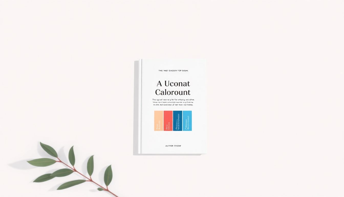
Here are a few concrete A+ examples you can copy the structure from. These aren’t just “generic ideas”—they show module type, headline text, and what I’d put on the image.
Example A: Fiction (Romance / Character-driven)
Module 1 (Text + image / brand opener)
- Headline: “Two strangers. One unforgettable summer.”
- Suggested image: a high-quality scene photo (or illustration) that matches the setting and mood.
- Why it works: it immediately answers the “what vibe is this?” question.
Module 2 (Feature/value bullets)
- Headline: “What you’ll love”
- Bullets (3–5): “Slow-burn tension,” “Meet-cute you’ll quote,” “Emotionally satisfying ending,” “Clean romance (or your actual content level)”
- Why it works: readers scan for fit signals, not plot summaries.
Module 3 (Comparison chart / series order)
- Headline: “Start here”
- Chart text: Book 1 / Book 2 / Book 3 with one-line descriptions
- Why it works: it reduces decision friction for series readers.
Before/after explanation: before A+, the listing relied on the main description alone. After adding the “vibe opener” module first, shoppers had a clearer emotional hook before they even reached the author bio.
Example B: Nonfiction (Career guide / practical outcomes)
Module 1 (Hero opener)
- Headline: “Get from stuck to confident in 30 days”
- Suggested image: a clean, minimal graphic (not a busy background). Include subtle icons if they match your brand.
- Why it works: outcomes feel concrete.
Module 2 (What’s inside / outcomes)
- Headline: “Here’s what you’ll learn”
- Bullets: “Resume rewrite framework,” “Interview story templates,” “Weekly practice plan,” “Mistakes to avoid”
- Why it works: it reads like a curriculum, which nonfiction shoppers love.
Module 3 (Comparison chart: edition or related resources)
- Headline: “Which version is right for you?”
- Chart columns: “Beginner track” vs “Advanced track” (or “Workbook included” vs “No workbook” depending on your product)
- Why it works: it prevents the wrong purchase.
Before/after explanation: before, the description sounded helpful but broad. After, A+ turned the promise into specific learning items—so buyers knew exactly what they’d get.
Example C: Fiction (Mystery / setting + clues)
Module 1 (Image: map/timeline)
- Headline: “A town full of secrets”
- Suggested image: a simplified map graphic or timeline strip (high contrast, readable at small size).
- Why it works: it sets scope and stakes fast.
Module 2 (Value bullets)
- Headline: “The mystery style”
- Bullets: “Clue-based chapters,” “No filler,” “Twists that feel earned,” “Atmospheric setting”
Module 3 (Author bio / trust)
- Headline: “Why I wrote this story”
- Bio snippet: 2–3 lines max with credibility or personal connection to the setting.
Before/after explanation: the A+ map/timeline module made the book feel “structured,” not random. That’s a big deal for mystery readers.
If you want more inspiration for how to structure the surrounding content (like intros and publishing elements), you can check how to write a foreword and other author/content examples on the site.
7. Tips to Make Your A+ Content More Effective
Here are the tips I’d use if I were rebuilding an A+ page from scratch tomorrow.
1) Write for scanning, not reading
If someone only reads half your text, will they still understand what the book is and why it’s worth buying? That’s the standard.
2) Use CTAs that match the genre (and keep them subtle)
A CTA doesn’t have to be loud. It just has to point the reader to the next thought. A few examples:
- Fiction: “Step into the story” / “Meet the characters” / “See what happens next”
- Nonfiction: “Start the framework” / “Learn the method” / “See what’s included”
- Series: “Start with Book 1” / “Choose your next read”
Where I place these: headline text and short lines inside value modules. I don’t bury CTAs in tiny image corners where nobody can read them.
3) Don’t overdo the visuals
One strong image often beats five mediocre ones. If your images don’t clearly communicate the theme, they’ll just look like decoration.
4) Make your author bio do real work
Readers want a reason to trust you. For nonfiction, mention relevant expertise. For fiction, mention what you’ve written before (if applicable) and any personal connection that shapes the story.
5) Test changes like a mini experiment
You don’t need fancy tools to iterate. Pick one variable:
- swap the first module headline
- move the “what you’ll get” module earlier
- replace a low-performing image with a clearer one
Then give it time and watch the listing behavior (clicks and conversion trends). Small tweaks can matter, but only when you change one thing at a time.
6) Keep Amazon formatting constraints in mind
Text fields and module layouts have limits. If you paste content without trimming, you’ll end up with awkward wraps or text that gets cut off. I always write the copy with the module size in mind from the start.
If you want to create clean visuals without hiring a designer, tools like best website builder for authors can help you maintain a consistent look across cover, A+ images, and promotional assets.
FAQs
Amazon A+ Content for books is enhanced product-page content that adds detailed images and formatted text. It shows on the product detail page in the “From the Publisher” section, typically below the core book description and before customer reviews.
Using A+ Content helps your book stand out, increases trust, and gives you more space to explain what readers get. It’s especially useful for highlighting features, setting expectations, and showcasing the author’s credibility in a visually compelling way.
Start with high-quality images, clear headlines, and short, scannable text. Highlight your unique selling points and keep a consistent style. If you’re writing copy, aim to answer the questions a buyer would ask before purchasing.
Log into the appropriate Amazon account (KDP/Seller tools depending on your setup), open the A+ Content Manager, create a new A+ module set, upload your assets, and add your copy. Review the preview carefully before submitting so you don’t get stuck in approval delays.