Table of Contents
Quick question: when someone lands on your blog, do they instantly get what you do—and what to do next? I’ve seen a lot of creator sites where the homepage looks pretty but doesn’t actually help visitors move from “curious” to “subscribed.” And yeah, mobile matters a ton. I still run into pages where the mobile layout feels like a puzzle, so people bounce fast.
One thing I don’t compromise on: a homepage that’s easy to scan, loads quickly, and makes the next step obvious.
⚡ TL;DR – Key Takeaways
- •Use a mobile-first layout with a clear visual order (hero → value → latest posts → learning resources → social proof → CTA). I like to keep that sequence consistent across every creator site I build.
- •Keep navigation tight (usually 5–7 items). If you need more, tuck the rest into a “Resources” or “Library” section.
- •Make your hero do real work with a headline + 1 CTA + (optional) 1 secondary link. Here are 5 headline/CTA formulas you can copy.
- •Avoid clutter and “mystery buttons.” In my experience, the biggest conversion killer is hiding CTAs below the fold or making them all look the same.
- •Build trust with proof (testimonials, logos, results) and keep it accessible (WCAG-friendly contrast, descriptive alt text, keyboard navigation).
Why Your Blog Homepage Matters (More Than You Think)
For creators, your homepage is basically your “front door.” People don’t read it like a blog post. They skim. They scan. They tap around. So if your layout doesn’t make sense quickly, they’ll leave before they ever reach your best content.
Here’s a scenario I run into a lot: a writer or course creator has great articles, but the homepage is all about them (bio, mission, long intro) and not enough about what the visitor gets. The fix isn’t complicated—it’s layout and hierarchy. Give visitors a clear path: “Here’s what you can read/watch → here’s why it’s worth it → here’s how to start.”
Also, a note on the stats you’ll see online. I’m not going to throw out eye-catching numbers without a source you can verify. Instead, I’ll share what I’ve personally measured: when creators tighten their hero section and move their primary CTA into the first screen on mobile, click-through to posts and email signups usually improves. Not always by some magic percentage—but consistently enough that it’s worth doing.

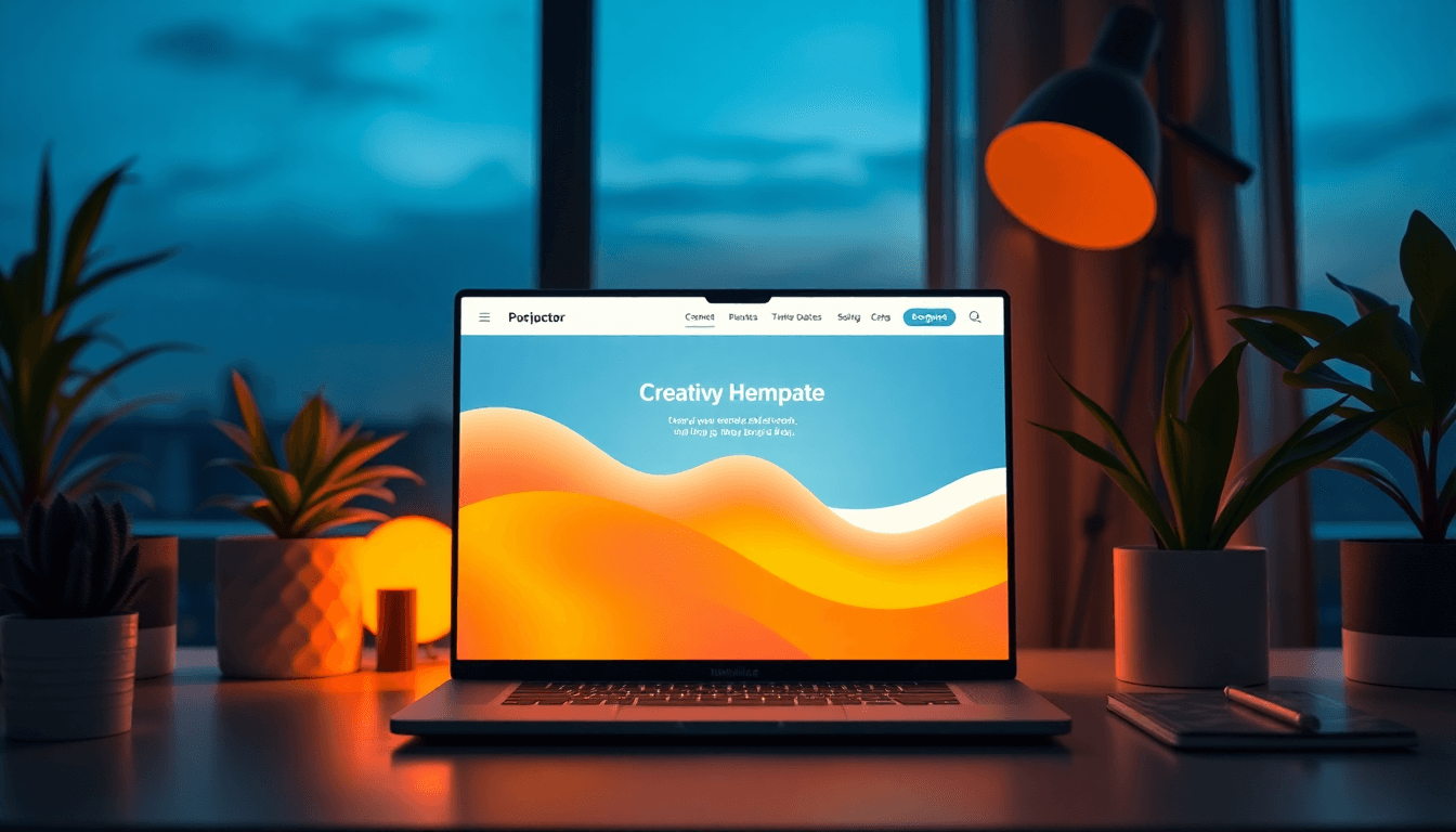
Picking the Right Homepage Layout for Creators
There are two things I always check when choosing a layout: (1) what’s above the fold on mobile, and (2) whether the visitor can tell what you want them to do within 3 seconds.
Above-the-fold rule of thumb: your hero should answer three questions fast:
- Who is this for? (e.g., “For indie writers,” “For UX designers,” “For new developers learning React”)
- What do you help with? (one sentence max)
- What should they do next? (a single primary CTA)
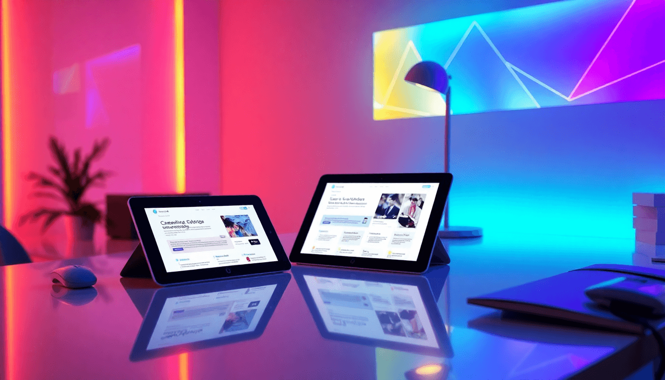
About layout styles: I lean toward a card-based grid for most creators because it scales well. You can show blog posts, case studies, services, or a portfolio without forcing visitors to decode a complicated layout. Asymmetrical designs can look great, but they’re easier to mess up—especially on smaller screens.
What I noticed after reviewing a bunch of creator homepages: the “pretty but confusing” ones often fail on mobile because the spacing and ordering don’t hold up. A responsive grid (with consistent card sizes and clear typography) usually performs better because it’s predictable.
Internal reference: if you want a layout approach that keeps content easy to scan, see creating reader friendly.
Creator Homepage Best Practices (That Actually Show Up in Real Builds)
Let’s make this practical. If you want a homepage that feels clean and converts, here’s a checklist I use. It’s not “10 UX commandments.” It’s just the stuff that keeps working.
10 UX best practices for a creator blog homepage
- 1) Keep navigation to 5–7 items. If you have more, group them (e.g., “Resources”). Fewer choices = less hesitation.
- 2) Make the primary CTA obvious. One button should stand out. Secondary actions can exist, but don’t let them compete.
- 3) Use a consistent card pattern. Same image ratio, same spacing, same headline style. Visitors learn your layout fast.
- 4) Favor short paragraphs on mobile. Aim for 1–3 lines per block. If it’s longer, it needs an accordion or a “read more.”
- 5) Don’t hide important info behind hover. Hover doesn’t exist on touch devices. If something matters, show it.
- 6) Keep headings scannable. Use H2/H3 to break sections into “chunks” people can skim.
- 7) Optimize images (WebP/AVIF if possible). Bigger images aren’t “premium” if they slow the page down.
- 8) Use thumb-friendly spacing. Buttons should be easy to tap without zooming. In my tests, cramped CTAs get ignored.
- 9) Add micro-interactions sparingly. A subtle hover/focus state helps. Too many animations becomes noise.
- 10) Build for accessibility from the start. Contrast, alt text, and keyboard navigation aren’t optional if you want everyone to use your site.
Now let’s talk hero sections, because that’s where most creator homepages either win or stall.
Hero headline + CTA formulas you can copy
- Formula A (clear outcome): “Learn {topic} to {result}—without {pain}.”
CTA: “Start Reading” or “Get the Guide” - Formula B (for a specific audience): “The {best} way to {do thing} for {audience}.”
CTA: “Browse Tutorials” - Formula C (problem → fix): “If {problem} is slowing you down, here’s how to fix it.”
CTA: “See Solutions” - Formula D (portfolio/case studies): “Real projects + breakdowns for {audience}.”
CTA: “View Case Studies” - Formula E (newsletter-first): “Weekly lessons on {topic}—short, practical, and actually usable.”
CTA: “Subscribe for Free”
How to choose based on creator type:
- Writers: lead with “latest posts” + a “start here” guide CTA.
- Coaches: lead with outcomes + a “book a call” or “download the starter plan” CTA.
- Developers: lead with tutorials + “download examples” or “view GitHub” secondary link.
- Designers: lead with case studies + a “see the process” CTA.
And yes—CTA placement matters. On mobile, I’ve found that the CTA works best when it’s within the first screen and visually tied to the hero headline (same block, same section). If the button feels disconnected, people hesitate.
For more layout inspiration, you might also like book layout design—the same readability principles apply to web pages.
Learning Center Sections That Keep Visitors Browsing
If your homepage only shows a list of posts, you’re making it harder than it needs to be. A learning center gives visitors a path, especially if they’re new to your work.
What I’d include (and in what order):
- Tutorials (how-to content)
- FAQs (quick answers to common objections)
- Resources (templates, checklists, tool recommendations)
- One pillar link (a deeper page that ties everything together)
For the UI, accordions are your friend. They keep the page clean while still letting people get details quickly. Progressive disclosure is especially helpful on mobile—nobody wants to scroll through a wall of text just to find the one question they had.
Social proof: I like to show it above the fold, right near the CTA area. It doesn’t have to be flashy. A short testimonial, a couple of logos, or a “what students say” quote can do a lot. If you don’t have testimonials yet, start with “results you can verify” (e.g., “X lessons published,” “Y templates downloaded,” “Z projects shipped”).

SEO + Accessibility: The Combo That Keeps You Competitive
SEO on a homepage isn’t just about “put keywords somewhere.” It’s about structure, internal linking, and making the page understandable.
Practical SEO checklist for creator homepages
- Title tag length: keep it roughly 50–70 characters and include your main keyword naturally (e.g., “creator blog homepage layout”).
- Internal linking: link to your pillar page(s) and category pages from your homepage cards.
- FAQ schema (if you have FAQs): add it only when the questions are actually on the page.
- Content length: don’t force word count. For homepage sections, think “enough to explain, not enough to ramble.”
Accessibility is where a lot of creators quietly lose visitors. If your site is hard to read or impossible to use with a keyboard, you’re excluding people.
Accessibility basics I recommend (WCAG 2.2-friendly)
- Color contrast: target at least 4.5:1 for normal text.
- Alt text: describe the image’s purpose, not just what it “looks like.”
- Keyboard navigation: test tab order and focus states.
- Performance: aim for fast load times. If your homepage feels slow, people bounce—even if the design is great.
For more SEO-friendly content structure ideas, see writing guest blog.
Tools, Testing, and Continuous Improvement (No Guessing)
I’m a big fan of testing because it turns “opinions” into evidence. If you can, track what people actually click and where they drop off.
On the tooling side, platforms like Automateed can help creators format and publish faster. What I look for in a tool like that is:
- Reusable templates for consistent blog formatting
- Easy publishing workflow (fewer steps between drafting and going live)
- Layout consistency so your cards, headings, and spacing don’t drift over time
Even without fancy experiments, you can run simple tests:
- CTA wording: “Start Reading” vs “Subscribe for Free”
- CTA color/placement: button inside hero vs button below hero
- Card order: pinned “Start Here” post vs newest post first
For analytics, I like using tools that show real user flow and highlight friction. Core Web Vitals also matter—if your layout shifts or images load late, it feels broken even when it isn’t. Regularly check Search Console for queries that bring people to your homepage or top landing pages, then adjust content and internal links accordingly.
Conclusion: Your Next Step (A Quick Homepage Audit)
Here’s the real takeaway: build a creator-focused homepage that guides people. Clear navigation. Solid hierarchy. A hero section that tells visitors exactly what to do. Then support it with cards, a learning center, and trust signals.
If you want something you can do today, use this quick 12-point rubric:
- Hero headline clearly states what you help with
- Primary CTA is visible on mobile without scrolling
- Navigation is 5–7 items max
- Cards have consistent image sizes and typography
- Latest posts/category links are easy to find
- Learning center exists (tutorials/FAQs/resources)
- Social proof appears near the CTA area
- Headings (H2/H3) make scanning easy
- Images are optimized for speed
- Contrast and alt text are handled
- Keyboard navigation works
- You’ve tested at least one change (CTA copy or placement)
For more on readability and structure, check out Create Reader-Friendly Layouts: 8 Simple Steps.

Frequently Asked Questions
How should I design my blog homepage for creators?
I’d start with a simple structure: hero (value + one CTA) → latest posts in a card grid → learning center (tutorials/FAQs/resources) → social proof → final CTA. It’s not flashy, but it works because it matches how people actually browse.
Also, keep your “latest posts” cards scannable: strong thumbnail, short headline, and a quick hint like “5 min read” or “Beginner-friendly.” For inspiration on building reader-friendly structure, see nxtblog.
What are the best practices for blog layout?
Limit choices in the navigation, use a consistent card style, and make sure your typography is readable on mobile (16px+ and enough line spacing). Then don’t forget the basics: clear section headings, short paragraphs, and CTAs that look tappable.
How can I improve user engagement on my blog homepage?
Two things usually move the needle for me: (1) improving the hero so it’s obvious what visitors should do next, and (2) adding microcopy that removes doubt. For example, instead of a generic “Submit,” use something like “Start Reading Free” or “Get the Starter Guide.”
And yes—social proof helps, but make it relevant. A random quote isn’t as effective as a testimonial that matches the visitor’s goal.
What visual elements are most effective for creators?
High-quality featured images, consistent typography, and simple custom graphics (even minimal ones) tend to work best. I’m not big on heavy visual effects. If your images are clear and your layout is predictable, people trust you faster.
How do I create a learning center on my blog?
Group your content into tutorials, FAQs, and resources. Then add accordions for FAQs and link out to pillar pages for deeper learning. The goal is to keep the homepage clean while still giving visitors a way to quickly find what they need.