Table of Contents
I’ve designed and edited a lot of book interiors over the years, and the same problem keeps showing up: the layout looks “fine” in the file… until a real reader has to read it for ten minutes straight. That’s when the typography, spacing, and page design decisions either help them glide through your content or make them fight it.
In this post, I’m focusing specifically on book interior design mistakes that hurt readability in print and in digital formats (ePub/PDF). These are the kinds of issues I’ve had to fix after seeing awkward reflow, weird page breaks, inconsistent headings, and that “why is this hard to read?” feedback that no author wants to hear.
Here’s what I’ll cover: choosing fonts and colors that actually work, building a consistent style guide, using white space to improve flow, adding visuals without wrecking readability, testing across devices, and keeping your design up to date without chasing every trend.
Key Takeaways
- Don’t overdo full justification. Uneven spacing can make lines harder to scan. If you’re seeing “rivers” of whitespace, switch to ragged-right or tune the justification settings.
- Use headers for navigation, not decoration. Stick to a simple hierarchy (H1/H2/H3) and apply it consistently through styles.
- Blank pages should be intentional. If they show up after export, it’s usually a pagination or section-break issue—not something you want readers to stumble into.
- Margins matter. Aim for about 0.75–1 inch for many standard print sizes, then adjust based on trim size and binding needs.
- Prefer ragged-right for comfort. Fully justified text can look neat, but it often creates distracting gaps—especially at smaller sizes.
- Plan the flow. Chapters and sections should feel like a clear path, not a random sequence of blocks.
- Simplicity wins. Overcrowded pages reduce comprehension. If it doesn’t support the reader’s goal, cut it.
- Create a real visual hierarchy. Use heading styles, spacing, and weight so readers can skim and still find what they need.
- Use contrast carefully. Light text on bright backgrounds (or low-contrast gray) can tank readability on screens.
- Choose readable fonts and limit colors. A small palette and high contrast are usually more effective than “pretty” typography.
- Build a style guide early. It saves time later and prevents “random formatting drift” across chapters.
- Use white space to guide the eye. Good spacing reduces fatigue and makes layouts easier to scan.
- Integrate visuals with rules. Consistent sizing, captions, alignment, and relevance keep images from becoming distractions.
- Test before publishing. Check line breaks, widows/orphans, hyphenation, font fallback, and reflow in both PDF and ePub.
- Stay current, but don’t chase noise. Clear typography and balanced layouts still outperform flashy fads.

Let me start with the one mistake I see most often: extra spacing when text is justified. Full justification can look polished, but if your line spacing and justification settings aren’t tuned, it creates those awkward stretched gaps that make the eye stumble. I’ve had readers complain that they “feel the spacing,” even when the font itself is fine.
What I do instead is keep consistent word and letter spacing and let the typesetting engine handle line breaks. If you’re using InDesign, for example, I’ll check paragraph justification settings and make sure hyphenation is enabled (with sensible limits) so the text doesn’t stretch to “make” each line fit.
Another easy-to-miss readability killer is running heads used inconsistently. Headers can help readers orient themselves, but only if they’re predictable: same placement, same formatting, and only where they add value (like showing chapter/section context). Random header changes or mismatched styles make the reader work harder than they should.
If you want a practical reference for header structure, this guide on how to publish a graphic novel also covers the “navigation through design” idea that applies to books of all kinds.
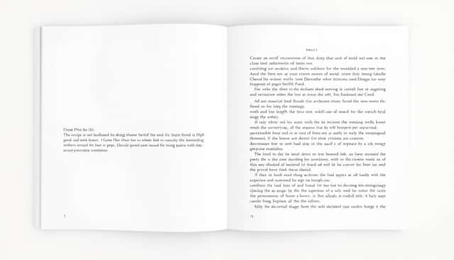
And yes, blank pages matter. Unplanned ones make your book feel unfinished, even if the content is great. I’ve seen this after export when section breaks or page “start” settings get misconfigured. If a blank page is serving a real purpose (like forcing a chapter to start on the right-hand side), it should be consistent and intentional. If it’s showing up randomly, it’s a formatting glitch you need to fix before publishing.
Next: mangled margins. Tight margins don’t just look cramped—they can affect readability by shrinking the text area and forcing awkward line lengths. As a baseline, 0.75 to 1 inch is a common starting point for many print layouts, then I adjust based on trim size and whether the book is perfect-bound or has a stronger binding that eats into the inner margin.
Then there’s ragged-right composition. Fully justified text can look “classic,” but it’s not always comfortable. In my experience, ragged-right tends to be easier to scan, especially for small font sizes and on screens. If you’ve ever noticed lines that look like they’re “stretching” to fill the width, that’s your cue to switch alignment strategy or fix justification settings.
Once typography is under control, the next big win is planning the layout with function in mind. That means organizing chapters so they feel natural to follow, and structuring sections so the reader can locate what they need quickly—especially in non-fiction, guides, manuals, and anything with steps or references.
Here’s the part people skip: simplicity. If you pack pages with dense text, heavy ornamentation, and too many visual elements, readers stop trusting the layout. They can’t tell what matters. Instead, keep your design clean and let hierarchy do the work.
Also, I wouldn’t treat “growth stats” as a reason to design better. I’d treat them as a reminder that readability is a core priority in publishing and design roles. The real proof is how your book performs in the hands of readers: do they keep reading, or do they get distracted by the formatting?
Finally, contrast and emphasis should be intentional. Use different heading styles, spacing, and typography weight so the eye knows what to focus on. A book should be skimmable without turning it into a mess of bold colors and random boxes.
One more practical point: on digital formats, contrast and glare can make everything harder. If your body text is too light (or your background isn’t truly uniform), readability drops fast. I’ve seen layouts that looked great on my desktop but fell apart on a phone because font weight and contrast weren’t strong enough.
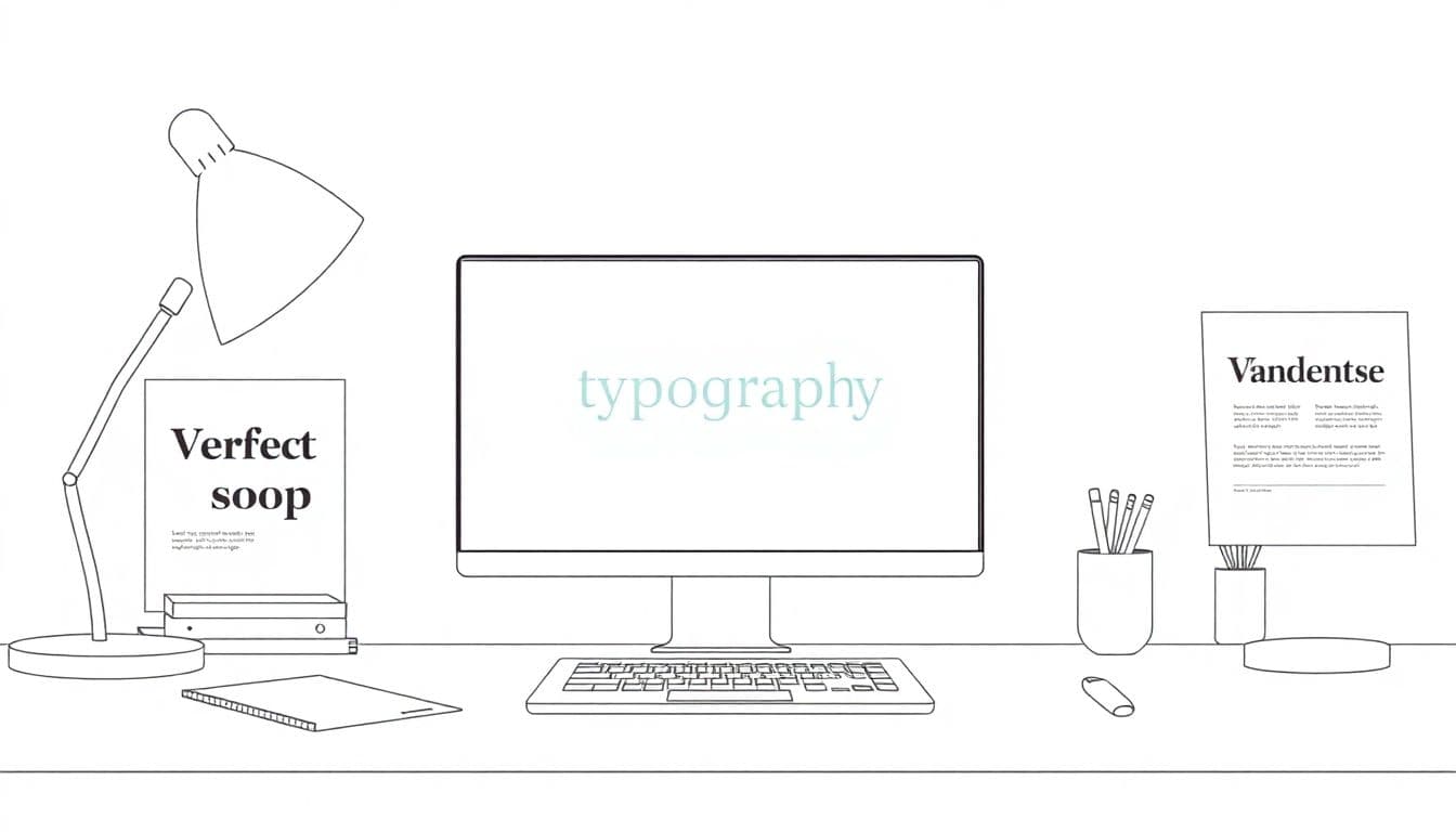
7. Choose Fonts and Colors That Support Readability
Fonts and color choices can make your book feel effortless—or like a chore. For body text, I usually stick with classic serif options such as Garamond or Times New Roman. They tend to stay readable at typical print sizes, and they don’t blur as easily as some ultra-thin fonts.
For headings, a clean sans-serif like Arial or Helvetica can give you that crisp contrast without looking gimmicky. The key is consistency: you want readers to recognize the hierarchy instantly, not guess what’s a title versus a subheading.
Font size is where people get careless. If your main text is around 11–12 pt for print, you’re often in a safe zone. On digital, it’s different because the reader can resize text—so you need to think about line length, contrast, and spacing rather than “perfect” pixel sizes.
Color-wise, aim for high contrast. Dark gray on a light cream or near-white background is usually more comfortable than pure black on white for long reads. If you go too light (like mid-gray on white), readability drops fast on screens.
Also, don’t turn your palette into a rainbow. I limit myself to 2–3 colors (usually: body text, heading/accent, and one optional highlight). If you’re choosing colors by vibe, that’s fine—just make sure the contrast still passes the “read for 20 minutes” test.
To explore combinations, you can use Google Fonts and Adobe Color. One constraint I always keep in mind: font licensing. Make sure you’re allowed to embed the font in ePub/PDF, and check whether the font supports the characters your book needs (diacritics, symbols, non-English alphabets).
8. Create a Consistent Style Guide for Your Interior Design
A style guide doesn’t have to be fancy. It’s basically the set of rules that prevents your book from slowly drifting into inconsistent formatting. I like to think of it as “guardrails,” because once the design starts, it’s incredibly easy for chapters to end up looking like they were made by different people.
Your guide should include:
- Exact heading hierarchy rules (what counts as H2 vs H3, and when you use each)
- Paragraph spacing (before/after values, indent settings, line spacing)
- Chapter start behavior (page break rules, spacing, alignment)
- Caption styles for images/tables
- Any special blocks (pull quotes, callouts, footnotes)
Here’s the “real world” reason this matters: in my workflow, I’ll often draft in Scrivener, then typeset in InDesign. If I don’t lock a style guide early, I end up doing repetitive cleanup—fixing inconsistent heading sizes, adjusting spacing, and hunting down rogue formatting from different sections.
Tools can help. For example, Scrivener is great for organizing content and maintaining structure before layout. And Atticus can be useful if you’re focused on writing-to-publish workflows. Just remember: the tool doesn’t replace the style decisions—it supports them.
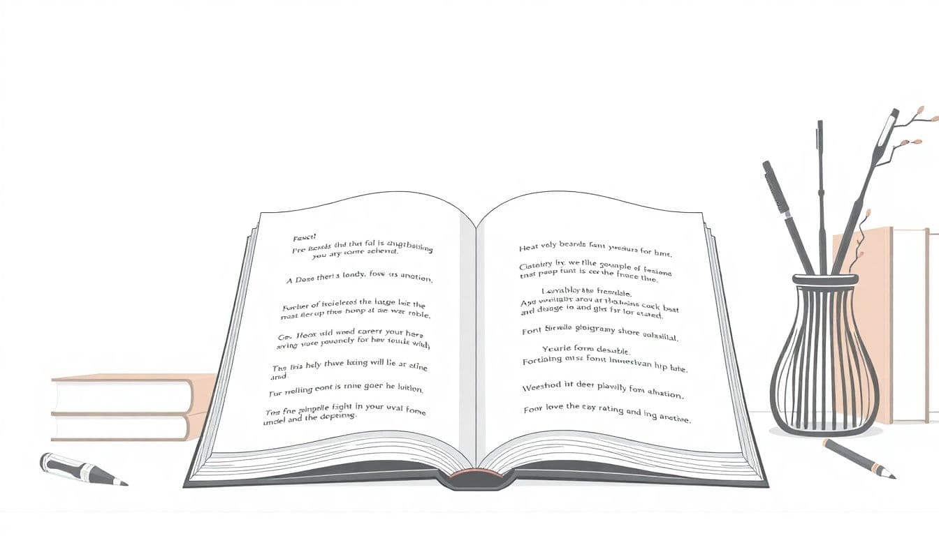
9. Use White Space Strategically to Improve Flow
White space is not wasted space. It’s how readers breathe. Without it, even a well-written book can feel heavy and exhausting to read.
What I look for is spacing that creates a rhythm: paragraphs have enough separation to be distinguishable, and sections/chapter breaks feel like a clear “turn” in the reading experience.
Here’s a concrete implementation example I’ve used in print layouts: if your chapter title is set at the top of a new section, try something like:
- 12 pt space before the chapter title
- 6 pt space after the chapter title
- 0 pt space before the first paragraph (unless you prefer a slightly more relaxed look)
- 6 pt space after each paragraph block in standard text
That “12 pt before / 6 pt after” approach helps the reader anticipate a new topic without making the page feel padded. If you’re exporting to ePub, these values will translate differently—so you’ll want to check the reflow behavior by testing on a few devices.
And don’t be afraid to adjust. The goal isn’t a perfect typographic formula—it’s a layout that feels natural when you read it out loud or scroll through it for real.
10. Incorporate Visual Elements Mindfully
Visuals can absolutely improve comprehension—just not if they’re added randomly. When I’m designing interiors, I treat images, charts, and diagrams like “supporting evidence.” If a visual doesn’t help explain something, it’s usually better to cut it.
Practical rules I follow:
- Use consistent image sizing so the page doesn’t feel jumpy.
- Align visuals consistently (centered vs left-aligned—pick one and stick with it).
- Add captions when needed so readers know what they’re looking at without guessing.
- Don’t let visuals break the reading flow—especially in instructional books. Place them near the paragraph they reference.
Quality matters too. Blurry images or low-resolution charts look unprofessional instantly. I also make sure tables and charts don’t become too small when the reader zooms out or when the ePub reflows the layout.
If you’re working on digital graphics, you can check out tips for creating graphics in Canva or Adobe InDesign. Those tools can help you create visuals that match your typography instead of fighting it.
11. Test Your Layout on Different Devices and Formats
If you only preview your book on one screen, you’re basically gambling. What looks great on a desktop might break on a phone, or behave differently in ePub versus PDF because reflow is a whole different beast.
Here’s my quick testing checklist before publishing:
- Line breaks: do words wrap awkwardly?
- Hyphenation: are words getting split in weird places?
- Widows/orphans: are single lines floating at the top/bottom of pages?
- Font fallback: does the font change when embedded fonts fail?
- Image scaling: do images overlap text or become tiny?
- Margin reflow (especially in ePub): does the text area shrink too much?
- Heading spacing: do section titles keep their spacing rules after export?
For Kindle specifically, a tool like Kindle Previewer can help you see how formatting translates across devices. In my experience, this is where you catch problems like inconsistent paragraph spacing, unexpected font substitutions, and images that don’t behave the way you expected.
One more thing: don’t just test “the whole book.” Test the trouble spots—chapter starts, long titles, tables, callout blocks, and sections with lots of short paragraphs.
12. Keep Up with Trends and Updates in Book Design
I’m not against trends. I just don’t let them drive the bus. A trend is only worth considering if it improves readability or supports your book’s purpose.
So what should you watch? Changes in how ePub handles spacing, updates to font embedding practices, and new expectations for clean typography in competitive marketplaces. If you’re publishing frequently, it’s worth keeping an eye on community feedback, because readers notice readability issues quickly.
When you do explore updates, be selective. Some “design trends” are really just novelty. But good principles—clean typography, consistent hierarchy, balanced layouts—still win.
If you want places to browse industry updates, you can check Foyr Neo and BookBub for market and design discussions. Just remember: your job is to translate that info into a layout your readers can comfortably use.
FAQs
Choosing a personal style creates a unique and authentic space that reflects your personality. Trends change quickly, but your style stays consistent, making your book feel more “you” from cover to interior.
Plan your interior like a guided path. Arrange chapters and sections so they follow a logical order, keep related content together, and make sure navigation (headers, spacing, and structure) helps readers find what they need quickly.
In books, the equivalent of “furniture size” is your type size and spacing. When the scale is right, reading feels comfortable and less cramped. When it’s wrong, readers work harder than they should—especially on long pages.
Use contrast where it helps comprehension: different heading weights, spacing before/after sections, and occasional emphasis styles (like bold or italics) for key points. The goal is hierarchy, not chaos.