Table of Contents
When I’m helping authors polish the front matter, the title page is one of the first places I look. Not because it’s “marketing,” but because it’s where your book starts acting like a real, finished object. Readers (and reviewers) may not consciously study it—but it absolutely affects first impressions in previews, and it sets the tone for the whole interior.
⚡ TL;DR – Key Takeaways
- •A book title page is the formal identification page inside the book: title, author, publisher, and publication details—separate from the cover’s sales job.
- •For 2026, I’m seeing bolder typography and cleaner layouts. The practical move: use a strong title size, generous margins, and keep the design readable as a tiny thumbnail.
- •Match the title page’s typography vibe to the front cover, but don’t copy it blindly. Use genre-evoking motifs (not clutter), and keep the page balanced.
- •Most problems come from overcrowding, weak contrast, and mismatched styles between cover and interior. Those issues show up fast in digital previews.
- •Eco-friendly choices are great, but the core workflow matters more: build in InDesign/Canva, export correctly for your platform, and do 1-inch scale readability checks before you finalize.
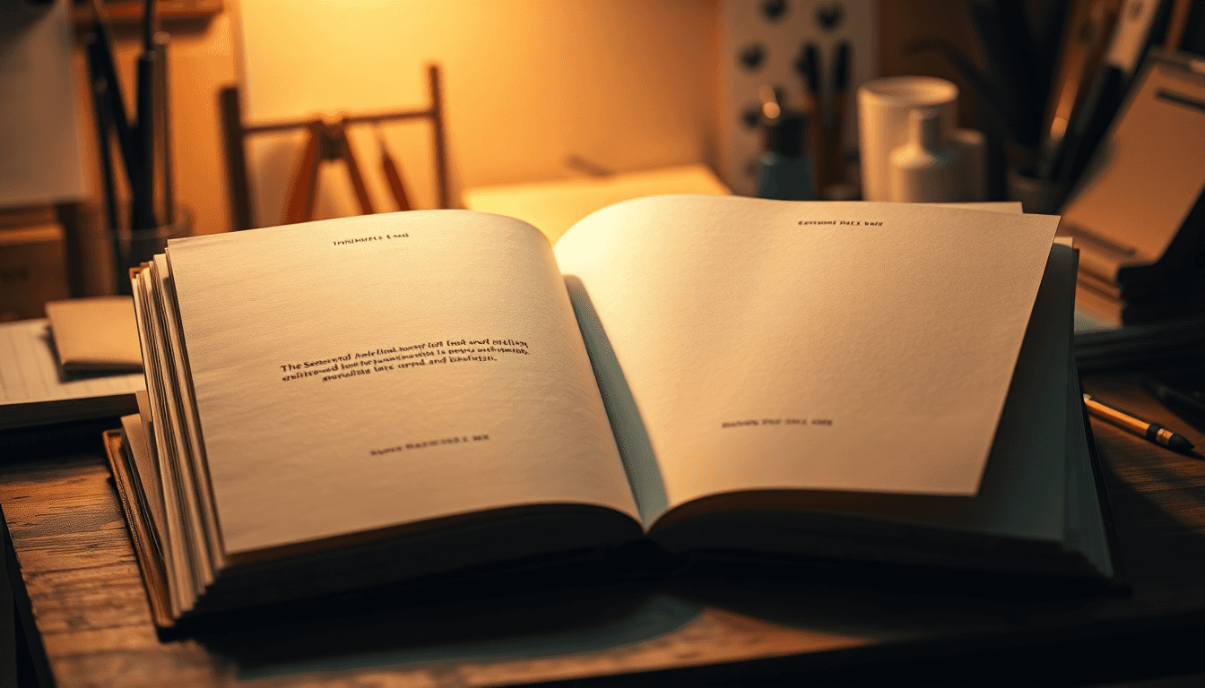
What a book title page actually is
The book title page is the main interior page that displays the publication information readers expect to see. Think of it as the book’s “identity card.” It’s usually placed right after the front matter (like copyright and dedication), and it’s typically the first page of the main content block.
That’s the key difference between the title page and the front cover. The cover is designed to sell the book fast—artwork, big type, emotional hooks. The title page is informational and formal. It legitimizes the edition and helps everything feel cohesive and professional when someone flips through the book—or when you preview it digitally.

What goes on a book title page?
At minimum, you’ll want the book title and subtitle (if you have one). Most title pages then place the author name underneath, followed by publisher information.
Common elements include:
- Title (largest text on the page)
- Subtitle (smaller than the main title)
- Author name (often centered and clearly separated)
- Publisher name and sometimes a logo
- Location and year (more common in traditional formatting, but still used)
- Edition/series/volume (optional, but useful for multi-book projects)
Some authors also add genre cues—like a small emblem, symbol, or motif that matches the story. And yes, interactive elements (QR codes or AR markers) are getting more common, especially for e-books and marketing-linked print runs. Just don’t treat them like a requirement. They should support the reader experience, not distract from the core text.
How to create a title page (a workflow that won’t waste your time)
I like to build title pages in a way that makes revisions painless. Here’s the workflow I use most often:
- 1) Start with the “text stack”: title → subtitle → author → publisher line(s). Decide which line is visually dominant.
- 2) Pick fonts that match your cover: if your cover uses a bold serif, keep that energy. If it’s a modern sans-serif, use a clean sans for the title and a readable sans/serif pairing for details.
- 3) Set margins for balance: aim for 20–30% margins around the text block (top/bottom and left/right). That breathing room is what makes the page look “designed,” not “typed.”
- 4) Center the composition: I usually center vertically and horizontally for the classic look, unless your cover style is intentionally asymmetrical.
- 5) Do the 1-inch scale readability test: export a PDF, then zoom out until the title page becomes roughly the size of a thumbnail (or print a quick test at about 1 inch tall per key text element). If the title becomes mushy or the author line disappears, it’s too small or too low-contrast.
- 6) Export for your platform: don’t “hope” it works. Use the platform’s recommended PDF settings so spacing and font embedding survive the upload.
On the practical side, this connects directly to page planning for e-books. If you’re also working out minimum length/format decisions, see our guide on minimum pages ebook. That article helps when you’re trying to avoid under-length issues and keep your interior formatting consistent across devices.
Now, about “2026 trends.” I’m not a fan of chasing trends just to say you did. But the direction I keep seeing is: strong typographic hierarchy and clean negative space. If you want to lean into that without risking readability, here are some actionable starting points:
- Title font size: often lands in the 28–48 pt range for common trim sizes (like 6x9), depending on the font’s x-height and weight.
- Subtitle font size: commonly 12–24 pt (enough separation from the title to feel intentional).
- Author/publisher line size: often 10–16 pt for print-friendly clarity.
- Line spacing: keep it tight but not cramped—usually 1.0–1.2 for display lines, and slightly looser for small text blocks.
Where do tools like InDesign, Canva, and Pressbooks come in?
- Adobe InDesign: best if you want precise typographic control, consistent spacing, and professional exports (especially for print-ready PDFs).
- Canva: quick for simple, centered designs—just be careful with font licensing and export quality.
- Pressbooks: great for structured ePub workflows, but you’ll still want to verify how your title page renders on multiple screen sizes.
And yes—AI can help, but only if you use it like a drafting assistant, not a final designer. Here’s a simple “AI-assisted layout” workflow that actually works:
- Input: genre (e.g., romance, fantasy), trim size (e.g., 6x9), page orientation, and your cover font vibe (serif vs sans; bold vs light).
- Output: a proposed typography pairing (title font + detail font), a motif suggestion (e.g., small starburst for fantasy, minimal line icon for mystery), and a layout rule (centered block, margin range, hierarchy order).
- Your job: implement the layout in InDesign/Canva, then run the 1-inch readability test and adjust font sizes/spacing until it holds up.
Elements of a title page (what makes it look “right”)
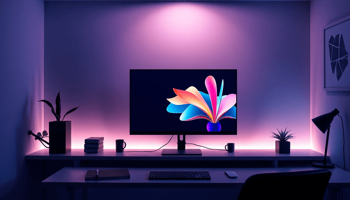
Typography is the whole game. If the title doesn’t read instantly, the rest doesn’t matter. In 2026-style layouts, bold and oversized typography tends to dominate—but the real win is hierarchy: the title should be unmistakable, the subtitle should feel like support, and the author/publisher lines should be crisp, not tiny.
Practical rules I stick to:
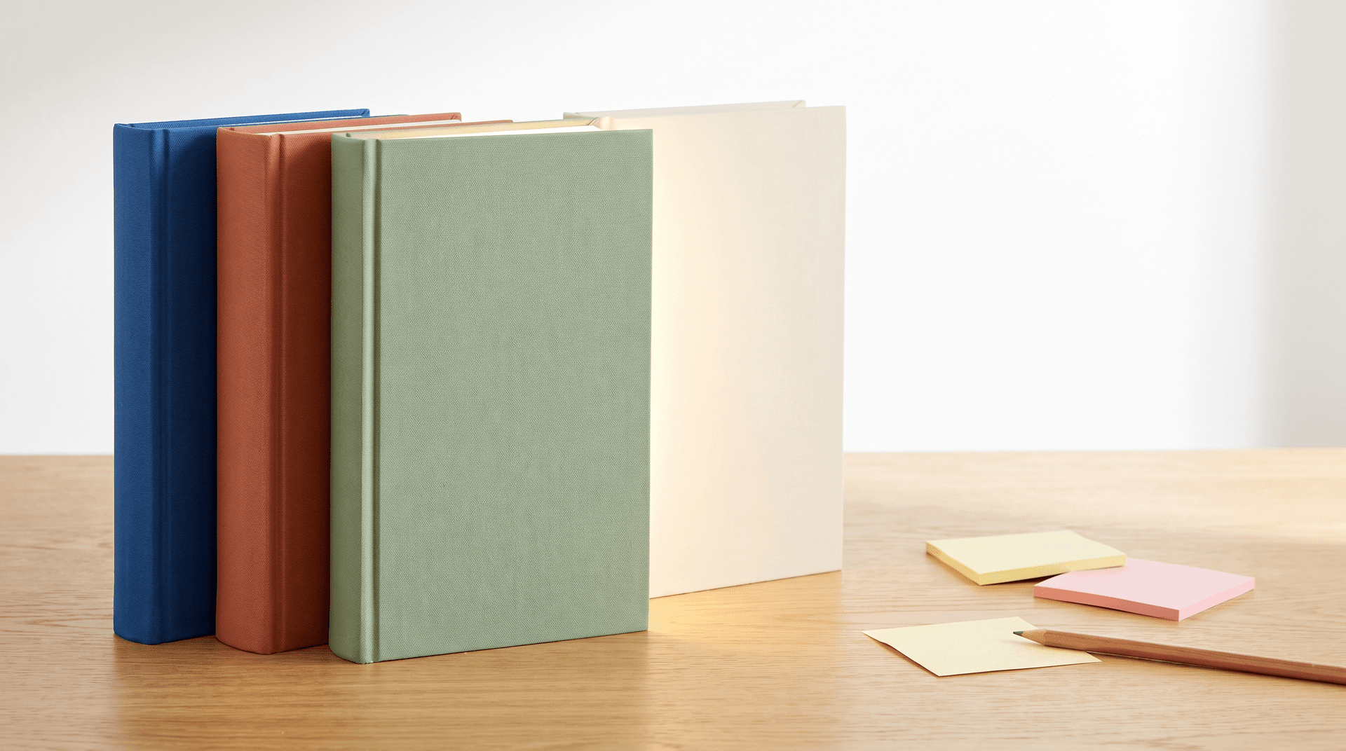
- Use high contrast (dark text on light background is the safest default).
- Choose one strong “hero” font for the title and one secondary font for details.
- Limit colors (often 1–2). Too many colors look like a template.
- Keep letterforms readable at small sizes—especially the author’s name.
Imagery and symbols should be subtle. A title page doesn’t need to be an art gallery. Small motifs work well: a line icon, a small engraved-style emblem, or a faint texture behind the text (as long as it doesn’t reduce contrast).
If you’re going for a genre feel, think in terms of cues rather than literal scenes. Romance and YA often lean playful with decorative elements. Mystery and fantasy often use symbolic objects (keys, sigils, stars) or hand-drawn accents. Non-fiction usually benefits from restraint: clean typography, minimal ornament, and strong readability.
Layout and alignment should be consistent and intentional. I recommend centered alignment for most title pages, with 20–30% margins to keep the text block from feeling cramped. And yes—keep the title page aligned with the front cover’s typography direction so the interior feels like it belongs to the same book.

Formatting a title page (so it survives print and e-book)
Most title page formatting follows long-standing publishing conventions (often associated with styles like Chicago formatting for front matter structure). The biggest “real-world” rule isn’t the manual—it’s readability and consistency across formats.
Here’s what I recommend:
- Fonts: use legible fonts and embed them in your PDF when possible.
- Spacing: keep consistent spacing between title/subtitle/author lines.
- Placement: publisher info typically goes at the bottom or top depending on your chosen layout style and genre expectations.
- Thumbnail checks: verify how it looks when the page is small (this is where weak contrast and tiny fonts get exposed).
For digital formats, minimalist designs tend to render cleanly across devices. If you add a QR code, make sure it’s scannable at common screen sizes and that the destination URL works reliably. For print, eco-friendly inks and paper choices can be a good fit—but don’t let sustainability choices compromise contrast or durability.
Also, make sure your file format matches your workflow. If you’re publishing through platforms like Pressbooks or IngramSpark, your exported PDF/ePub needs to be compatible. For another formatting-related page-size decision, see our guide on what best page.
Title page examples by genre (what I’d actually expect)
Genre doesn’t control your layout, but it does influence the vibe. Here are common patterns that tend to work:
- Romance & YA: brighter color accents, playful font choices, and light decorative motifs (think subtle florals or spark-like symbols).
- Mystery & fantasy: symbolic objects, hand-drawn accents, and strong serif or bold typographic contrast.
- Non-fiction & academic: cleaner typography, minimal ornament, and a layout that prioritizes clarity over decoration.
What about “innovative” title pages—like AR or animated elements? It’s feasible, but with constraints. In practice, AR/QR works best when:
- You’re comfortable linking from a scannable code (QR is the most reliable).
- You’re targeting devices/platforms where the reader can actually access the experience (most readers have phones, but publishers still need to test).
- You keep the title page readable first—any animation or AR marker should not cover the core text.
For e-books, animation can be supported depending on the format and reader app. For print, AR generally relies on a camera + marker approach, and production teams usually handle it through specific tooling. If you’re considering it, treat it like an add-on feature you test—not something you assume will “just work” for every buyer.
Where the title page goes (and why placement matters)
In most standard front matter sequences, the title page comes right after pages like copyright and dedication. It becomes the first page of the main content block, which is why placement matters for both print flow and digital previews.
A few placement tips that reduce headaches:
- Digital previews: test the order in your ePub viewer so you don’t end up with the title page buried or duplicated.
- Print: confirm whether your layout expects a right-hand start (common for books with spreads).
- Consistency: keep margins uniform and avoid crowding. If the title page looks different from the pages around it, readers notice.

Best practices (and the pitfalls I keep seeing)
Here’s the stuff that consistently improves results:
- Match genre expectations without copying the cover exactly.
- Test at small scale—if the title or author line can’t be read when the page is small, it’s going to fail in previews.
- Keep it uncluttered: fewer elements, stronger hierarchy.
- Use eco-friendly options when they don’t harm contrast or print quality.
In my experience working directly with authors and editors, the biggest “aha” moment usually comes down to typography and contrast—especially on the right-hand page where the title presentation gets the most visual attention during a flip-through. I’ve seen titles look “fine” in the design file but feel sloppy in the final PDF export. The fix was almost always font size, spacing, and contrast, not a total redesign. Once those were dialed in, revisions dropped and the page felt instantly more confident.
Common mistakes:
- Too many elements (motifs, logos, long lines) competing for attention
- Low-contrast text (especially light gray on tinted backgrounds)
- Mismatch between cover typography vibe and interior styling
- Forgetting that digital thumbnails don’t forgive tiny type
If you’re also thinking about front matter legal/rights pages, you might find our guide on copyrighting book title helpful for the details that often get overlooked during formatting.
Latest title page trends for 2026 (what’s real vs. what’s hype)
Trends I actually think are worth considering:
- Clean, bold typography: fewer decorative elements, more hierarchy.
- Interactive add-ons: QR codes for bonus content, and AR markers for readers who opt in.
- Digital-first testing: checking how the title page looks in previews and on multiple screen sizes.
- Smarter layout iteration: using layout suggestions (including AI-assisted drafts) and then validating with real exports.
On the “industry standards” topic: different platforms and publishers have different recommendations, and they can change by workflow (print vs ePub vs PDF). Instead of treating any single platform as the rule of nature, I recommend checking the specific formatting guidelines for your chosen distributor and then testing exports. That’s how you avoid surprises.
Important title page stats (and what to do without the shaky numbers)
You’ll see a lot of ultra-specific stats online—wishlist boosts, click lifts, percentages of thumbnail readability. Some of those claims are either impossible to verify or they come from narrow tests that don’t generalize. What I trust more are the repeatable principles: contrast, hierarchy, and readability at small sizes.
If you want defensible data, your best bet is to look at platform research and publisher/typography studies that clearly explain sample size, measurement method, and timeframe. For this post, I’m sticking to guidance you can validate yourself with quick tests: export your title page, view it at thumbnail size, and print a small test so you can see what readers will actually experience.
Quick self-check you can run in 10 minutes:
- Export your title page PDF.
- Zoom out until the title is roughly “thumbnail-sized.”
- Ask: can you read the title and author without squinting?
- If not: increase title size, darken text, or reduce clutter.
Next steps: finalize your 2026 title page without overthinking it
If you want a title page that looks professional in both print and digital previews, here’s a simple checklist you can follow right now:
- Text hierarchy is clear: title > subtitle > author > publisher.
- Margins are generous (aim for 20–30% breathing space).
- Contrast is strong and consistent.
- Readability test passes at ~1-inch scale (or thumbnail-size preview).
- Export tested in the format your platform actually uses.
- Design matches the cover vibe without copying it line-for-line.
If you’re also working through front matter options, the half title page is another place where formatting decisions matter. For that, see our guide on what half title.

FAQs
What is a title page in a book?
A title page is the interior page that displays your book’s title, author name, publisher, and publication details. It’s the formal identification page inside the book.
What goes on a book title page?
Typically: the book title and subtitle (if you have one), the author’s name, publisher name (and sometimes publisher logo), and publication details like year (and sometimes location/edition). Some books also include series info or a small motif related to the theme.
What is the difference between a title page and a cover page?
The cover page is designed to grab attention and market the book. The title page is informational and sits inside the book, presenting the publication details and edition identity.
Where is the title page located in a book?
Usually it comes right after the copyright and dedication pages, and it’s commonly positioned on the right-hand page as part of the front matter-to-main-content transition.
Does every book need a title page?
Most books benefit from one. It’s especially important for self-publishing and academic works where clarity, formatting consistency, and professional front matter structure matter.
What is the half title page in a book?
A half title page typically includes just the book title (often in a simpler layout) before the full title page. If you’re deciding whether to use one, this guide breaks down how it fits into front matter order: What Is a Half Title Page?.