Table of Contents
If you’ve ever tried to print comic pages and wondered why your “perfectly centered” art still ends up looking a little off after trimming… yeah, I’ve been there. The short version is that the most common North American interior trim size you’ll run into is 6.625" × 10.25". It’s the size most printers and retail bag/board setups are built around, so it saves you headaches if you’re aiming for a standard floppy-comic footprint.
Now, about that exact number—6.625" × 10.25"—you’ll see it show up consistently in production workflows for North American comics because it matches the industry’s trim conventions for interiors and the way comic distribution expects files to land. And when you’re uploading files to print, the printer’s template is what ultimately “confirms” the spec for your exact job (paper, binding, and whether they want you to include bleed as part of the final PDF).
For the practical side of production (like how to think about text density and layout spacing), you might also like our guide on many words per.
⚡ TL;DR – Key Takeaways
- •North American interior trim for most floppy-style comics is 6.625" × 10.25", so build around that if you want things to fit standard retail setups.
- •Manga, graphic novels, and European albums use different trims, so don’t assume your “comic size” will carry over.
- •Plan for bleed and keep important art/text inside the safe zone—that’s what saves you from trimming surprises.
- •Binding + page count change what your final “cover size” needs to be, so decide binding early.
- •I like to design on a larger canvas (like 11" × 17"), then scale down—cleaner lines, easier layout tweaks.

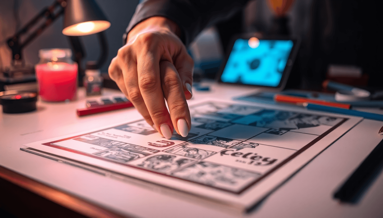
1. The “Standard” Comic Page Size (and the real reason it matters in 2026)
For North American floppy-style comics, the go-to trim size is 6.625" × 10.25". That’s the interior size printers and distributors expect when you’re targeting the familiar shelf/pull-box look—and it’s also the size that lines up with common comic bag/board options.
Here’s the part people skip: your file size isn’t just the trim. You need to build in bleed so the printer can trim accurately even if cutting shifts a hair.
What I actually plan for (trim + bleed + safe zone)
- Trim: 6.625" × 10.25"
- Bleed (common target): 0.125" on each side
- Full art size (trim + bleed): 6.875" × 10.5"
For the safe zone, I usually treat 0.25" inside the trim as a “don’t put anything important here” buffer. That means if your trim is 6.625" × 10.25", your safest interior content area becomes roughly:
- Width safe area: 6.625" − 0.5" = 6.125"
- Height safe area: 10.25" − 0.5" = 9.75"
One quick reality check: bleed and safe-zone numbers can vary by printer and product (paper type, binding, and whether they’re strict about PDF/X settings). So yes—use these as solid defaults, but always confirm with your printer’s template before you export 100 pages. I’ve seen templates where the bleed is still 0.125", but the safe-zone guidance is stricter. Better to follow the template than “industry averages.”
2. Comic format “families” you’ll actually encounter (floppies vs. manga vs. albums)
The 6.625" × 10.25" trim dominates interior pages for US floppy comics, but it’s not the only game in town. Once you start planning distribution—bookstores, conventions, international markets—you’ll see size choices that affect layout and production.
Common formats and what they usually mean for your layout
- US floppy comics (saddle-stitched): 6.625" × 10.25" trim. Great for dense dialogue pages and classic panel rhythm.
- Trade paperback / graphic novel (often perfect bound): frequently 6" × 9" or 8.5" × 11"-ish trims depending on publisher. More room for art scale and typography.
- Manga: commonly around 5" × 7.5". Smaller canvas means you plan for tighter panel spacing and careful lettering scaling.
- European albums: often A4-adjacent (~8.3" × 11.7"). More “poster-like” art spreads and generous layout breathing room.
What I noticed after doing a couple of print runs: when you switch formats, it’s not just the canvas size—it’s how your lettering and panel gutters behave. A font size that looks perfect in a 6.625" width can get cramped fast at manga scale. So treat size changes like a redesign, not a resize.
3. Bleed, safe zones, margins—my checklist before I export
Let’s make this practical. If you’re preparing print-ready comic pages, here’s the workflow checklist I follow every time. It’s boring. That’s why it works.
Pre-export checklist (works for Photoshop/Illustrator workflows)
- Confirm printer template: trim size, bleed requirement, page count layout rules.
- Set your artboard/canvas: use the printer’s “final PDF page size” dimensions (trim + bleed if they want it baked in).
- Place a safe-zone guide: I draw a rectangle at least 0.25" inside the trim and keep all dialogue, sound effects, logos, and faces inside it.
- Extend backgrounds into bleed: anything that touches the edge should reach the bleed boundary.
- Lock your lettering layers: after scaling, double-check balloon tails and SFX placement—those are the first things trimming will “nibble.”
- Export as print-ready PDF: in most cases, PDF/X is safest (and follow the printer’s preference).
- Use the right resolution: 300 dpi for raster art is the usual target for print.
- Do a digital proof: even if you can’t print a test set, review a flattened PDF at 100% and zoom to the trim edges.
On bleed specifically: 0.125" on all sides is a very common requirement, but I don’t treat it as universal. What I’ve learned is that printers often standardize around it because it’s easy and reliable, yet their templates still win. If their template says 0.0625" for a particular product, you follow that—even if it feels “smaller” than you expected.
About “aspect ratio” and why I don’t obsess over it
You’ll see people talk about aspect ratio as if it magically makes panels look harmonious. Sure, the trim ratio naturally fits the classic comic proportions, but the real control comes from your panel grid, gutter widths, and how lettering scales. So instead of relying on ratio alone, I focus on keeping consistent gutters and readable type sizes across pages.
4. Page count, binding, and why your “cover size” isn’t just the trim
Binding changes everything. It affects how the book opens, how thick it feels, and—yes—how your cover needs to be sized.
Saddle-stitched page count realities
For saddle-stitched comics, you typically work in multiples of 4 pages. That’s because the printer folds and stacks signatures in a way that likes those increments. If you ignore that, you’ll often get rework or they’ll force you into a different pagination plan.
As a rule of thumb from common printer setups, saddle-stitched is happiest in the 24–64 page neighborhood (exact limits depend on paper thickness and how the spine handles the stack). When you push too far, you can run into a “pillow spine” look or binding stress.
Worked example: 24 pages (what I’d plan for)
Let’s say you’re doing a saddle-stitched comic and your interior trim is 6.625" × 10.25". You still need bleed for the cover, and the cover needs to account for spine width based on paper and page count.
Without knowing the exact paper thickness your printer uses, you can’t calculate the spine perfectly. But a common planning target you’ll see in workflows is that your cover outer size ends up slightly larger than the interior trim because it includes bleed and the spine panel area.
For a “good starting point” estimate, many creators plan around something like 6.75" × 10.5" for the cover dimension when using the same bleed logic as interiors (trim + bleed). Then the printer’s template tells you the exact spine width and the full wrap layout.
If you want one actionable takeaway: don’t guess the cover wrap dimensions. Use the printer template for the cover wrap, even if your interior pages are straightforward.
Perfect bound / case bound (trade-offs you should expect)
Perfect bound and case bound options are usually where you go for thicker books. The trade-off is that covers behave differently (spine gutter, cover thickness, and whether you need extra margin for the fold/hinge area).
And if you’re selling in bookstores, perfect bound is often the “feels premium” route. But for small runs and classic floppy presentation, saddle-stitched is hard to beat.
5. Variations: graphic novels, indie sizes, and how not to paint yourself into a corner
Once you step away from the standard US comic trim, sizes start reflecting the creator’s goals—bookstore placement, shipping cost, and how much detail you want to show.
What changes when you pick a larger trim
- Lettering gets easier: you can keep dialogue readable without going microscopic.
- Art can breathe: you’ll fit more background detail and larger panel compositions.
- Production cost can rise: larger pages often mean more paper and sometimes different press considerations.
Indie and “stand out” sizes
Indie creators sometimes go with trims like 4" × 6" or even square formats like 5.5" × 5.5". I like the marketing angle (it’s memorable), but you’ll need to plan distribution carefully—bags/boards, shelf fit, and even how convention vendors store items can become part of the decision.
In my experience, if you’re planning to sell through multiple channels, it’s worth choosing a size that matches common display and packaging habits. Otherwise, you end up paying for custom everything.
6. International sizing: what changes when you’re targeting Europe or Japan
If you’re publishing internationally (or doing a second edition later), you’ll want to think about regional trim conventions early. It’s not just “format”—it affects lettering scale and whether you’ll need a re-layout pass.
Europe / UK (album-style)
European comic albums often land near A4-like dimensions (around 8.3" × 11.7"). That extra space is perfect for detailed art and bigger panel spreads, especially for trade paperback-style releases.
Japan (manga)
Manga volumes commonly come in around 5" × 7.5" and are often perfect bound with lots of pages packed in. Because the canvas is smaller, lettering and panel density need to be intentional—there’s less “oops margin” to save you.
If you’re also thinking about digital publishing alongside print, you might find our guide on what best page useful for planning consistent reading experiences.
7. Expert setup tips: artboards, export settings, and a scaling method that actually helps
Here’s what I recommend if you want fewer “why does it look different?” surprises.
Start bigger, then scale down
I usually build pages on a larger artboard like 11" × 17" at 300–600 dpi (depending on whether the art is mostly vector or raster). Then I scale down to the final trim. It makes it easier to keep linework crisp and keeps your workflow flexible if you decide to tighten gutters or adjust panel composition late.
Lettering safety: don’t rely on eyeballing
Before you export, I do a quick “zoom test” at the trim edge. If a balloon tail is within that 0.25" safe zone buffer, I move it. If a logo touches the bleed area, I make sure it extends properly into bleed (and isn’t just “almost there”).
Also, if you’re using Blambot fonts or similar comic lettering systems, follow their guidance for sizing and print settings. Speech balloons are unforgiving—tiny differences in scale show up fast in print.
For more on page planning (especially if you’re mixing print and platforms like Amazon), see our guide on minimum pages ebook.
Panel planning without the “one-size-fits-all” rule
You’ll see advice like “four to six panels per page.” That’s a decent starting point, but it’s not a law. What matters is how the page functions:
- Action pages: often need fewer, larger panels so motion reads clearly.
- Dialogue pages: usually tolerate more panels because the conversation carries the pacing.
- Reveal pages: one big establishing panel can do more than a grid full of small ones.
So instead of chasing a panel count number, I plan the page beat first, then build a panel layout that supports it at your final trim size.

8. Common comic printing problems (and how to prevent them)
Let me save you from a few classic mistakes I’ve seen repeatedly.
Problem: important art gets trimmed off
Fix: extend backgrounds into bleed, and keep faces, dialogue text, and logos at least 0.25" inside the trim. If your printer’s template suggests a different safe margin, follow theirs.
Problem: binding looks weird or the spine gets stressed
Fix: respect page-count multiples and don’t push saddle-stitched beyond what your printer can comfortably handle. If you’re hovering near the upper limit, ask your printer what paper thickness they’re using and what page count they recommend for that stock.
Problem: your “standard size” doesn’t fit bags/boards or shelf displays
Fix: match the trim to your distribution plan. The standard US comic size is popular for a reason—it plays nicely with common retail packaging and display habits. If you go off-standard, be ready for custom bag/board sizes or sell through channels that don’t require them.
Problem: the PDF looks right on screen, but not on paper
Fix: export correctly (PDF/X if requested), check color profiles if your printer specifies them, and always review at 100% zoom around the trim edge. I like to make one “sacrificial” page with full-bleed gradients, small text, and a high-contrast face near the edge. If that page comes out clean, the rest usually will too.
9. What’s changing in 2026 (and what’s probably not)
The standard US comic size of 6.625" × 10.25" is still the anchor for floppy interiors. That consistency helps printers, bag/board suppliers, and distributors keep everything predictable.
Where things are changing is how creators adapt comics for digital reading. You’ll see more layout experimentation—especially for web and mobile. Vertical scrolling is popular because it matches how people naturally consume content on phones.
A simple vertical scrolling layout template (if you’re adapting your comic)
- Keep your “safe text” area consistent: don’t place text right at the edges of the scroll frame.
- Use panel transitions: stagger panel reveals so each scroll segment ends on a beat (turn the page into a punchline).
- Don’t just stretch: reflow panels or adjust gutters so lettering stays readable.
- Export in segments: many creators slice pages into scroll-friendly chunks instead of forcing the entire page into one long image.
In other words: the trim size still matters for print, but digital layouts need a different kind of planning. I’ve found that treating it like a separate “reading experience” (not a direct resize) is what keeps it looking good.
10. Wrap-up: what you should lock in before you draw another panel
If you only remember one thing, it’s this: your comic page size in inches isn’t just a number—it’s the foundation for bleed, safe zones, lettering scale, and binding planning.
Start with 6.625" × 10.25" if you’re aiming for the standard US floppy look. Set up bleed and safe margins correctly, use the printer’s template as the final authority, and decide binding early so you don’t have to redo your cover wrap at the last minute.
Do that, and your pages will feel “pro” the moment they come off the printer—no frantic re-exporting, no trimmed-off captions, no mystery shifts around the edges.
FAQs
What is the standard size of a comic book page?
In North America, the common interior trim size for comic book pages is 6.625" × 10.25" for floppy-style comics.
What size should I draw my comic pages?
I recommend drawing on a larger artboard like 11" × 17", then scaling down to your final trim size. It helps keep details crisp—especially lettering and linework.
What size is a comic book in inches?
Most American comic interiors are about 6.625" wide by 10.25" tall (trim size).
What is the size of a Marvel/DC comic book?
Marvel and DC floppy comics typically follow the same North American standard US comic size of 6.625" × 10.25", with printer-required bleed included in the production workflow.
What size are graphic novels?
Graphic novels vary a lot, but common trims include 6" × 9" and 8.5" × 11", especially for bookstore-friendly releases.
What is the difference between comic book and manga sizes?
North American comics are commonly 6.625" × 10.25" (trim), while manga is often around 5" × 7.5". Manga also tends to have tighter lettering/panel planning because the page is smaller. For a related sizing topic, see our guide on book cover size.