Table of Contents
Creating a fantasy map can feel intimidating at first—especially when you’re staring at a blank canvas and wondering how anyone ever makes rivers, mountains, and labels look “real.” I’ve been there. My first attempts looked more like decorative blobs than a place people could actually navigate.
What changed everything for me was getting practical: picking the right tool for the kind of map I wanted, sketching the big shapes first, then adding details in a predictable order. Follow the same workflow and you’ll move faster (and enjoy it more) from first draft to a map you’re actually proud to share.
Key Takeaways
- Choose your tool based on the output you need. In my experience, Inkarnate is fast for good-looking drafts, while Wonderdraft is better when you want more control over terrain and exports.
- Build consistency early. Pick one terrain style, one label style, and one color palette, then stick to them like it’s a rulebook.
- Add “understanding” elements, not just decoration. A simple legend, readable labels, and a scale bar make your map feel intentional.
- Use story details to guide the eye. Landmarks, icons, and callouts aren’t fluff—they’re how you hint at history and culture.
- Do a revision pass after a break. I usually come back the next day and fix clarity issues first: label collisions, river logic, and contrast.
- Make your map usable. I’ve used maps for game sessions, story scenes, and even quick poster crops—design it so it works in multiple formats.
- Practice with a repeatable checklist. Every map gets easier when you follow the same steps and learn from what didn’t work last time.

1. Choose the Best Software or Tool for Creating Fantasy Maps
Picking the right map-making tool really does change your results. Not because one tool is “better” in general—but because each one pushes you toward a different workflow.
Here’s how I think about it: if you want a fast, good-looking map with minimal fuss, go web-based. If you want fine control over terrain shape, borders, and export quality, desktop apps tend to feel more “hands-on.”
1.1 Popular Map-Making Programs and Generators
Inkarnate is one of the quickest ways to get a polished fantasy map without wrestling with layers for hours. In my testing, the biggest win is how quickly you can go from “rough landmass” to “oh, this actually looks like a map.” It’s web-based, so there’s no install step, and the asset library makes it easy to add forests, cities, roads, and coastlines.
If you want to experiment with world ideas fast, AI generators can be great for inspiration. OpenArt’s AI Fantasy Map Generator is the kind of tool I’d use for a quick draft concept—especially when I’m still deciding on geography. Then I’d rebuild the parts I care about in a more controllable editor.
For more control, Wonderdraft is a popular desktop option (and yes, it has a learning curve). You can start with a base map style and then refine terrain, rivers, and labeling more deliberately. You can also check out Wonderdraft and other related resources at Automateed, but the key point is this: desktop tools are usually where you get the “this is my style” feel.
1.2 Cost, Platforms, and Features
Before you commit, ask two questions: Where will you use the map? (web, print, game handouts) and How much control do you need?
In practice, here’s what matters most:
- Web tools (like Inkarnate): typically faster to start, easy to share, and good for iterating. You’ll often find export options that are “good enough” for most uses, but you may hit limits if you’re aiming for extremely large print sizes.
- Desktop tools (like Wonderdraft): usually stronger control and more predictable exports. You’re trading speed for precision. You’ll also spend time learning how the program wants you to build.
- AI generators: great for fast drafts and mood. The catch is that you don’t always get the geography logic you want (like rivers flowing “correctly” or consistent mountain placement).
Pricing and export limits can change over time, so I treat it like this: start with a tool that matches your timeline. If you need something usable this week, don’t pick the tool you might “learn someday.”
1.3 Pros and Cons of Each Tool
Here’s the honest version:
- Inkarnate: super approachable. You can get a satisfying map quickly. The downside is that “quick” can sometimes feel like “less custom” if you’re chasing a very specific style.
- AI map generators: fast inspiration. But you may have to redo geography details manually anyway—especially rivers, coastlines, and label hierarchy.
- Wonderdraft / other desktop editors: strong control and a more “professional” feel. The tradeoff is time: setup, learning the interface, and building your own consistent style.
So which should you choose? If you want speed and a great-looking draft, start with Inkarnate. If you want control and you’re okay learning, go desktop. If you want ideas and composition inspiration, try an AI draft—but plan to refine.

7. Keep Your Map Consistent and Coherent
Consistency is what makes a fantasy map feel like a real place instead of a collage of cute icons. I learned this the hard way: my first map had three different “forest vibes,” and once I noticed it, I couldn’t unsee it.
Here’s a coherence method I use now—simple, repeatable, and surprisingly effective.
- Pick one palette and lock it. For example, I’ll choose a warm land color (like a sandy green), one ocean blue, and one mountain gray/brown tone. If you keep swapping shades, the map starts to look unstable.
- Use a label hierarchy. Cities should be bigger and darker than regions. Rivers should have either fewer labels or smaller text. If everything is the same size, nothing stands out.
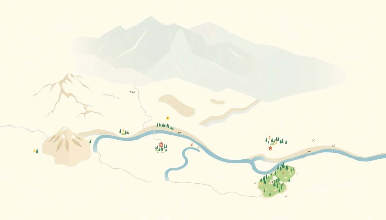
- Make rivers obey basic logic. Rivers usually start at higher ground and flow downhill. They should branch in a way that feels natural: one main river, a few tributaries, and then the messier delta near the coast.
- Group mountains like they have a reason. I try to keep mountain ranges as connected “chains,” not isolated dots everywhere. If mountains are everywhere, nothing feels special.
- Blend layers intentionally. If you’re stacking textures (terrain + forests + roads + effects), check contrast. Overlapping textures can make everything muddy fast.
Quick coherence test: zoom out to 25–30% and squint a bit. Can you tell what’s important without reading every label? If not, that’s usually a contrast or hierarchy issue—not a “you need more detail” problem.
8. Add Legends, Labels, and Scale Bar
If your map doesn’t explain itself, people will struggle—even if your art is gorgeous. The best maps I’ve seen treat legends and labeling like part of the design, not an afterthought.
Legend that actually helps
Keep the legend simple. In my projects, I use a 2–4 row legend with only the symbols that matter for navigation. For example:
- Cities: a solid circle icon
- Forests: a cluster of tree symbols
- Mountain ranges: a jagged line or stacked peaks icon
- Special landmarks: a unique icon (ruins, temple, lighthouse)
Place the legend in a corner that doesn’t cover a major region. If you don’t know where to put it, start with the least “busy” area—usually a coastline edge or a blank-ish ocean/region margin.
Label font sizing that won’t fight your map
Here’s a rule of thumb I follow: big labels for big places, smaller labels for smaller features. If you’re using a single font, vary weight and size instead of switching styles mid-map.
Also, don’t cram. If you can’t avoid overlap, it’s better to remove 20 labels than to leave 5 unreadable ones.
Scale bar placement
Scale bars are great, but only if they don’t block the story. I usually put a small scale bar near the legend or along a margin. Make it visible at a glance, but not so large that it becomes another “feature” competing with cities and landmarks.
9. Incorporate Narrative and Artistic Flair
This is where your map stops being “a map” and becomes your world. I like adding narrative elements that guide attention—so the viewer learns something just by looking.
- Use landmarks with purpose. A “Ruins of Alderwatch” should look different from a “Generic Ruins” icon. Even one unique shape or border can make it feel intentional.
- Icons should match the tone. Dark and gritty worlds often use harsher contrast and fewer bright accents. Whimsical maps can go heavier on decorative flourishes.
- Callouts work best when they’re selective. If you add callouts to every location, none of them mean anything. I usually pick 3–6 key places: the capital, a major dungeon, a famous port, and one “mystery” site.
- Cartouches and borders should frame, not drown. Add a decorative border or cartouche if it supports readability. If it distracts from labels, scale it back.
One thing I’ve noticed: the more coherent your terrain and labeling are, the more effective your artistic flair becomes. You can’t “decorate” your way out of unclear geography.
10. Review, Share, and Iterate
Don’t judge your map while you’re still in “making mode.” I take a break—usually overnight—then come back with fresh eyes. That one change has fixed more issues than any fancy tool ever did.
When I do a review pass, I check these in order:
- Clarity: Can I find cities and major regions quickly?
- Rivers and terrain logic: Do rivers start in high areas and end logically?
- Contrast: Are labels readable over forests and mountains?
- Hierarchy: Are the important places actually the most noticeable?
- Consistency: Do forests/mountains/roads share the same visual style?
If you want feedback, ask for specific things. Instead of “What do you think?”, try: “Can you tell where the capital is in 5 seconds?” You’ll get more useful answers that way.
And yeah—make variants. I often export:
- a thumbnail for sharing (so people actually click/recognize it),
- a web version sized for speed,
- and a high-res print version for posters or handouts.
11. Use Your Map Creatively
Your map can do more than sit in a folder. I’ve used mine for story planning, game session handouts, and even character “where are they now?” screenshots.
- Story scenes: drop callouts like “last seen near the ford” to anchor chapters.
- Game prep: mark encounter zones, travel routes, and safe havens so sessions run smoother.
- Print/cosplay: crop the map into a poster section or a prop-friendly sheet.
- Digital marketing: share zoomed-in crops of interesting regions on social media to pull people in.
When you design with reuse in mind, you naturally polish details that matter—like legibility and focal points.
12. Keep Learning and Improving Your Skills
Mapping is one of those skills that gets better fast once you build a habit. I don’t mean “make a masterpiece every time.” I mean do small exercises.
- Try one map with only rivers and mountains first. Then add forests and cities later.
- Rebuild the same region twice using different styles to see what changes.
- Steal (respectfully) from good references: notice label spacing, icon size, and how legends are simplified.
Also, don’t get discouraged by early maps. I still make “bad” versions—then I learn exactly what to fix next time. That’s the whole point.
FAQs
Start with your use case. If you need a nice-looking map quickly for web or a small print, a web tool like Inkarnate is usually the fastest path. If you need more control over terrain, borders, and exports, desktop tools like Wonderdraft are worth the extra learning time. If you’re still exploring geography ideas, use an AI generator for a draft, then rebuild the parts that matter in a more controllable editor.
Plan like you’re designing a real landscape. Sketch the big shapes first: coastline, major mountain chains, and where rivers originate. Then decide where the major settlements would realistically form (ports on coasts, cities near rivers/fords, trade hubs along routes). Once that foundation is in place, fill in forests, biomes, and smaller features.
Keep political layers readable. Mark kingdoms or regions with subtle boundaries and distinct label styles (for example, bold for capitals, regular for regions). Add trade routes only where they connect meaningful locations. Cultural depth can come from icons and callouts—like temples near holy sites, ship symbols near ports, or faction markers near contested borders.
Finalizing is mostly about readability and consistency. Use a limited palette, keep label sizes in a clear hierarchy, and make sure icons don’t blend into the background. I also recommend doing one “zoom-out pass” to check contrast at a glance—if it’s hard to read from far away, it won’t feel professional up close either.