Table of Contents
Designing your own book cover doesn’t have to feel like a mystery. I’ve helped friends put together covers from scratch (and I’ve redone a few of mine after realizing the sizing was off), so I’ll walk you through the part that matters most: getting the measurements right, then building the cover—either handmade or digital—so it actually looks professional.
To make this practical, I’m going to assume you’re making a standard print book (like a 6x9 paperback or a hardcover) and you want something you can upload to a print platform or mount onto boards. If you’re doing a different size, don’t panic—just swap in your numbers and follow the same steps.
Key Takeaways
- Measure your book accurately (height, width, and spine width), then plan bleed for print—commonly 0.125 in on each side—so trimming doesn’t cut into important text.
- For a handmade hardcover, use sturdy boards (cardboard/bookbinding board), cover them with decorative paper or fabric, and use a strong adhesive like PVA.
- Score and fold carefully so edges stay crisp. I’ve found that clamps/weights during drying make a huge difference in how “clean” it looks.
- For digital covers, use tools like Canva and add your title/author text last so you can judge spacing at the final scale.
- Pick a style that matches your genre: clean layouts, readable fonts, and a tight color palette usually beat “more stuff” every time.
- Export correctly for your platform (print vs digital), then do a quick preview at thumbnail size to catch text that disappears.
Step 1: Measure and Prepare Your Book for Cover Design
Start with measurements. Not “close enough.” I mean real measurements—because covers fail when the numbers are off, not when your design is “not creative enough.”
Grab a ruler or tape measure and write down:
- Height (top to bottom)
- Width (front cover edge to back cover edge)
- Spine width (the thickness of the book’s spine)
If you’re doing a hardcover, measure the spine width at the thickest point. If you’re doing a paperback, you can still measure spine thickness—especially if the final layout needs to match a specific template.
Then decide: print, digital, or both.
For print: you’ll want bleed. A common starting point is 0.125 inches (1/8 in) on each side so trimming doesn’t clip your title or background. But here’s what I do to keep it safe: I keep all critical text inside a “safe area” about 0.25 inches away from the trim edge.
Example (6x9 paperback): If your finished size is 6 x 9 inches, you’d build your full cover file at roughly (6 + 0.25) x (9 + 0.25) for bleed on both sides in each relevant direction, then place text within the safe area. (Your spine width still matters—use your actual measurement.)
Now open your tool. For a free, beginner-friendly setup, I usually use Canva because you can start with templates and adjust without wrestling layers for an hour.
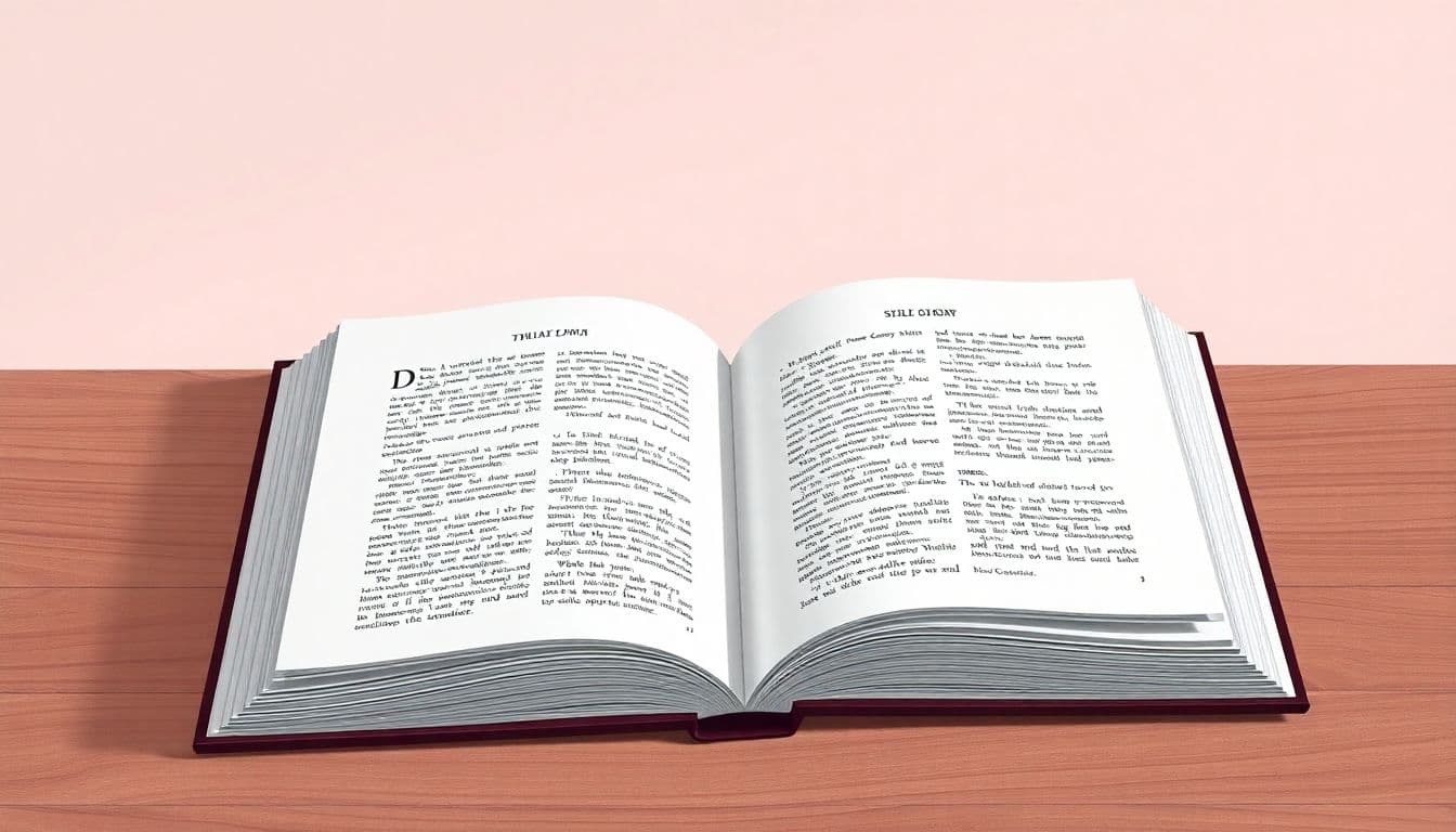
One more thing people skip: genre and thumbnail test. Before you pick colors, think about how the cover will look at small sizes—like a mobile store thumbnail. If the title can’t be read quickly, it won’t matter how pretty the background is.
Step 2: Create a Handmade Hardcover Cover
If you want that real “made by hand” feel, start with sturdy boards. I’ve used regular thick cardstock and also bookbinding board—bookbinding board tends to feel more rigid and less “wobbly” when you pick the book up.
Cut your cover boards to your measured dimensions. For the wrap/edge, add about 1/8 inch (0.125 in) for overlap on all sides so you’re not fighting tiny gaps.
Next: cover the boards.
- Use PVA glue (or another strong adhesive designed for paper/fabric).
- Lay down the decorative paper or fabric smoothly.
- Press and smooth out bubbles right away with a bone folder or a clean brayer.
Here’s what I noticed the hard way: the first time I tried this, I rushed the smoothing and ended up with faint ripples along the spine area. It wasn’t “catastrophic,” but it looked less professional in photos. The fix was simple—more glue coverage, slower smoothing, and letting it dry under a flat weight.
If your book is thick, add spine reinforcement. A simple strip of card glued between the covers can help prevent sagging and makes the spine area feel sturdier.
Want a personal touch? Add stamped titles, stickers, or hand-drawn details. If you’re mixing handmade + digital (front/back designed digitally, then mounted), print your chosen front/back panels and mount them carefully so the edges line up. It gives you that polished look without losing the craft vibe.
Step 3: Fold, Score, and Glue Your Cover Materials
This is where your cover goes from “okay” to “wow.” The goal is crisp folds and clean edges.
Score your paper or fabric before you fold. You can use a scoring tool, or—if you don’t have one—the dull edge of a craft knife along a ruler. Don’t cut all the way through. You’re making a guide so the material bends cleanly.
Then glue:
- Apply adhesive evenly to the back of your cover material.
- Position it carefully on the boards.
- Align edges first, then press from the center outward.
Use clamps or weights while it dries. I’m not kidding—this is one of those “small step, big payoff” moves. It keeps everything flat and reduces the chance of corners lifting later.
For durability, reinforce the edges by folding extra material inward and gluing it down. That inside fold is what protects the cover from rubbing and fraying during handling.
When you’re done, take a minute and check alignment. Are the corners even? Does the spine look straight? Fixing a tiny misalignment now saves you from living with a crooked cover later.
Step 4: Design a Digital Book Cover Using Easy Tools
Digital covers are honestly where you can iterate fast—so use that to your advantage.
I typically use Canva for layout speed and KDP Cover Creator when I want a quick check against Amazon’s formatting. If you publish on KDP, that cover creator is worth using because it helps you avoid the “my spine doesn’t match” problem.
Start by inputting the correct dimensions. Many tools let you set custom sizes—use that. Don’t rely on “similar size.”
Then build your cover in layers:
- Background (color/texture/gradient)
- Title block (largest text element)
- Author name
- Genre cue (icon, small image, or motif)
About trends: I’m not obsessed with “what’s hot in 2025,” but I do see patterns that sell. Minimal layouts with strong typography tend to work because they’re readable at thumbnail size. So if you’re stuck, start simple: clean background + bold title + one supporting visual element.
For images, use free or paid stock. Tools often include built-in libraries, but you can also bring in your own. Just don’t use blurry images. If it looks slightly soft on your screen, it’ll look worse when exported.
Font sizing (practical rule): make your title large enough that it still reads when your design preview is zoomed out to about 25% or smaller. If you can’t read it quickly, increase size or increase contrast.
Export settings (print vs digital):
- For print uploads: export at 300 DPI (or the platform’s required PPI/DPI). Use PNG or high-quality PDF when possible.
- For digital stores: JPEG/PNG is usually fine, but keep the resolution high enough that text doesn’t blur.
Because platform requirements vary, always double-check the specs on the upload page. For KDP, the safest move is to use their cover creator and then match your design to what it expects.
Step 5: Pick Your Style and Visual Elements
Style is basically how your cover communicates “what this book is” in a split second.
Pick a color palette that matches the mood. Here’s a simple starting point I use:
- Eco / wellness: greens, creams, soft browns
- Thrillers / horror: deep blacks, dark blues, high-contrast accents (like red)
- Romance: pastels, warm tones, lighter backgrounds
Keep it tight. Clutter kills readability. If you’re adding multiple icons, multiple textures, and three different “background patterns,” the title usually loses.
Choose fonts that fit the genre and stay readable:
- Thriller/mystery: strong sans-serif or condensed type can work well (high contrast helps)
- Literary fiction: serif fonts often feel more “classic” (just don’t make them too thin)
- Nonfiction: clear, direct typography usually performs better than decorative fonts
Use graphic elements sparingly. One bold icon or abstract shape is usually enough. The trick is spacing—give the title room so it’s the first thing people notice.
Want inspiration? Don’t just “look at covers.” Evaluate them. Ask:
- Can I read the title instantly at thumbnail size?
- Is the author name visible (not swallowed by the background)?
- Does the design match the genre expectations?
- Would this still work in grayscale?
If you’re using Canva, you can quickly swap colors and elements to test options without starting over every time.
Step 6: Assemble and Finish Your Cover
Now it’s assembly time—where you either prove your measurements were right… or you find out they weren’t.
If you designed a digital cover for print, print it at the highest quality your printer/service offers. If you’re printing at home, test on a spare sheet first. I’ve had ink bleed slightly on textured paper, and it changes how crisp the title looks.
If you’re mounting a printed cover onto a handmade hardcover, use double-sided tape or photo-grade glue so you don’t get wrinkles. Start aligning from the spine side and press outward. Take your time—this is one of those steps where rushing shows up immediately.
For an extra “professional finish,” consider spine details like embossing or foil stamping if your budget allows. Even simple improvements—like a clean edge and no bubbles—make a big difference.
Before you call it done, do one last check:
- Is the title centered?
- Do the edges line up cleanly?
- Does the spine look straight?

Bonus Tips and Common Mistakes to Watch Out For
If you want the “professional” look, you need to avoid the tiny issues that scream DIY. Here are the ones that show up most often—and what to do about them.
- Text cut off at trim: symptom = title/author looks cropped after printing. Cause = bleed too small or text too close to the edge. Fix = add 0.125 in bleed and keep text at least 0.25 in inside the safe margin.
- Spine looks wrong: symptom = spine text doesn’t line up with the book. Cause = spine width measured incorrectly or not updated in the template. Fix = re-measure spine thickness and rebuild the cover file using that exact number.
- Blurry images: symptom = background looks soft or pixelated. Cause = low-resolution assets. Fix = use images that are high-res, then export at 300 DPI for print.
- Title disappears on mobile: symptom = can’t read the title in the store thumbnail. Cause = title too small or low contrast. Fix = increase title size and boost contrast between text and background.
- Wrinkles/bubbles on handmade covers: symptom = uneven surface or air pockets. Cause = rushing glue application or not smoothing under pressure. Fix = apply glue evenly, smooth slowly, and dry under a flat weight.
Also: preview in grayscale. I know it sounds old-school, but it works. If the cover doesn’t read in black and white, it won’t read in full color either—just with more distraction.
And yes, minimalism + bold typography really does hold up. Not because it’s a “trend,” but because it’s readable. Readers don’t buy what they can’t understand quickly. They buy what they can recognize instantly.
Common Mistakes to Avoid When Designing Your Cover
Here are the big cover mistakes I see again and again—plus the real reasons they hurt you.
1) Ignoring measurements. If your cover doesn’t fit, everything else becomes irrelevant. Print platforms can reject files that don’t match their templates, and handmade covers look crooked when the wrap size is off.
2) Using low-resolution images. This is one of the fastest ways to make a cover look “amateur.” If an image looks slightly soft on your screen, it’s going to look worse when printed or zoomed.
3) Overloading the design. Too many fonts, too many icons, too many colors. The cover becomes a busy poster instead of a clear message. Pick one focal point—usually the title.
4) Genre mismatch. A romance cover with horror-style visuals will confuse readers. The same goes for font choices and color palettes. People browse by expectation.
5) Skipping copyright checks. If you’re using stock images, make sure you actually have the right license (royalty-free doesn’t always mean “free for any use”). Stick to your own graphics or properly licensed assets.
One more practical tip: if you’re unsure about typography, check spacing and alignment. Even a good font looks messy when it’s unevenly spaced. If you want help with that, this resource can be useful: tips for optimizing fonts on Kindle.
Additional Resources and Tools for DIY Book Cover Success
When you’re building your cover alone, tools are your best friend—especially when you’re trying to move fast without sacrificing quality.
If you’re still deciding on typography, start here: Best fonts for book covers. It’s a solid way to understand how font choice changes reader perception.
For images, I like using Unsplash and Pexels for free, high-quality photos. If you use stock, keep the style consistent—don’t mix “photo realism” with “cartoon icons” unless that’s the concept.
About AI and templates: I’m not suggesting you generate a cover and call it done. But AI can help with the practical parts—like faster layout iterations and getting you to a version that looks balanced before you fine-tune typography and spacing. If you use Canva, explore its built-in design helpers (like layout and color suggestions) so you can test ideas without rebuilding from scratch.
Want feedback? Join communities where people actually critique covers (not just “looks great!”). And if you’re uploading to multiple formats, double-check your platform specs before exporting. It’s the easiest way to avoid last-minute rework.
FAQs
Use a ruler or measuring tape to determine your book’s height, width, and thickness. Record these measurements carefully, including the spine if applicable, to ensure a perfect fit for your cover design.
Cardboard or bookbinding board work well as a base. Cover these with decorative paper, fabric, or leather for durability and visual appeal. Use PVA glue or other appropriate adhesives for assembly.
Free tools like Canva and GIMP are beginner-friendly options for designing digital covers. They offer templates and easy editing features to help you create visually appealing covers quickly.
Avoid cluttered designs, poor font choices, and low-resolution images. Ensure all elements are aligned and legible, and double-check measurements to prevent fitting errors before assembly.