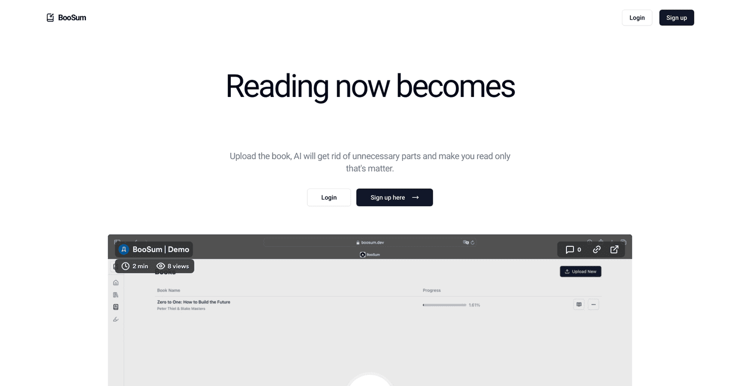
Table of Contents
I’ve fixed a lot of ebook interiors over the years, and the same problems keep popping up—text that just doesn’t sit right, headings that look fine on my computer but fall apart on a Kindle, and paragraphs that turn into a weird block of “rivers” when they’re fully justified. If any of that sounds familiar, good news: most layout issues are predictable, and you can fix them without starting from scratch.
In my workflow (mostly InDesign for print/PDF, and Word/Calibre for EPUB checks), I usually start by asking one question: what exactly is breaking? Is it spacing, alignment, reflow, or navigation? Once you know the culprit, the fixes are pretty straightforward. Below are the interior layout errors I see most often, plus the specific settings I change to get a clean, professional reading experience.
Key Takeaways
- For most ebooks, I recommend left-aligned body text and avoiding full justification unless you’ve tested it on real devices.
- Use widely supported fonts (like Georgia, Times New Roman, Lato, Merriweather) and keep body text around 12–14 pt (then verify on Kindle/Apple Books).
- Chapter and section breaks should be consistent: same heading style, predictable spacing, and clear visual markers (not random line breaks).
- In ebooks, prioritize clickable navigation (TOC + internal links). Headers/footers and page numbers are more important for print/PDF.
- Don’t force a “print mindset” on EPUB. Use flowable layouts and responsive images so content reflows cleanly.
- Set comfortable margins and line length—roughly 0.5–1 inch margins and 50–75 characters per line—and preview on multiple screens.
- Control widows and orphans using your layout tool’s paragraph settings so you don’t get single lines floating awkwardly.
- Use clean front matter and structural pages (title, copyright, TOC, etc.) with consistent styles so readers know where they are.
- Apply consistent styles (and master pages/templates where possible) so headings/body/captions don’t drift across chapters.
- Optimize images: compress them, keep them reasonably sized (often < 1MB for EPUB speed), and ensure they scale without getting blurry.
- Add hyperlinks with descriptive anchor text and routinely test for broken URLs and correct jump targets.
- Always do device testing. A layout that looks perfect in one preview can reflow differently on iOS/Android/Kindle.
- Subtitle and genre formatting should match reader expectations (fiction vs nonfiction). Use the same style system every time.
- Improve readability with spacing, sensible line height (often 1.15–1.5), lists, and selective emphasis—without clutter.
1. Fix Incorrect Text Alignment and Justification
Poor alignment is one of those “you notice it instantly” ebook interior layout errors. In my experience, it usually comes down to one thing: the text alignment and justification settings weren’t applied as a style, so every paragraph ends up slightly different.
What I look for: uneven ragged edges, paragraphs that don’t line up across a chapter, and—on justified text—big gaps between words (the dreaded “rivers”). On Kindle and Apple Books, justification can also reflow in ways you didn’t expect.
My fix (InDesign):
- Open Window > Styles > Paragraph Styles.
- Edit the body paragraph style and check Basic Character Formats doesn’t override alignment.
- For justification: go to Paragraph > Justification (or the paragraph style’s Justification options) and enable hyphenation options.
- In Paragraph > Paragraph Composer, turn it on and choose a composer preset that balances lines (I usually start with a standard “Paragraph Composer” preset, then tweak until gaps stop looking extreme).
My fix (EPUB/CSS): if you’re using CSS, keep it simple for body text. I prefer text-align: left; for EPUB/flowable layouts unless you’ve tested justified output on multiple readers.
Before/after example: I once inherited an EPUB where full justification looked fine in the desktop preview but created huge word gaps on an iPhone. Switching body paragraphs to left alignment (and letting readers reflow naturally) immediately cleaned up the reading experience.
2. Use Readable Fonts and Sizes
Fonts are personal, sure—but readability isn’t. If your text is hard to read, people won’t “try harder.” They’ll tap away.
What works reliably: Georgia, Times New Roman, Lato, Merriweather, and other ebook-friendly fonts that render consistently. I avoid super decorative fonts for body copy because EPUB rendering engines can be unpredictable.
Sizing guidance I actually use:
- Body text: aim for around 12–14 pt in print/PDF layouts.
- EPUB reality check: EPUB readers often let users change font size anyway, so your goal is good defaults plus clean line/paragraph spacing.
One practical tip: don’t just pick a font size—check your line spacing too. If line height is too tight, the page feels cramped even if the font size is technically “readable.”
3. Format Clear Chapter and Section Breaks
Confusing chapter breaks can make a reader feel like they’re lost, even when they’re not. The fix is usually easier than you think: consistent heading styles and consistent spacing.
In print/PDF: I set chapter titles with a style that includes:
- Clear differentiation (bold or larger size).
- Consistent spacing before and after the heading (not random extra blank lines).
- A predictable break mechanism (page break or section break, depending on your layout).
In EPUB: the biggest mistake I see is using plain text “fake headings” instead of real heading structure. Your EPUB should use proper heading semantics (H1 for the book title, H2 for chapters, H3 for sections, etc.). This affects the TOC generation and how readers navigate.
My quick test: in an EPUB reader, tap the TOC and confirm the structure matches your intent. If it doesn’t, your headings weren’t mapped correctly.
4. Add Proper Headers, Footers, and Page Numbers
Headers, footers, and page numbers are one of those “depends on format” areas. For ebooks (flowable EPUB), page numbers can be misleading because page counts change based on device and font settings.
Where they matter:
- Print and PDF: page numbers and consistent headers/footers make the book feel finished.
- EPUB: prioritize clickable TOC + internal links instead of relying on page numbers.
What I recommend doing: if you’re making a print book, set headers/footers using master pages or templates. If you’re making an EPUB, build internal links to chapter IDs (so “Chapter 5” actually jumps to Chapter 5).
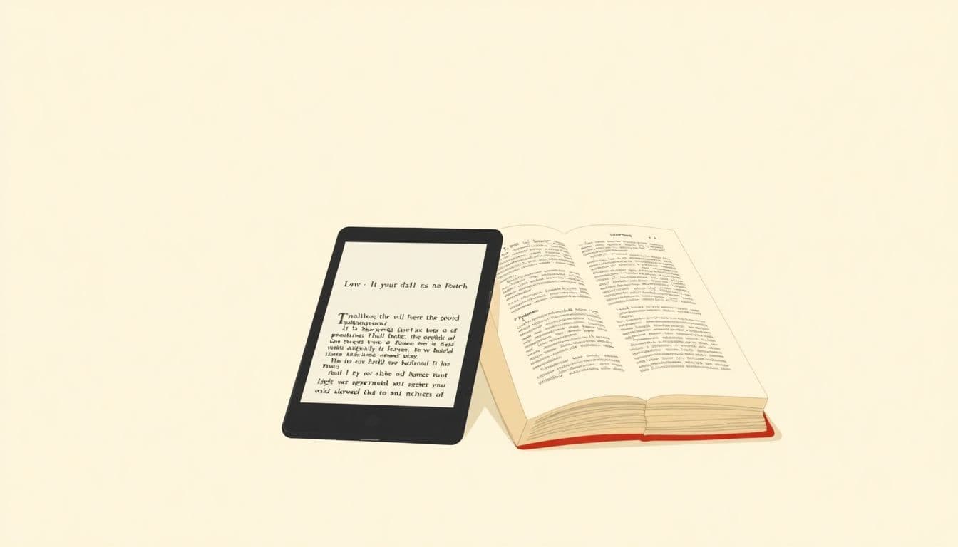
5. Adapt Layouts for eBook vs. Print Formats
Here’s the thing: print layouts are fixed. eBooks aren’t. What looks perfect on a 6x9 page can break when the text reflows on a phone.
Common failure: using fixed layouts (or absolute positioning) in EPUB so text spills, images overlap, or spacing becomes chaotic.
What I do instead: keep EPUB content flowable. Use relative sizing for images and avoid absolute positioning. For styling, rely on CSS that supports reflow rather than pixel-perfect placement.
Quick rule I follow: if you can’t explain how it will behave when the reader increases font size, it’s probably not EPUB-safe.
6. Set Appropriate Margins and Line Lengths
Margins and line length are comfort settings. Get them wrong and the book feels “off” even if everything else is technically correct.
My target ranges:
- Margins: about 0.5–1 inch for many print interiors (then adjust for your trim size and binding).
- Line length: roughly 50–75 characters per line for comfortable reading.
How to implement without guessing: in your layout tool, check your text frame width and measure how many characters fit per line in a sample paragraph. Then test again after you change font size or margins.
7. Prevent Widow and Orphan Lines
Widows and orphans are those annoying single lines that show up at the top or bottom of a paragraph. They don’t just look unpolished—they make the layout feel unstable.
Fix approach:
- In InDesign, use Paragraph > Keep Options (or the paragraph style’s keep settings).
- Turn on widow/orphan control if available.
- If it’s still happening, tweak paragraph spacing (sometimes the “fix” is simply making the paragraph composer work with better spacing).
EPUB note: EPUB rendering can vary, but you can still reduce issues by keeping paragraphs and headings structured properly and avoiding manual line breaks.

8. Include Essential Front and Structural Pages
Most readers won’t complain about your formatting… until they can’t find something. Title page, copyright, and a proper table of contents are the basics for a reason.
What “good” looks like:
- Front matter is formatted consistently (same typography system).
- The TOC entries match the actual content order.
- There’s no clutter—no random extra blank pages, no mis-styled headings, no “mystery” sections.
In my experience, when front matter is messy, readers assume the rest of the book will be messy too. First impressions matter.
9. Apply Consistent Styles and Master Pages
This is the part that saves you time later. Consistent styles are what keep an interior from drifting over 10, 20, or 50 chapters.
Here’s what I set up early:
- One body paragraph style (alignment, spacing, line height).
- One heading style for chapters.
- One heading style for sub-sections.
- Optional styles for captions, pull quotes, and block quotes.
If you’re using a layout tool with master pages/templates, use them. If you’re not, at least use styles instead of manual formatting. Manual formatting is how you end up with “why does Chapter 7 look different?” moments.
10. Optimize Image Placement and Size
Images should support the content, not fight it. The most common image-related interior layout errors I see are oversized images, images that don’t scale properly, and images that are blurry because they were exported at the wrong resolution.
What I do:
- Placement: align images intentionally (usually centered or aligned with the text block) and keep consistent spacing around them.
- Size: compress images and keep them reasonably sized. For many EPUB workflows, keeping images under 1MB helps with loading and file size.
- Scaling: for EPUB, make sure images can resize without breaking the layout.
And yes—always preview. A “looks great” image in desktop view can become a layout wreck on a smaller screen.
11. Implement Effective Hyperlinks and Cross-References
Hyperlinks are where ebooks can feel genuinely interactive. But they only help if they’re accurate and easy to understand.
My checklist:
- Internal TOC links jump to the correct section IDs.
- Inline links use descriptive anchor text (not “click here”).
- External URLs open correctly and aren’t outdated.
Also: test on at least one real device. I’ve seen links work in preview tools but fail in actual reader apps due to ID mismatches or encoding issues.
12. Test Your Layout on Multiple Devices and Formats
This is the step people skip—and it’s the step that catches most layout issues. A perfect desktop preview isn’t proof.
What I test:
- Kindle preview: upload to Amazon KDP preview tools and check reflow, TOC, and image scaling.
- Apple Books: check on iOS/iPadOS if possible (iOS reflow can differ from Kindle).
- Android reader apps: if you can, check one.
Common problems testing reveals: awkward line breaks, headings not appearing in the TOC, images that expand weirdly, and page-break behavior that makes sections start in the middle of paragraphs.
Fixing these early beats dealing with negative reviews later. Trust me—those “it looks broken on my phone” comments add up fast.
13. Use Proper Subtitle and Genre-specific Formatting
Subtitles and genre conventions are real. Readers have expectations, and your interior should match them.
Examples that make a difference:
- Fiction: chapter titles often look best with consistent typography (bold or slightly larger text) and predictable spacing.
- Nonfiction: numbered headings and clear hierarchy help scanning—especially for guides and textbooks.
Also, if you’re referencing platform styling guidelines, follow them. For example, if you’re building covers and typography choices, it helps to review related recommendations like this style guidance so your interior typography matches the overall brand look.
14. Incorporate Readability Enhancements
Readability is where “pretty” turns into “actually enjoyable.” Small tweaks add up fast.
Things I consistently adjust:
- Paragraph spacing: don’t rely on manual blank lines—use spacing in your paragraph style.
- Line spacing: try 1.15 to 1.5 depending on font and style.
- Break up long paragraphs: if a paragraph is a wall of text, readers will skim past it.
- Lists: bullet points and numbered lists make dense information easier to digest.
- Emphasis: use italics/bold sparingly so the page doesn’t feel like it’s shouting.
In short: if someone can scan your page without effort, you’ve done your job.
FAQs
Start by editing your paragraph style (not individual paragraphs). Set alignment consistently (I usually use left for body text) and, if you must justify, enable hyphenation and use your layout tool’s paragraph composer/keep options so you don’t get large spacing gaps.
For most interiors, I stick to simple, widely supported fonts like Georgia or Times New Roman (or ebook-friendly fonts like Lato and Merriweather). For print/PDF, 12–14 pt is a solid default. For EPUB, readers can change font size, so focus on clean spacing and tested defaults rather than chasing one “perfect” point size.
Use consistent heading styles and spacing. In EPUB, make sure chapter titles and sections are marked as real headings (H2/H3 hierarchy) so the TOC and reader navigation work properly. Avoid manual line breaks as “fake” separators.
They help organization and navigation—especially in print/PDF. For ebooks, page numbers can be inconsistent, so clickable TOC and internal links matter more than fixed page references.