Table of Contents
I’ve helped a bunch of people turn rough drafts into ebooks that actually feel good to read. And honestly? The “pretty but unreadable” problem is super common. You end up with cramped paragraphs, weird font choices, and pages that look fine on a desktop… until someone opens them on a phone.
So instead of generic design talk, I’m going to share what I’ve noticed after building and exporting ebooks, then checking them across real viewers. If your ebook feels cluttered or hard to navigate, good news: you can fix a lot of it with a few layout, typography, and compatibility tweaks.
Here’s what I focus on: clear structure first, fonts that don’t fight the screen, visuals that support the message (not just decoration), and an export setup that behaves in EPUB and Kindle-style readers. Ready?
Key Takeaways
- Build a simple reading layout: one clear heading hierarchy, short sections, and scannable lists so mobile readers don’t have to “hunt.”
- Use screen-friendly type: pair a readable sans-serif for body text with a consistent heading style, and keep spacing generous (line-height and paragraph margins matter).
- Use visuals to clarify, not to fill space. Export images at the right size/format so they don’t balloon file size or render blurry.
- Add interactivity carefully. Links work everywhere; embedded video/audio is limited depending on the reader, so test what actually plays.
- Keep styling consistent: a tight color palette, repeatable heading styles, and restrained iconography make the ebook feel polished fast.
- Compatibility isn’t optional. I test EPUB reflow, TOC behavior, and image scaling on iOS (Apple Books), Android readers, and e-readers like Kindle Paperwhite.

1. Focus on Clear Layout and Structure
Good ebook design starts with navigation. If readers can’t quickly tell where they are (and where they can go next), they’ll bail—even if your content is great.
Here’s a structure I like because it works on small screens:
- One main title per section (your H2), then subsections (H3) for the sub-points.
- Short paragraphs. If a paragraph would take more than ~4–6 lines on a phone, break it up.
- Use lists for “steps,” “checklists,” and comparisons. Readers skim. Let them.
- Keep a consistent order: idea → explanation → example → quick recap (if needed).
One practical trick: when I’m testing, I jump through the Table of Contents and see whether the section headings “land” where I expect. If headings are too similar (or too many levels deep), the TOC becomes noise. Make it obvious.
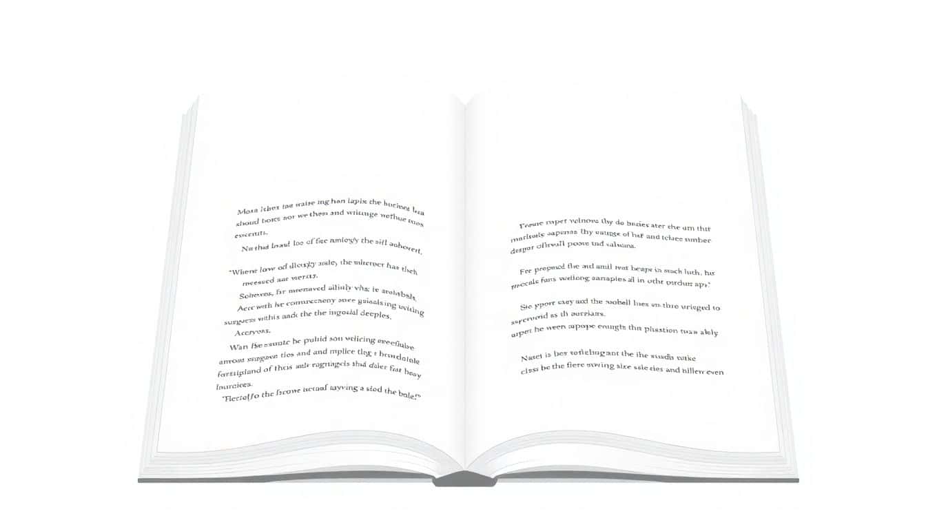
2. Use Readable and Suitable Fonts
Fonts aren’t just aesthetics in ebooks. They directly affect whether someone can read for 10 minutes or 2.
In my experience, these choices are the safest:
- Body text: a clean sans-serif (think Arial/Helvetica-style). I aim for a base size that feels comfortable in reflow readers—commonly 12–14px equivalent.
- Headings: you can use a serif or a slightly heavier sans-serif, but keep it consistent across the whole ebook.
- Avoid overly decorative fonts. If it looks “cool” but you squint, it won’t survive device scaling.
Spacing is where a lot of ebooks quietly fail. If your lines feel cramped, readers get fatigue fast. I typically look for:
- Line-height: around 1.4–1.7 (reflow readers will adjust, but this range usually stays comfortable).
- Paragraph spacing: enough that new ideas feel separated, not welded together.
- Letter spacing: keep it normal. Don’t overdo it for “style.”
What I noticed in testing: some viewers handle font embedding differently. If your EPUB uses custom fonts, always check whether the reader substitutes fonts. That substitution can change line breaks and push headings into awkward wrapping.
3. Incorporate Quality Visuals and Graphics
Visuals should earn their place. When they do, they make complex ideas easier to digest and they break up text in a good way.
Here’s what I recommend for visuals in ebooks:
- Use images that add meaning (diagrams, screenshots, charts, examples), not just “backgrounds.”
- Export for readability: charts and UI screenshots tend to look best when kept crisp (SVG can help in some EPUB workflows, but don’t assume every viewer supports it).
- Keep image sizes realistic. If you drop a 4000px-wide image into an ebook without resizing, it often becomes a file-size problem and can render slower.
About charts: I don’t like filler stats unless they’re actually part of a design point. Instead, I’ve found it better to focus on how the chart is presented for small screens. For example, if you’re showing a growth trend, make the chart readable at a glance: bigger labels, fewer gridlines, and a short caption that explains what the reader should notice.
Quick checklist I use: Can someone read the axis labels on a phone without zooming? If not, the chart needs simplification (not more decoration).

4. Add Interactive Elements for Engagement
Interactivity can be great… as long as you don’t rely on features that won’t work in every reader.
Here’s what I treat as “safe bets”:
- Clickable links to related sections and external sites. These usually work reliably.
- Hyperlinked Table of Contents (internal anchors). This is one of the biggest usability wins.
- Buttons and hotspots inside images can work in some EPUB setups, but I always test because not every viewer handles the same way.
For “bigger” interactivity like embedded videos, audio, or animations: I don’t assume it will play everywhere. In my testing, some EPUB viewers simply don’t support the media type, or they show a broken placeholder.
My rule: if the interactivity fails, the ebook should still make sense. The content can’t depend on the video to explain the idea.
5. Keep the Design Simple and Consistent
If you want your ebook to look professional quickly, simplify it.
What “simple and consistent” looks like in practice:
- White space isn’t optional. It reduces perceived clutter and makes scanning easier.
- Color palette: pick 1 primary accent color and 1 neutral background/text setup. Don’t introduce 6 different colors “just because.”
- Repeat styles: the same heading style should look the same every time (H2s shouldn’t randomly become smaller or bolder halfway through).
- Limit font families: 2 families max is usually enough (body + headings).
Also, don’t underestimate how much background patterns and heavy borders can hurt readability. In ebooks, “pretty” can become “hard to read” faster than you think.
6. Ensure Compatibility Across Devices and Platforms
This is where ebooks either feel premium—or frustrating.
I test across a few common environments so I can catch the usual problems:
- Apple Books (iPhone/iPad) for reflow behavior and font/spacing changes
- Android ebook readers (since rendering can differ)
- Kindle Paperwhite for e-ink readability and image scaling
Here are the compatibility issues I’ve actually run into:
- TOC jumps to the wrong place when heading IDs don’t match or when anchors shift.
- Images overflow or become tiny when the EPUB doesn’t handle reflow/resizing cleanly.
- Fonts substitute if embedding fails, which changes line breaks and can make layouts look “off.”
So what do I recommend?
- Export EPUB as the primary format (reflow is usually better supported).
- Keep your markup clean (simple headings, lists, and paragraphs). Complex CSS can break in unexpected viewers.
- Use alt text for meaningful images. Decorative images should be treated as decorative (so screen readers aren’t forced to read “image, image, image”).
- Check accessibility basics: heading order, link clarity (“Click here” isn’t helpful), and readable color contrast.
One last thing: test after you export. Not before. It’s the export step that usually changes everything.
FAQs
A clear layout helps readers find what they need quickly and keeps the experience smooth. When headings, lists, and sections are organized, people don’t feel lost—and they’re more likely to keep reading.
Pick fonts that are easy to read on screens and stick to a simple pairing. I usually recommend a clean sans-serif for body text and a consistent heading style. Then set comfortable spacing so the text doesn’t feel cramped on phones.
Good visuals explain ideas faster than text alone. They also reduce fatigue by breaking up long sections. If your chart or diagram is readable on a small screen, it’s doing its job.
Interactivity can make the ebook feel more “alive” by helping readers navigate and engage. Links and internal TOC navigation are especially useful, while more advanced media should be tested because support varies by reader.