Table of Contents
Quick question: when someone lands on your homepage, do you give them a reason to stay within about 3–5 seconds? Most people don’t read everything—they scan. So your copy has to do the heavy lifting fast. If you get it right, you can turn random browsers into subscribers, clients, or fans. And yes, the bar is higher in 2026.
⚡ TL;DR – Key Takeaways
- •Write a benefit-focused hero headline that’s obvious on mobile—people should “get it” in ~3 seconds.
- •Make your homepage skimmable: short paragraphs, bold section headers, and bullets. It’s not just nicer—it performs better.
- •Add social proof (testimonials, results, logos, case snippets). It reduces doubt fast and helps conversions.
- •Skip vague CTAs. Use specific next steps (“Get the checklist,” “Book a 15-min call,” “Watch the demo”).
- •For SEO in 2026, think E-E-A-T + helpful answers: FAQs, clear authorship signals, and content updates.
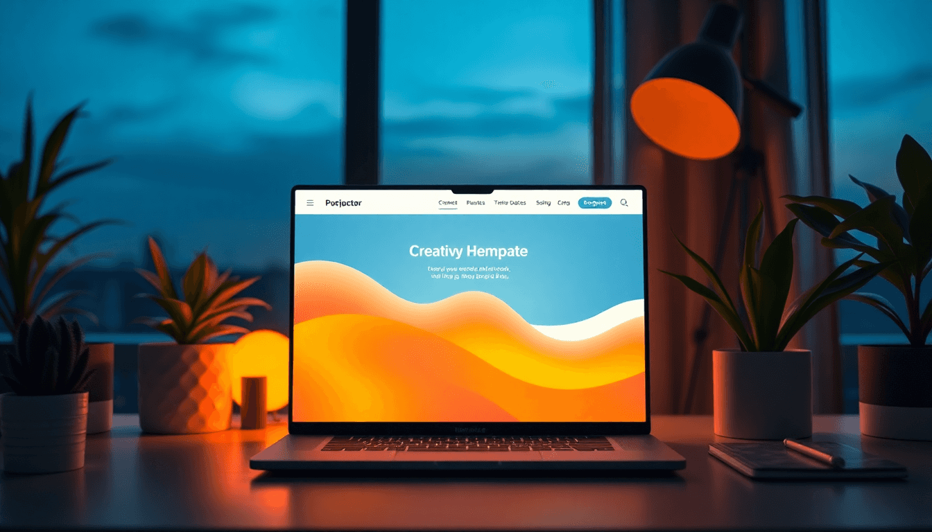
What Your Creator Homepage Is Really For
In practice, your homepage is your best chance to answer three things instantly: Who are you? What do you help with? and What should I do next? In 2026/2026, it’s not just a digital business card anymore—it’s a conversion page disguised as a “welcome” page.
Start with your UVP (unique value proposition). Not “I’m a creator who loves content.” More like: “I help [specific people] get [specific outcome] using [your method].” If your UVP can’t fit on a single line of the hero section, it’s probably too broad.
Then align your page with what people actually search for. If someone lands from Google or a social link, they usually have an intent: they want an answer, proof, or a way to hire you. That’s why FAQs and “quick answers” matter. They help you meet visitors where they are instead of making them hunt.
One more thing I always remind creators: mobile-first isn’t optional. A big chunk of traffic is mobile, and if your hero text, buttons, or spacing don’t work there, you’ll lose people before they ever scroll.
Tools help, but use them in a concrete way. If you’re using SEMrush (or anything similar), don’t just grab a keyword list and hope. Look at:
- Top organic keywords for your site (what you already rank for)
- Keyword intent (informational vs. comparison vs. “hire me”)
- Questions people ask (these become FAQ headings)
- Competitor pages that rank (copy structure + content depth, not copy/paste)
When your homepage matches real intent, it feels effortless to the visitor. And when it feels effortless, they’re more likely to click your portfolio, sign up, or book a call.

Headlines That Actually Earn Attention
Use Action + Specific Benefit (Not “About Me” Energy)
Your hero headline is doing the first job: grabbing attention and making the value obvious. Generic headlines like “Welcome” or “About Me” might feel warm, but they don’t help anyone decide whether to stay.
Instead, start with an action verb and a clear payoff. Examples (and I mean examples you can steal):
- “Book More Brand Deals in 30 Days (Without Burning Out)”
- “Turn Your Content Into Leads: A Simple Creator System”
- “Get Edit-Ready Shorts in 2 Hours a Week”
- “Build a Portfolio That Gets Paid Work—Fast”
Ask yourself: if someone read only your headline and your CTA, would they know what you do?
Then test. Headlines aren’t “set it and forget it.” Change one variable at a time: the promise, the audience, or the mechanism. Even small swaps can shift click-through rates.
Try AIDA or Micro-AIDA (But Keep It Creator-Specific)
AIDA (Attention, Interest, Desire, Action) works because it mirrors how people decide. You don’t need to write a novel—just hit the beats.
A simple homepage flow using AIDA:
- Attention: headline with a specific outcome
- Interest: subheadline with your method or niche
- Desire: proof (testimonial, mini case, results snippet)
- Action: one primary CTA (plus maybe one secondary)
Micro-AIDA is even cleaner for creators because it forces focus. Use:
- Short headline
- One-line subheadline
- One primary CTA
Example setup:
- Headline: “Struggling to grow your creator audience?”
- Subheadline: “I’ll help you turn posts into consistent sign-ups using content + landing pages.”
- CTA: “Get the free 7-day growth plan”
That’s the difference: clarity beats cleverness every time.
Layout and Design Choices That Make Your Copy Easier to Read
White Space, Big Type, and a Layout People Can Scan
If your homepage looks like a wall of text, your copy won’t matter. White space isn’t “aesthetic”—it’s usability. It helps visitors separate ideas and it makes your hero message stand out.
I like to keep these rules of thumb:
- Hero text should be readable on a phone without zooming
- Buttons should look clickable and be spaced enough for thumbs
- Sections should have clear headings (people skim by headings)
- Navigation should be simple (don’t make them guess)
If you want a deeper look at creator-focused pages, you can check out creators.
Also: test your homepage on real devices. Not just your laptop. If your headline wraps awkwardly or your CTA disappears below the fold, your bounce rate will tell the story.
Use Visuals Like Proof, Not Decorations
Visuals should reinforce what your copy claims. A portfolio screenshot should look like “proof of work,” not a random stock image. A video intro should explain your niche quickly—no rambling.
Here are visuals that usually work well for creator homepages:
- Short intro video (10–45 seconds) that says who you help and what results you deliver
- Portfolio grid with 6–12 items (and captions that say what the viewer gets)
- Before/after or “process” screenshots (how you work)
- Mini case studies (problem → approach → outcome)
If you’re creating a lot of media and you want consistency, tools like Automateed can help you keep output steady. The key is still the same: don’t let the media distract from your message—use it to support your UVP.
And yes, media can improve trust. A video intro often helps people feel like they “know” you faster, which can translate into more sign-ups or inquiries. Just don’t assume it will magically fix weak positioning—your headline and CTA still need to be strong.
Write Content People Can Understand in One Pass
Short Paragraphs + Bullets That Answer Real Questions
Most visitors skim. So structure matters. I aim for paragraphs that are easy to read on mobile—think 1–3 short lines. Then I use bullets to make benefits obvious.
What should you bullet?
- Your services (with outcomes, not just tasks)
- What someone gets when they hire you or sign up
- Common deliverables (templates, checklists, edits, walkthroughs)
- Who it’s for / who it’s not for
For example, instead of:
“I offer content strategy and editing.”
Try:
“You’ll get a weekly content plan + hooks that match your audience + edits that keep your style consistent.”
If you want a quick way to see how clarity changes performance, compare your current page to a “rewrite for skimmers” version. Keep the same sections, but rewrite the hero, rewrite service bullets, and shorten paragraphs. Then measure:
- CTA click-through rate
- Scroll depth to key sections
- Form starts and completed submissions
Empathize: Call Out Objections Without Being Negative
Good homepage copy anticipates objections. Not with fear tactics—just with clarity.
Common creator objections sound like:
- “Will this actually work for my niche?”
- “Do you have examples like what I need?”
- “How long will this take?”
- “What’s included, exactly?”
- “Is this worth the cost?”
So write answers right where people decide. Use plain language. Avoid insider terms unless you immediately explain them.
If you want a related resource about creator safety and tools, see youtube unveils revolutionary.
And don’t forget social proof. Testimonials and case snippets aren’t “nice to have.” They’re a shortcut for trust.

CTAs That Don’t Feel Like a Random Button
Make CTAs Specific, Benefit-Driven, and Easy to Act On
A CTA should tell people exactly what happens next. “Learn more” is fine, but it’s also vague. What are they learning? How long will it take? Will it help them?
Better CTA patterns for creators:
- Resource: “Get the free creator homepage checklist”
- Demo: “Watch the 3-minute walkthrough”
- Consult: “Book a 15-min fit call”
- Case proof: “See 3 examples like yours”
If you want a concrete lead magnet idea that fits homepage copy, use something like:
- Lead magnet: “Creator Homepage Copy Checklist (2026)”
- For: creators who want more sign-ups, inquiries, or bookings
- What they get: a one-page checklist + 5 rewritten hero headline examples + a CTA template
- Expected outcome: visitors know what to do next, and your page becomes easier to scan
Then build 3–5 CTA variants by funnel stage:
- Cold: “Get the free 2026 homepage checklist”
- Warm: “See examples of creator homepages that convert”
- Hot: “Book your 15-min fit call”
- Proof-focused: “Read a quick case study”
- Low-friction: “Watch the walkthrough (3 minutes)”
Guide Visitors From Awareness to Conversion (Without Confusing Them)
Most homepage journeys are simple:
- They land on your hero
- They scan proof + services
- They click the next step
So don’t throw five CTAs that all point to different things. Pick one primary conversion goal (newsletter, lead form, booking, or shop purchase), then support it.
A good CTA flow looks like:
- Hero CTA: lead magnet or “see how it works”
- Mid-page CTA: “view portfolio/case studies”
- End CTA: “book / sign up” with a short reminder of what they’ll get
And keep messaging consistent. If your hero says “content that turns into leads,” your CTA shouldn’t suddenly become “contact us for general info.” That mismatch kills momentum.
SEO for Creator Homepages in 2026 (Without Writing for Robots)
Use AI-Helpful SEO the Practical Way: Intent + FAQs + Clear Structure
SEO isn’t just about stuffing keywords. For a homepage, the biggest wins usually come from matching intent and making your page easy to interpret.
Here’s what I’d implement:
- Natural keyword placement: include your main keyword in the hero headline or subheadline, and again in a relevant section heading
- FAQ section: write 4–8 FAQs that mirror real questions your audience asks
- Zero-click optimization: answer key questions in 40–60 word blocks right under the FAQ heading
- Internal links: link to your portfolio pages, pricing page, and a few “how-to” posts
If you’re looking for related creator SEO resources, you can also reference author resource directories.
For topical authority, link out to relevant, helpful pages on your own site (and use external links sparingly when they genuinely add value). For example, you could reference:
- Creators AI Review – Your Guide to Automated Influencer Outreach
- Author Resource Directories: Top Listings for Writers and Creators
Also—update matters. If your homepage is “set and forget,” it can quietly lose relevance. Add new proof (new projects, new testimonials), refresh your FAQs, and tweak your hero based on what’s actually converting.
E-E-A-T Signals: Make Credibility Visible
E-E-A-T isn’t a magic badge you can sprinkle on top. It’s about showing evidence. On a creator homepage, that usually means:
- Experience: “how you got results” and what you’ve done
- Expertise: clear niche focus and useful content
- Author signals: a real author bio, real credentials, links to work
- Trust: testimonials, case snippets, clear contact/booking info
Practical tip: if you have testimonials, include a bit of context. “Great work” is fine, but “Great work for [niche]—we saw [measurable outcome] in [timeframe]” is better.
And yes, update your homepage content. Even a quarterly refresh—new portfolio items, updated FAQs, new proof—can keep your page aligned with what people are searching for.
Homepage Mistakes That Quietly Hurt Conversions
Vague Headlines and Generic CTAs
If your headline could apply to anyone, it’s not doing its job. “Welcome” and “About Me” don’t tell visitors what you do or why they should care.
Same with CTAs. “Submit” and “Click here” don’t tell people what they’re submitting or clicking into. Upgrade them with specificity:
- “Get the free checklist”
- “Book a 15-min call”
- “Watch the demo”
- “See client results”
Too Much Jargon (and Not Enough Plain Answers)
Creators love “industry language.” I get it. But your homepage isn’t for other creators—it’s for your audience. If someone can’t understand your first pass, they’ll bounce.
Here’s a quick test: can a non-expert read your homepage and explain what you do in their own words? If not, rewrite.
Ignoring Mobile Optimization
If your homepage doesn’t work smoothly on a phone, everything else is secondary. Make sure:
- fonts are large enough
- buttons are easy to tap
- images aren’t huge and slow
- your hero content doesn’t get cut off
- your navigation doesn’t feel cramped
If you want another creator-focused resource, see cliptics.

A Simple 2026 Homepage Recap (Do This, Then Measure)
If you want a no-fluff checklist, here’s what I’d do before calling your homepage “done”:
- Rewrite the hero: UVP + specific outcome + one primary CTA
- Add 4–8 FAQs with short direct answers (aim for skimmable blocks)
- Upgrade proof: testimonials/case snippets that include context
- Make services scannable: short bullets with outcomes, not just tasks
- Fix mobile: test on a real phone and tighten spacing
- Link internally: portfolio, pricing, and 2–4 helpful posts
Then track what matters: CTA clicks, form starts/completions, and scroll depth to your proof section. That’s how you’ll know your copy is actually working—not just looking good.
Frequently Asked Questions
How do I write an effective homepage for my creative portfolio?
Start with a UVP-based headline that answers “What do you help people achieve?” Then add visuals that prove you can deliver (portfolio items with short captions). Finish with a CTA that matches the next step: sign up, book a call, or view relevant work.
What are the key elements of homepage copy for creators?
You’ll generally want: a clear headline + subheadline, benefit-focused content, scannable service sections, visuals/portfolio proof, social proof, simple navigation, and specific CTAs that point to one primary conversion goal.
How can I make my homepage more engaging?
Write for skimmers: short paragraphs, bullet points, and clear section headers. Add a short intro video or portfolio preview, and make sure your FAQs answer the questions people actually have. Keep your page fast and mobile-friendly so engagement doesn’t die on load time.
What are common mistakes in homepage copywriting?
Most problems come from vague headlines, generic CTAs, jargon-heavy explanations, and mobile layouts that don’t read well on phones. If visitors can’t quickly understand your value, your conversions will suffer.
How important is SEO for my creator website?
SEO matters because it brings in targeted visitors who are already looking for what you offer. Use intent-based keywords in key sections, write FAQs that match real questions, and keep your homepage updated with new proof and relevant links so it stays useful over time.