Table of Contents
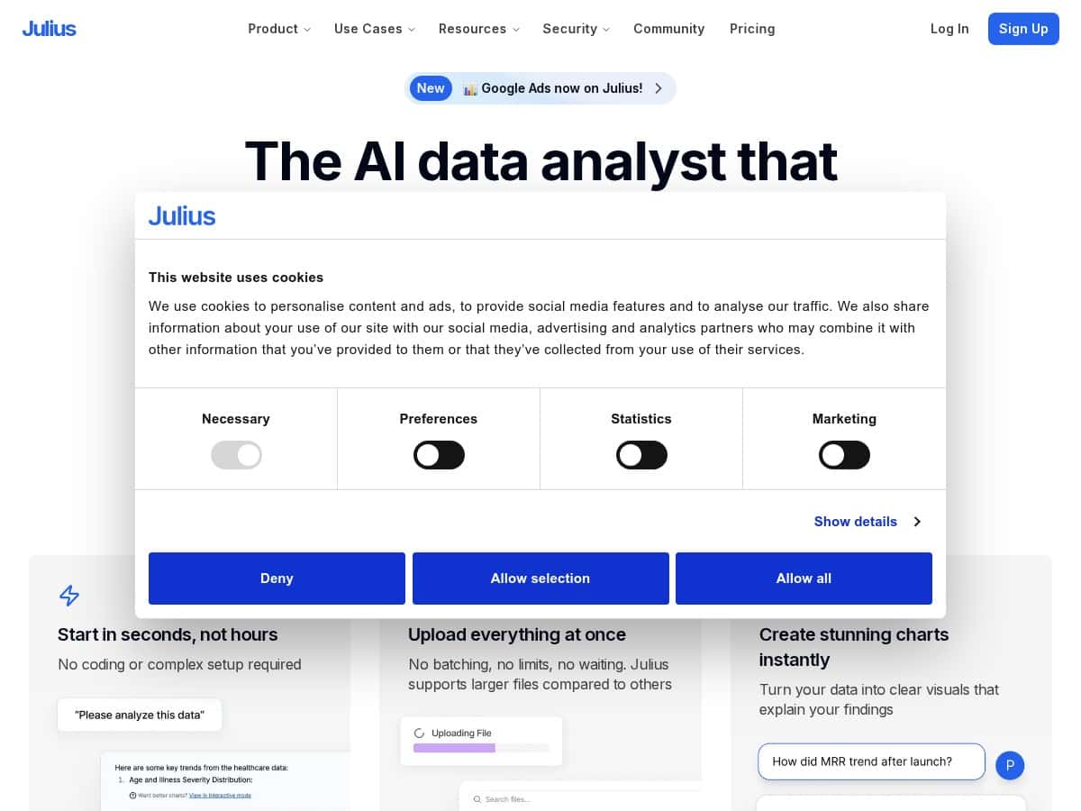
I’ve been testing Julius AI for a few days, mainly to see if it really can replace the usual “clean the data, write the query, make the chart, repeat” loop. What I liked right away is that it doesn’t feel like a spreadsheet clone or a coding IDE. It’s more like: upload your file, ask in plain English, and let it generate the analysis and visuals.

Julius Review
For my test, I used a couple of real-world-ish datasets I already had lying around: one was a small sales-style CSV (around a few thousand rows) with columns like date, region, product, and revenue. The other was a messy export that included a few inconsistent values (some dates in different formats, and a couple numeric fields stored as text). I wanted to see two things: (1) how well it handles imperfect data, and (2) whether the “ask in English” outputs are actually useful or just pretty charts.
Upload + setup: Julius handled CSV and Excel without any drama. I didn’t have to predefine a schema or manually map columns. When I uploaded the file, it recognized the columns and gave me a straightforward starting point for questions.
Natural language questions: This is where it either wins or loses. I started with a simple prompt: “Show total revenue by month and highlight the month with the biggest increase.” The first chart it generated was a monthly revenue line chart, and it also identified the biggest jump month in the accompanying report. That part worked well enough that I didn’t feel like I had to babysit the analysis.
Then I tested something slightly more specific: “Break revenue down by region for the last 3 months. Also tell me which region is underperforming versus the overall average.” The output included a table (region vs revenue) and a short explanation tying it back to an average comparison. In my experience, the explanation wasn’t just generic—it actually referenced the numbers from the table.
Data cleaning: On the messy dataset, I asked: “Clean the date column and convert revenue to numeric. Then compute revenue by product.” What I noticed: it didn’t just fail fast when the date formats were inconsistent. It attempted to standardize them and proceed. I still double-checked the results (I always do), and a couple rows ended up being excluded or treated oddly—so it’s not magic—but it was good at getting me to a usable first pass without me writing cleaning code.
Switching to code when needed: One of the biggest reasons I kept using Julius is that it doesn’t trap you in “no-code only.” When I asked for a more complex slice—“Write the Python to calculate rolling 7-day revenue and plot it”—it offered a code-based path. I didn’t have to rebuild everything from scratch. I could compare what it produced against what I’d normally write, and it saved time.
Speed: The turnaround was fast in the sessions I ran. I’m talking seconds for charts and summaries, not minutes. If you’re used to waiting on BI dashboards or manually wrangling data, that speed is genuinely noticeable.
Limitations I ran into: The main constraint wasn’t accuracy—it was how much you can do before hitting message limits (more on that in the pricing section). Also, for very niche questions, it sometimes needs a bit more context. If your prompt is vague (“analyze trends”), you’ll get something, but if you specify metrics (“growth rate,” “top 10,” “variance by cohort”), the results get sharper.
Key Features (and how they showed up in my testing)
- Natural language analysis (plain English): I asked Julius for “revenue by month” and “biggest increase,” and it returned a chart plus a written explanation that matched the chart. The best prompts were the ones with a clear metric and timeframe.
- Multiple data formats: In my tests, Julius accepted Excel, CSV, and PDF inputs. PDFs were more “extract and summarize” than “perfectly structured analytics,” but it still helped when the data was locked in a document.
- Instant visuals: It generated charts and tables quickly—especially for standard breakdowns like by month, region, or product. If you want a quick sanity check, this is where it shines.
- Reproducible workflows: I liked that I could save what I did and rerun variations without starting over from scratch. That matters when you’re iterating on questions (top regions, different date ranges, alternate metrics).
- Code support (Python, R, SQL): When I needed something more precise, I could switch to code-based output. That’s a big deal if you’re working with analysts who want SQL/Python artifacts, not just charts.
- Collaboration: The workspace tools make it easier to share outputs with teammates. I didn’t run a full multi-user project, but the workflow felt designed for team review instead of “solo notebook only.”
- Automated cleaning + pattern detection: On imperfect data, Julius attempted to clean and continue. It wasn’t flawless, but it reduced the amount of manual fixing I had to do before analysis.
- Advanced reasoning with AI + insights: When I asked “what stands out” questions, it produced interpretations that were tied back to the data it used. Just remember: “insight” is only as good as the prompt and the quality of the underlying dataset.
Pros and Cons (what I’d actually watch for)
Pros
- No-code friendly: I could get charts and summaries without writing a single query.
- Fast results: In my sessions, visuals and reports came back quickly enough that I stayed in a “try, adjust, try again” loop.
- Good for iteration: Changing the timeframe or grouping (month vs region vs product) didn’t require starting over.
- Code option when you need it: If you want SQL/Python outputs, Julius doesn’t block you.
Cons
- Advanced tasks can still require context: For complex analysis, you’ll likely need to be more specific in your prompt (metrics, filters, definitions). Otherwise, the output can feel generic.
- Message limits matter: This isn’t a “forever sandbox.” If you’re doing lots of back-and-forth exploration, you can burn through messages faster than you expect.
- Pricing transparency for enterprise: Enterprise details aren’t something you can fully self-serve. In practice, you’ll need to talk to sales for the full picture.
Pricing Plans (what you get in practice)
Julius AI uses a tiered plan with message-based limits, which is important because your “analysis depth” depends on how many prompts you can run.
- Free plan: 15 messages monthly with basic features. In my experience, this is enough to test a workflow (upload → ask a couple questions → get a few charts), but it won’t cover an extended exploratory session.
- Plus: $20/month (or $16/year) with 250 messages. This is where I’d expect most solo users to feel comfortable doing multiple iterations—like comparing time ranges, changing groupings, and re-asking with tighter prompts.
- Pro: $45/month (or $37/year) with unlimited messages, team features, and larger RAM. The “unlimited” part is a big practical difference if you’re working with heavier datasets or you want to iterate without constantly thinking about the counter.
- Enterprise: Custom negotiation for org-level needs and dedicated support. If you’re looking for strict controls, admin setup, or custom limits, expect this to be a sales conversation.
Quick reality check: When I was testing, the bottleneck wasn’t “can it do the analysis?”—it was “how many prompt iterations do I have left this month?” If you’re the type who asks 10 follow-ups to refine a result, message limits are something you’ll feel.
Mini case studies from my test
Case study #1: Sales trend breakdown (CSV, a few thousand rows)
Prompt I used: “Show total revenue by month. Then identify the month with the biggest increase compared to the previous month.”
What I got: A monthly line chart plus a written note explaining the biggest jump. The chart and explanation matched, which is exactly what I want for a quick business review.
Case study #2: “Messy data” cleanup (inconsistent date + numeric-as-text)
Prompt I used: “Clean the date column and convert revenue to numeric. Then compute revenue by product.”
What I got: A product revenue breakdown after standardizing dates. A small number of rows didn’t behave perfectly (a reminder that automated cleaning can’t be 100% without supervision), but it still got me to an actionable output faster than doing everything manually.
Case study #3: More advanced logic (rolling metric request)
Prompt I used: “Calculate rolling 7-day revenue and plot it. Also summarize the trend direction.”
What I got: A rolling metric output and chart, plus an explanation of the trend. This is where the option to generate code (Python/R/SQL) is useful, because you can reuse the logic later.
Wrap up
Julius is one of those tools that feels genuinely built for speed: upload data, ask in plain English, and get visuals quickly. In my testing, it handled common analytics questions well, and the option to switch into Python/R/SQL is a big plus if you want more control. The main things to watch are message limits (especially on the free tier) and the fact that unclear prompts or messy inputs can still lead to imperfect results. If you want faster iterations without building everything from scratch, Julius is worth your time.