Table of Contents
If you’re new to large print publishing, I get why it feels a little overwhelming. The “right” settings aren’t always obvious, and one small layout decision (like justification or tight leading) can make a book harder to read fast. What helped me was turning the whole process into a checklist I could actually follow—standards first, then formatting, then layout, then accessibility checks, and finally distributor/retailer requirements.
In my own workflow, I also learned the hard way that you can do everything “by feel” and still get rejected because a file doesn’t match a vendor spec. So below, I’m sharing the same standards I now use before I ever send a proof to print or upload a digital file—plus the specific things I verify each time.
Key Takeaways
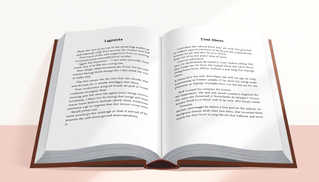
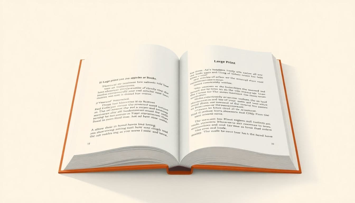
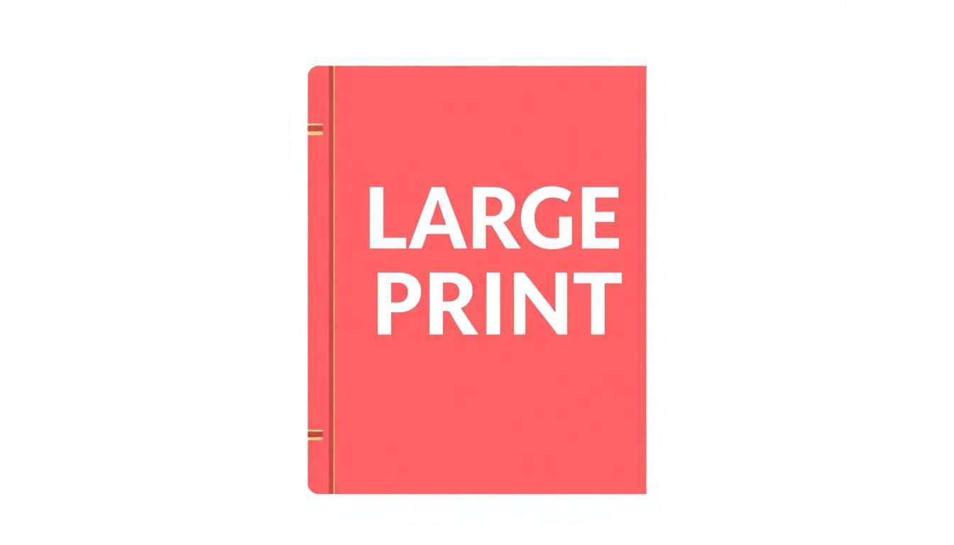
- Font size: I aim for at least 18 pt (often 20–22 pt for comfort), using clean sans-serif fonts like Arial/Helvetica. I avoid decorative/script fonts because they’re harder to track line-to-line.
- Line spacing + leading: I set 1.5x line spacing for most books, and I’ll go to double for dense text. I also control line length so lines aren’t ridiculously long.
- Line length matters: keep text to roughly 35–50 characters per line (including spaces). If your lines run long, readability drops even with a big font.
- Contrast + color rules: black text on white is the safest. If you use color, I verify contrast visually and avoid light gray on white. (If you can, test contrast—don’t guess.)
- Headers for scanning: headings should be bold and noticeably larger than body text. I use left alignment and consistent paragraph spacing so readers can “find their place” quickly.
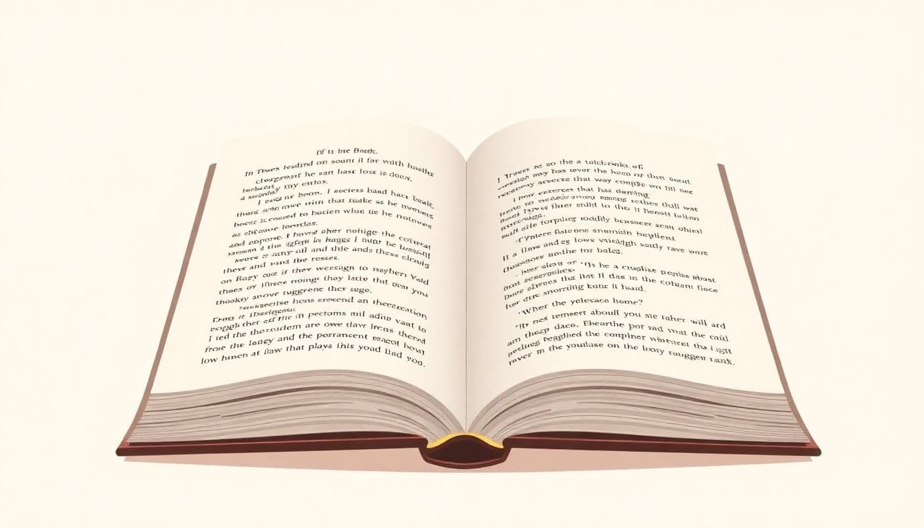
- Layout with breathing room: I design with generous margins and plenty of white space. For trim size, 6 x 9 inches or larger is a common starting point.
- Consistency prevents confusion: same font styles, same heading hierarchy, same spacing rules everywhere. Page numbers and running headers help readers relocate sections fast.
- Accessible digital files aren’t optional: for EPUB/PDF, I make sure headings are real headings (not just styled text), reading order is correct, and images have alt text.
- Tools affect accessibility: Word/InDesign/Vellum-style workflows can work well, but only if you export properly (tagged PDF, accessible EPUB). I don’t skip export settings.
- Beta testing with real readers: I include at least 2–5 visually impaired beta readers when possible, and I track the top issues they report (spacing, hyphenation, header navigation, etc.).
- Distributor/retailer specs can block sales: before finalizing, I check trim size, file format, labeling, bleed (if needed), and “Large Print” designation rules from each vendor.
- Standards stay current: I review BISG and APH-related guidance on a schedule (at least quarterly) and update my templates when specs change.
1. Set Clear Large Print Publishing Standards
Start with the “rules” you’ll repeat across the whole book. If you only decide formatting as you go, you’ll end up with chapters that look slightly different—and that’s where readers get annoyed fast.
Here’s what I set as defaults before I touch any chapter content:
- Minimum font size: I use 18 pt as the floor. For many titles, I’ll bump to 20–22 pt after reviewing test pages with real readers.
- Font choice: stick to clean sans-serif fonts like Arial or Helvetica. Avoid decorative/script fonts, and be careful with overly condensed faces.
- Line spacing: default to 1.5. If the book feels dense (short paragraphs, lots of dialogue, or technical text), I’ll use double.
- Line length: don’t let lines stretch too wide. I aim for about 35–50 characters per line. (Long lines make it harder to track where the next line starts.)
- Margins: give the text room. Wide margins make the page feel less crowded and reduce visual fatigue.
One test I do every time: I print (or export) a single page layout and measure the text block with a ruler overlay. If the lines feel like they’re “racing across the page,” I tighten the text frame or adjust margins.
2. Use Proper Formatting for Accessibility
Large print isn’t just “bigger letters.” The formatting has to help readers navigate—especially if they’re using screen readers or relying on consistent visual cues.
In my experience, these formatting choices make the biggest difference:
- Headings: use real heading styles (not just bold text). Headings should be bold and a bit larger than body text, so the eye can scan quickly.
- Alignment: I avoid justified text. I use left alignment because spacing stays consistent from line to line.
- Contrast: black text on white is the easiest to read. If you’re using off-black or color text, test it—don’t guess.
- Paragraph structure: consistent spacing between paragraphs, clear indents where needed, and short paragraphs for complex ideas.
- Lists and numbering: use true lists for steps and bullet points. It’s easier to scan and easier to convert for digital accessibility.
For digital formats, I also make sure the file structure supports accessibility features—especially tagged PDFs and accessible EPUBs. That usually means checking heading hierarchy and reading order before exporting.
3. Choose Suitable Page Layout and Design
When I’m designing large print interiors, I think in terms of “comfort” more than “fit.” Yes, you can cram text onto a page. But should you? Not really.
What I look for in the layout:
- Whitespace: enough white space that the page doesn’t feel busy. Dense pages increase fatigue.
- Trim size: 6 x 9 inches is a common choice. If you’re going larger, you can often keep line length in that 35–50 character range without shrinking fonts.
- Visual hierarchy: the reader’s eye should move from heading to paragraph without effort. Keep headings distinct and predictable.
- Decorations: minimal and functional. If an element doesn’t help comprehension, it’s probably not worth the distraction.
If you’re unsure about design, make a “test spread” (one chapter page and one list-heavy page). I’ve found that a single realistic sample tells you more than ten minutes of tweaking settings blindly.
4. Maintain Consistent and Accurate Content
Consistency is where accessibility turns from “nice idea” into “reliable experience.” In large print, small inconsistencies can feel bigger because the font size amplifies layout mistakes.
Here’s what I lock down:
- Use the same font styles and heading styles everywhere.
- Keep spacing rules consistent (before/after paragraph spacing, list spacing, and indents).
- Make sure page numbers and running headers are correct—readers often jump around using those anchors.
Accuracy matters too. In educational or instructional content, a single wrong number or mis-ordered step can confuse readers who are already working harder to process the page.
One practical habit: I do a “spot-check pass” on 3–5 random pages per chapter before final export. It’s faster than checking everything at once, and it catches most formatting drift.
5. Meet Distribution and Retailer Requirements
This is the part people skip—then they’re shocked when a distributor rejects the file or the book listing doesn’t match what they expected.
Before you publish, I recommend you pull the spec sheet for each distributor/retailer you plan to use. Specs vary, but common requirements include:
- Trim size ranges (and sometimes preferred sizes for large print programs)
- Format (often PDF for print production, and EPUB for digital versions)
- File specs (resolution, fonts embedded, margins/bleed rules if applicable)
- Labeling requirements (how “Large Print” is displayed/declared)
If you can’t find exact specs for a retailer, don’t assume. Make a quick checklist you can send to support (or use in your own notes): “What trim size do you accept? What file format and export settings do you require? Do you require tagged PDFs or specific EPUB validation?”
6. Follow Accessibility Best Practices
Accessibility is bigger than font size. It’s about how people move through the content—visually and digitally.
Here’s what I check:
- Descriptive headings: each section heading should actually describe what’s inside. Don’t rely on vague headings like “Chapter 3.”
- Alt text for images: if the image conveys information (charts, diagrams, key scene context), add meaningful alt text. If it’s decorative, you can keep it minimal.
- Tagged PDFs / accessible EPUBs: verify tagging, heading structure, and reading order. If the order is wrong, screen reader users will hear content out of sequence.
- Testing method: I test with a screen reader and also do a quick “ruler check” for spacing and line breaks. Not perfect, but it catches obvious layout problems.
- Avoid reliance on color alone: if you use emphasis, don’t use color as the only indicator. Underline, symbols, or bold can help.
One small thing that surprised me: hyphenation. If your software hyphenates weirdly, it can break word recognition. I now review hyphenation rules and look for awkward breaks in the middle of key terms.
7. Select Tools and Software That Support Large Print Formatting
Tools matter because they determine how consistently your styles and exports behave. I’ve used Word/InDesign-style workflows and learned that “export” is where accessibility often breaks.
Common options people use:
- Microsoft Word: good for straightforward layouts and accessible exports when you use heading styles properly.
- Adobe InDesign: strong for print layout control, especially if you build consistent paragraph/character styles.
- Vellum: popular for ebooks and can produce clean digital output when you configure styles and metadata correctly.
- Scrivener: helpful for drafting and organizing, but you’ll still need a solid formatting/export step for accessibility.
- Canva: useful for cover design and simple layout work, but I’m careful about how it handles the interior if you need structured digital accessibility.
Whatever you choose, confirm that your workflow supports tagged PDFs and accessible EPUBs. Also, don’t ignore plugins/add-ons—some teams use them to improve tagging or export consistency.
Some publishers find that using specialized accessibility plugins or add-ons enhances their workflow further. Learn more about accessible publishing tools.
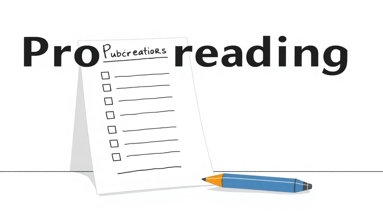
8. Check Your Large Print Book Before Publishing
This is where I stop “hoping it’s fine” and start validating. If your book is going to be read by people who need support, you owe them a careful final pass.
My pre-publish checklist looks like this:
- Print proof: print at least a few sample pages (not just the cover). Check font size, margins, and line length. Look for crowding and awkward line breaks.
- Digital accessibility checks: confirm heading structure, reading order, and that images have alt text (when applicable).
- Beta readers: I try to include 2–5 visually impaired beta readers when budget allows. I ask targeted questions like “Where did you lose your place?” and “Were any words hard to recognize because of hyphenation or spacing?”
- Error sweep: scan for typos, broken formatting, inconsistent styles, and any pages where spacing changed unexpectedly.
Small layout problems can have outsized impact at large font sizes. That’s why I treat proofreading as a workflow step, not a last-minute chore. Check out expert tips for final proofreading.
9. Keep Updated on Industry Guidelines and Standards
Publishing standards evolve, and distributors update their requirements too. If you only check specs once, you’ll eventually get surprised.
I keep a simple maintenance cadence:
- Quarterly: review guidance from organizations like the American Printing House for the Blind and Book Industry Standards and Communications (BISG).
- Per retailer/distributor: confirm their current spec sheet before each upload or print run.
- After template changes: rerun accessibility checks on a sample chapter to ensure export settings didn’t drift.
It’s also smart to watch for updates in EPUB/PDF accessibility practices and any changes to how validators expect tagged content. The goal isn’t to chase trends—it’s to avoid preventable issues that block accessibility.
The more consistent your process, the easier it is to produce large print books that actually serve readers and meet typical industry expectations. If you want to expand into other formats, learn how to publish a coloring book and explore other niche options too.
FAQs
In practice, key standards come down to readability: a minimum font size (often 18 pt or higher), strong contrast between text and background, and generous spacing (line spacing and margins). Beyond that, consistent layout and clear headings make the biggest difference in real-world reading.
Proper formatting helps readers navigate. That means using real heading styles, left alignment (instead of justified text), short readable paragraphs, consistent spacing, and true lists for steps and bullet points. For digital versions, it also means correct tagging, reading order, and alt text where needed.
Design for comfort: ample margins, enough whitespace to avoid visual fatigue, and a simple layout with a clear hierarchy. I also pay attention to line length (roughly 35–50 characters per line) because long lines can hurt readability even when the font is large.
Industry guidelines set expectations for minimum readability standards and consistent formatting. They help publishers produce large print editions that are easier to read, easier to navigate, and more likely to meet distributor/retailer requirements—especially for digital accessibility.