Table of Contents
If you’ve ever tried to make a book cover mockup look “real,” you already know the problem: the cover can look perfect by itself, but once you drop it into a template, it suddenly looks flat, blurry, or like it doesn’t belong in the scene. I’ve been there. The good news? You don’t need to be a graphic designer to get convincing results—you just need the right mockup files and a workflow that doesn’t accidentally ruin the lighting, perspective, or crop.
In this post, I’m going to share exactly what I look for when I’m choosing realistic book cover mockups, where I’ve found strong templates, and how to use them without ending up with that “sticker on a photo” look. By the end, you’ll have a repeatable way to generate mockups that actually sell the finished book.
Key Takeaways
- Realistic book cover mockups are scene-based previews (book on a desk, in-hand, on a shelf) that make your cover feel like a real product—not just a flat design.
- Some of the most practical sources in 2025 are Canva, Kittl, Book Brush, and Adobe Photoshop (especially when you want PSD smart object templates).
- Use mockups where they matter: your product page, landing page, Amazon/KDP promo materials, social posts, and ad creatives. What sells is usually the lighting + shadow, not just “high resolution.”
- Match the mockup to your genre and format. Romance often looks great with softer bedside-table scenes; thrillers tend to feel more believable with dramatic desk lighting and sharper shadows.
- If you want unique visuals, consider custom mockups or premium marketplaces (PSD files with editable lighting/perspective). Freelancers can also save you time when you need a specific angle or cover size.
1. What Are Realistic Book Cover Mockups?
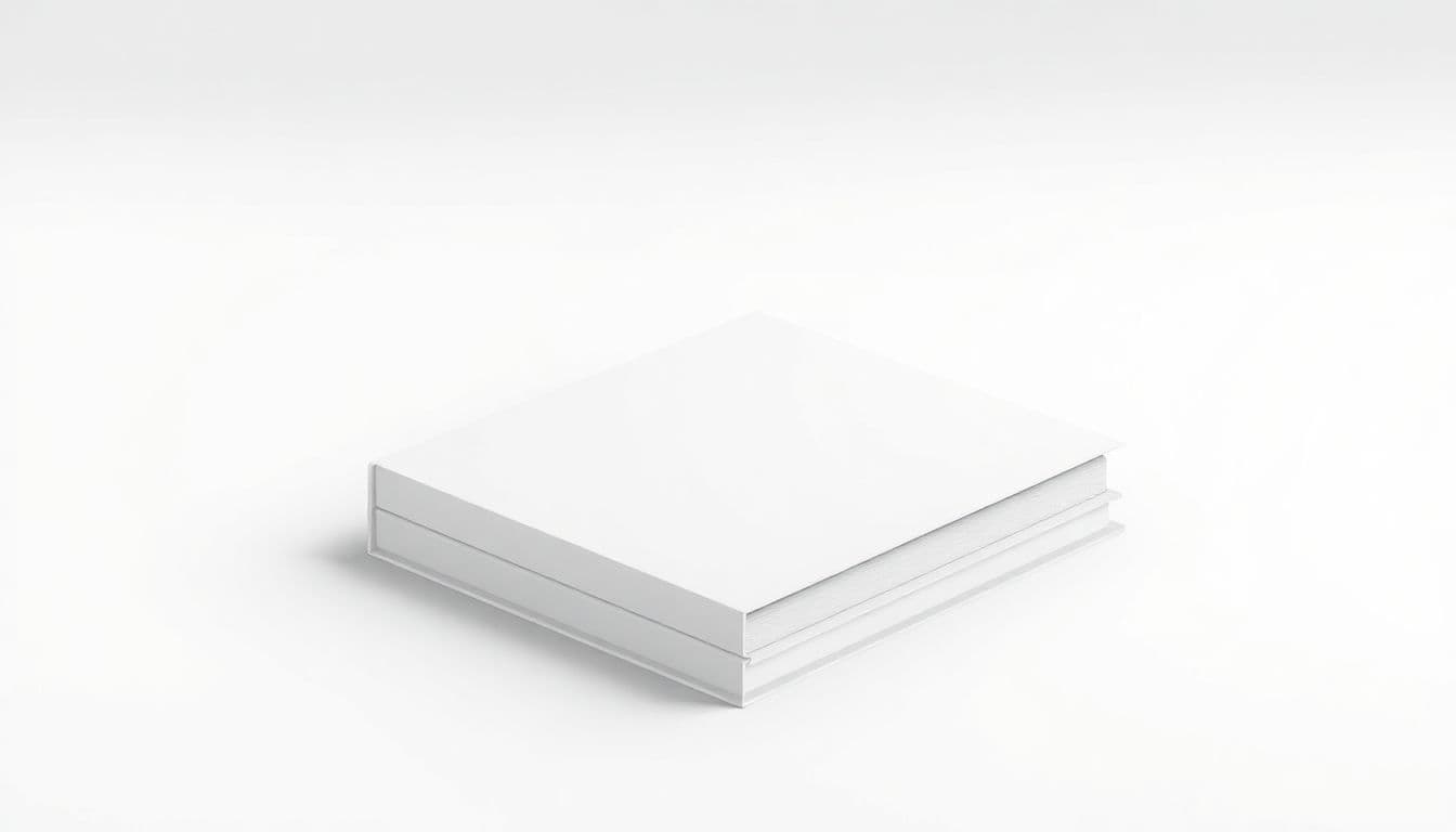
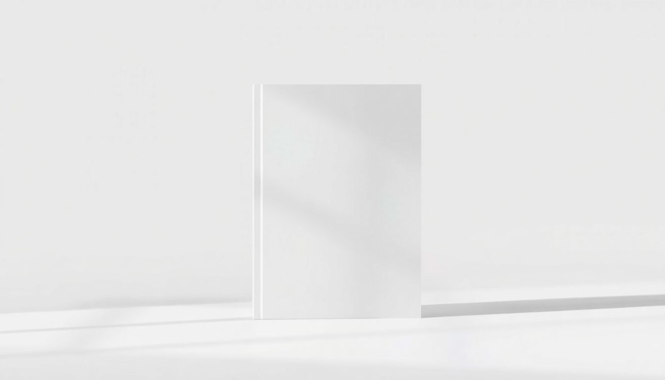
Realistic book cover mockups are scene-based images that show your cover on an actual-looking book—on a shelf, on a desk, in someone’s hands, or propped open. Instead of just seeing your cover flat on a white background, you get a preview of how it will look in the “real world,” where people actually buy books.
Here’s what I’ve noticed makes a mockup feel real: the cover needs to match the lighting direction (where the highlights and shadows land), the perspective (spine and edges should look believable), and the crop (the design shouldn’t get cut off in weird places).
And yes, physical still matters. Nearly 40% of Americans read printed books exclusively, which means your promo visuals should make the book feel tangible—even if the viewer is scrolling on a phone.
One common misconception I want to clear up: “DPI” isn’t always the deciding factor for mockups that are mainly used online. Many mockup generators export high-quality images based on their own rendering, and the final output is typically a raster image (JPG/PNG) or a composite (PSD with layers). Still, if you’re working in design tools, you should start with clean, high-resolution cover artwork so nothing looks pixelated after resizing.
Most mockup tools work like this: you upload your cover (or replace a smart object), the template places it into the scene, and you download the result. You’ll often see exports like 3000 x 3000 pixels or similar—perfect for social media and web banners. If you’re planning to print, you’ll want to pay attention to the template’s export size and your intended print dimensions.
2. Top Sources for Realistic Book Cover Mockups in 2025
When I’m hunting for realistic mockups, I don’t just look for “pretty.” I look for templates that handle the hard stuff: spine placement, edge distortion, and lighting that actually matches the scene. Here are some sources that consistently deliver.
Canva is handy when you want speed and simple editing. If you’re using it, I recommend searching for mockups that specifically mention book in hand, book on desk, or book on shelf—and double-check that you can swap the cover without weird stretching. You can find relevant resources here: Canva.
Kittl is another option I’ve seen work well for authors who want templates without getting stuck in complicated layers. It’s especially useful if you’re doing quick variations for ads or social posts. If you want to explore it, start here: Kittl.
Book Brush tends to shine for social-ready mockups—things like covers displayed in a way that matches ad formats and website headers. If you’re going for “minutes, not hours,” this is usually the route. You can check more about their workflow via: Book Brush.
And then there’s Adobe Photoshop, which is where things get really controllable. If you can find PSD templates that use smart objects, you can replace your cover and still keep the template’s lighting and shadows. That’s the difference between “close enough” and “this looks like a real photo.”
Quick comparison: which source is best for what?
- Canva: Great for fast edits and consistent exports for web/social. Best when you don’t want to manage layers. Watch out for: stretching on angled shots if the template isn’t built well.
- Kittl: Similar strengths to Canva, with a focus on easy customization. Watch out for: overly generic scenes that don’t match your genre vibe.
- Book Brush: Best for ready-to-post mockups and marketing-style layouts. Watch out for: limited control over spine/edge realism in certain templates.
- Photoshop (PSD): Best for maximum realism and consistency across formats. Watch out for: you’ll need to spend a little time learning smart object replacement and shadow/perspective alignment.
3. How to Use Book Cover Mockups Effectively
Creating the mockup is step one. Using it correctly is where you actually get results.
Step 1: Match the mockup to the placement. If it’s for a website hero section, pick a straight-on or slightly angled shot where the title is readable at thumbnail size. For Instagram or ads, choose a tighter crop where the cover fills most of the frame. I’ve found that if the cover title is hard to read, engagement usually drops—even if the image looks “cool.”
Step 2: Keep lighting believable. If the scene has a warm light from the left, your cover shouldn’t look like it’s under neutral indoor lighting. Some templates will handle this automatically. Others won’t. If you’re in Photoshop, you can fix a lot by adjusting brightness/contrast or using color balance on the smart object layer, then letting the template’s shadows do their job.
Step 3: Don’t ignore the spine. This is where realism often breaks. If your cover includes a spine design (typical for print), make sure the mockup template actually supports a spine replacement. If it doesn’t, you’ll end up with a “front cover only” look that can feel off to anyone who’s seen real books.
Step 4: Export for the platform you’re using. Here’s a practical rule I follow:
- Social/web: export JPG (good quality) or PNG if you need crisp edges. Aim for a width around 2000–3000px for best results on modern feeds.
- Ads: export in the template’s recommended size so your image doesn’t get resized by the ad platform and turn soft.
- Print: if you’re using mockups in print materials (brochures, postcards), confirm the template export resolution and your intended print size before you order. The “DPI” label alone can’t save you if the pixel dimensions aren’t there.
What I do in my own workflow (quick version): I generate 3–5 versions from the same cover using different angles (straight-on, angled, and “in hand” if available). Then I check each one at 25% zoom. If the title becomes unreadable, I don’t use it for ads. Sounds harsh, but it prevents a lot of wasted posts.

4. Tips for Choosing the Right Book Cover Mockup
Choosing a mockup isn’t just about “which one looks best.” It’s about which one looks right for your genre and which one won’t betray your cover design once it’s placed into the scene.
Genre-to-mockup mapping (examples that usually work):
- Romance: bedside table, soft morning light, warm tones, slightly shallow depth of field.
- Thriller / crime: desk with dramatic shadows, darker color grading, angled shots that feel tense.
- Fantasy: book on a textured surface (leather, parchment), moody lighting, props that match your world (maps, candles, etc.).
- Business / non-fiction: clean desk, minimal background, crisp shadows—nothing messy or overly “cute.”
- Children’s books: bright, friendly settings, but keep the cover readable (avoid heavy blur behind the book).
Here’s my realism checklist (use this every time):
- Perspective looks correct: spine isn’t “floating,” edges don’t warp oddly.
- Lighting matches: highlights fall on the cover where the scene light would hit.
- Color doesn’t fight the scene: your cover shouldn’t look like it was pasted in with completely different temperature.
- Text stays sharp: zoom in. If the title looks soft at 100%, the export will look worse after resizing.
- Crop is intentional: nothing important gets cut off at the left/right/top/bottom edges.
And one more thing: avoid mockups that don’t fit your cover format. If your book is a larger trim size, but the template is clearly built for a smaller paperback, the proportions can look weird. It’s subtle, but readers notice.
5. Where to Find More Realistic Book Cover Mockups
If you want more variety (and more “custom-feeling” results), you’ll need more than one source. I rotate between quick tools for speed and marketplaces for when I want a specific angle or a more premium look.
Start with Issuu alternatives if you’re also thinking about how the book will appear in a digital reading experience. Some platforms there focus on interactive previews, which can complement your static mockups when you’re promoting online.
For templates you can edit quickly, Canva and Kittl are solid starting points. Look specifically for mockup categories like:
- “Book in hand” (good for social posts)
- “Book on shelf” (great for browsing-style content)
- “Paperback mockup PSD” (best for Photoshop workflows)
- “Hardcover mockup” (if your trim style is more premium)
If you want premium templates, check marketplaces like GraphicRiver and Creative Market. Many sellers provide PSD mockups with smart objects, so you can swap your design while keeping the scene’s shadows and reflections intact. These are usually worth it when you’re producing a campaign (multiple posts, ads, and a landing page) and you want consistent visual quality.
Finally, if you need something specific—like a particular book size, a custom background that matches your branding, or a unique angle—hire a freelancer. Platforms like Fiverr or Upwork are common for this. The best use of freelancers is when you already know the exact style you want, so you can request a mockup that matches your campaign instead of starting from scratch.
FAQs
Realistic book cover mockups are images (or PSD scene files) that place your cover design onto a believable-looking book in a real setting—like a shelf, desk, or reader’s hands—so your cover feels like a finished product, not a standalone graphic.
Good starting points include template-based tools like Canva and Kittl, purpose-built mockup tools like Book Brush, and premium PSD resources for Photoshop-style control. If you want a quick list of places to explore, you can also use these guides: Issuu alternatives and Canva.
My go-to approach is simple: pick a mockup that matches your genre vibe, replace the cover (or smart object), then check realism at two zoom levels—100% (sharpness) and 25% (thumbnail readability). If the title becomes unreadable, the mockup won’t perform well in ads or social feeds.
Also, if your mockup includes a spine, make sure your spine artwork is aligned with the template’s spine direction. Nothing kills credibility faster than a spine that’s mirrored or cropped.
You can find more options in template libraries (Canva/Kittl), marketplaces like Creative Market and GraphicRiver (often PSD files), and mockup-focused sites that regularly update collections. If you’re looking for digital presentation ideas too, browse Issuu alternatives alongside your static mockups.
Quick troubleshooting tip: if your exported mockup looks blurry or “washed out,” try exporting at the template’s highest available resolution and avoid re-uploading the finished image back into another editor at a larger size.
If you’re using Photoshop templates, PSD (smart object templates) are ideal because you can replace your cover without breaking the shadows and perspective. For final exports to use on websites and social media, JPG is usually best for photos and scenes (smaller file size), while PNG can help if you need sharper edges or transparency (depending on the template).
In short: use PSD for editing control, JPG/PNG for publishing.
Most of the time it’s one of these:
- Perspective mismatch: the cover gets stretched because the template expects a different orientation or trim ratio.
- Lighting mismatch: your cover colors don’t match the scene’s temperature/contrast.
- Wrong crop/bleed: important text or edges get cut off, or the design looks too “zoomed.”
- Low-res source artwork: the cover looks crisp in your editor, but the template scales it up and it turns soft.
Fix tip: if it’s Photoshop, open the smart object and check the cover at the same zoom level as the template’s placeholder. If you’re seeing blur, swap in a higher-resolution cover file and re-export.