Table of Contents
Science fiction book covers in 2026 feel louder (in the best way). The best ones don’t just look “futuristic”—they grab you at thumbnail size with bold type, hard contrast, and artwork that feels like it has atmosphere baked into it. If you’re still designing like it’s 2015, you’ll notice the difference fast.
⚡ TL;DR – Key Takeaways
- •Lead with typography: make the title the first “shape” someone sees, then add effects (glow/distortion/grain) so it still reads at small sizes.
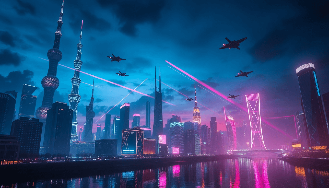
- •Use high-contrast color pairings: neon accents (pink/green/blue) on deep backgrounds consistently outperform flat, low-contrast palettes for thumbnail legibility.
- •Integrate text into the artwork: instead of “type on top,” blend it into the scene with textures, lighting, and distortion so it looks built-in.
- •Add human texture: a controlled grain pass, hand-drawn marks, or imperfect brush edges reduce the sterile “AI” feel without ruining clarity.
- •Export for dual use: create a thumbnail-safe version (100x150 px) and a full-size version, then compare them side-by-side before you publish.
What’s Really Driving Sci-Fi Cover Design in 2026 (and Why It Works)
Cover design has always been about grabbing attention and signaling genre fast. What’s changed in 2026 is the order of operations. People aren’t “browsing” covers the way they used to—they’re scanning thumbnails. So the title and major visual hierarchy have to survive at tiny sizes.
In my own workflow, I tested readability and “genre recognition feel” by making two versions of the same cover concept (same art direction, different typography treatment) and then checking them at:
- Thumbnail preview: 100x150 px and 300x450 px (typical marketplace scaling)
- Mobile cropping: the top 35–45% of the cover (where faces/primary title usually land)
- Search results style: small text against busy backgrounds to see what collapses
What I noticed was pretty consistent: when I used saturated neon accents (neon green/blue/pink) on a dark base, the title held up better and the cover “read” as sci-fi faster—even when the rest of the scene got visually complex. When the palette was muted and the title relied on thin strokes, it turned into noise at thumbnail size. That’s the whole game.
Illustration style is also shifting. Instead of polished stock-looking scenes, more covers are going painterly, hand-drawn, or abstract—anything that feels like it has depth. Soft atmospheric lighting plus integrated typography makes the whole thing feel like one piece, not two separate layers stapled together.
And yes, the pushback against AI-generated imagery is real. It’s not just “anti-AI” sentiment—it’s that a lot of AI output looks too smooth, too uniform, and too perfectly consistent. The covers that win feel imperfect in a controlled way: grain, subtle brush texture, slightly uneven edges, and lighting that matches the type.
On the “classic sci-fi texture” side, I’ve seen modern editions of Dune lean into tactile layers—more visible paper-like grain, atmospheric haze, and richer contrast than older, flatter treatments. The best versions feel like they belong to the story world instead of acting like a clean poster.

Design Elements in Sci-Fi Covers: A 2026 Checklist That’s Actually Usable
If I had to pick the biggest “wins” in 2026, it’s these: typography first, contrast second, and texture third (but texture has to support clarity, not fight it).
1) Typography that survives thumbnail size
Glowing and warped typography still shows up everywhere, but the key is restraint. The title needs to be the clearest element. In practice, that means:
- Use thicker strokes than you think you need
- Avoid thin serifs or hairline weights that collapse at 100x150 px
- Limit distortion so the letterforms remain recognizable
- Apply glow as a readability tool, not just decoration
I also like to treat the title like part of the scene. If the background is smoky, the type shouldn’t sit like a sticker. It should “catch” the lighting and share the same grain direction.
2) Color strategy: jewel tones + neon accents (with a dark base)
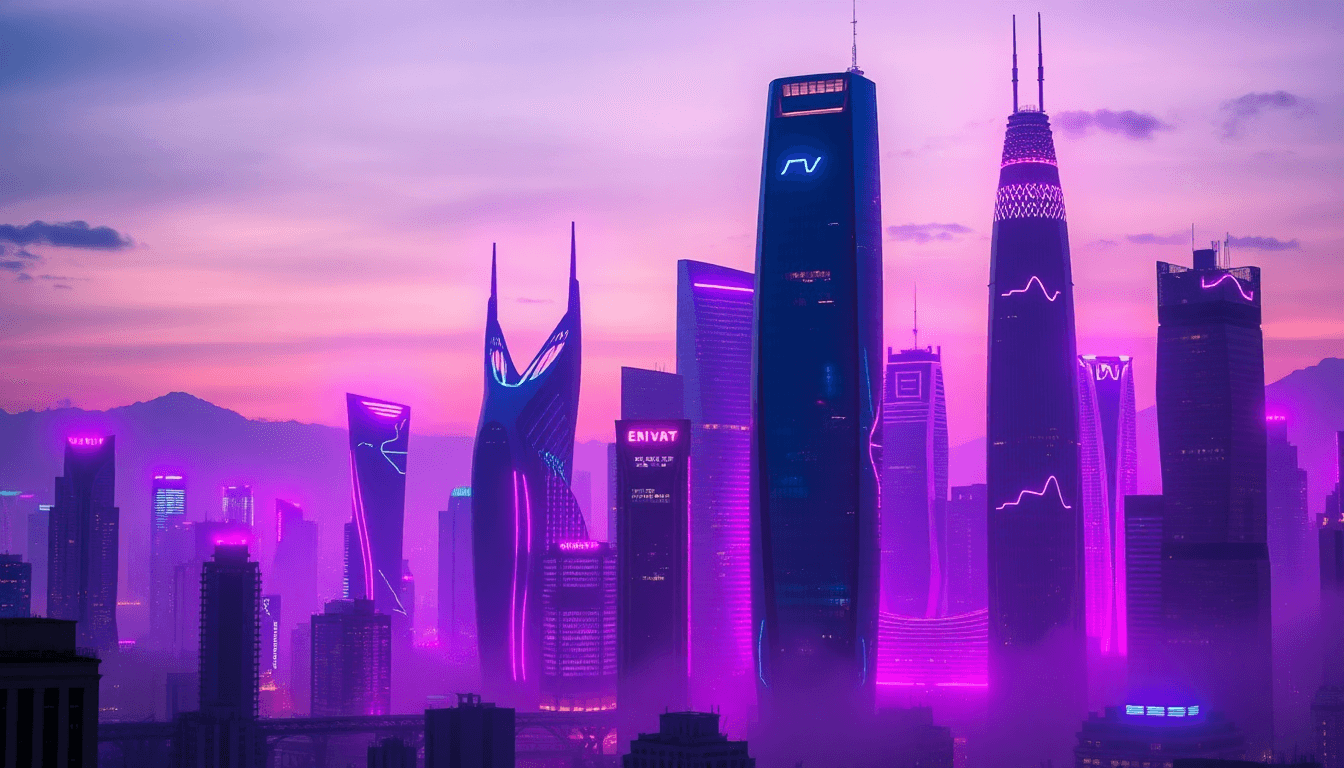
Current sci-fi cover palettes often follow a simple rule: deep background + bright focal accents. Jewel tones (teal, violet, cobalt) and neon highlights work because they create instant separation between the title and the artwork.
What I avoid is low-contrast palettes unless I’m intentionally going for a vintage vibe. If your title depends on subtle gradients, it will lose the fight in small previews.
3) Geometric composition that signals “world” fast
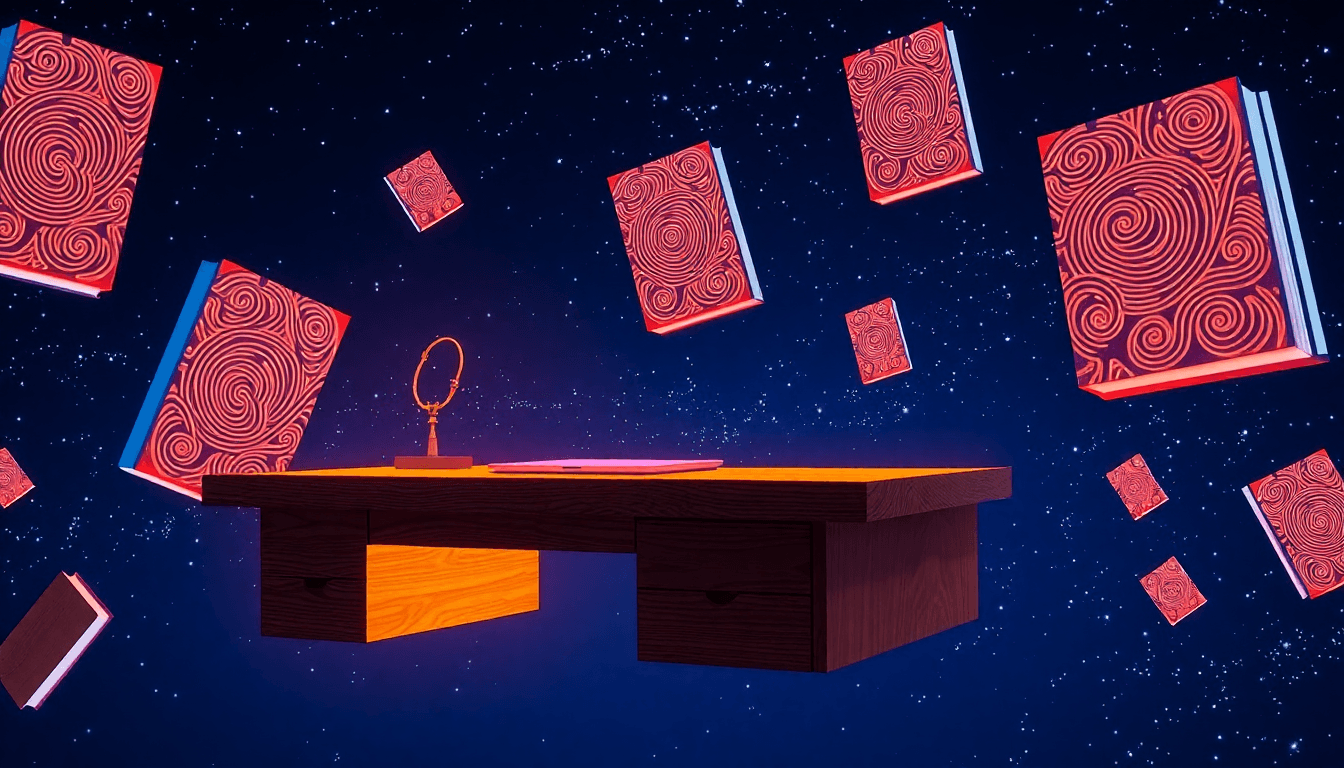
Circles, grids, repeating patterns, and layered shapes aren’t just aesthetic—they’re structure. They give the viewer an easy path through the image.
When you use geometry well, you get instant hierarchy. The grid becomes the visual “depth,” the shapes become wayfinding, and the title becomes the anchor.
Also, symbols help without becoming cliché. A subtle orbit ring, a star map overlay, or a stylized alien motif can hint at the genre without relying on the same spaceship silhouette everyone’s used before.
For inspiration and broader direction, you can also reference book cover design.
Best Practices for Creating Effective Sci-Fi Book Covers (My Repeatable Workflow)
Here’s the workflow I use when I want a cover to look good and also actually perform. It’s not fancy—it’s just structured.
Step 1: Build a thumbnail-safe layout first
Before you add details, lock in hierarchy. I start with a layout where the title is readable even if everything else turns into shapes.
- Safe margins: keep the title away from the edges (especially top and sides)
- Contrast: aim for a strong separation between title and background
- Fewer focal points: one main focal area beats five competing highlights
Then I test at:
- 100x150 px (hard mode)
- 300x450 px (more realistic)
If the title isn’t instantly readable at 100x150 px, no amount of “cool art” will fix it. That’s the painful truth.
Step 2: Integrate text into the artwork (not on top of it)
In 2026, the covers that look most professional make the type feel like it’s part of the world. A few practical ways to do that:
- Match the lighting direction of the scene to the type glow/shadows
- Add grain to the type and background together (same texture pass)
- Use blend modes carefully so the type “inherits” the atmosphere
- Distort the type subtly so it fits the perspective/grid
Step 3: Human texture pass (to avoid sterility)
“Anti-AI” doesn’t mean you have to use chaos. It means you add believable imperfections. I usually do it like this:
- Base render (clean)
- Texture/grain overlay (low-to-medium intensity)
- Optional hand-drawn marks or brush edges
- Final check: does the type still read?
If the grain makes the letters muddy, reduce it. Clarity wins.
Step 4: Design for dual sizes (and verify exports)
“Dual-size design” sounds vague, so here’s what it means in practice:
- Master file: high-res (so you can export cleanly)
- Thumbnail export: 100x150 px (or whatever your platform uses) and review in the same UI style you’ll publish
- Full cover export: your standard marketplace size (commonly 1600x2560 px or similar, depending on platform)
Validation matters. Don’t just export and hope—compare the thumbnail and full view side-by-side and make sure the title isn’t the first thing to break.
Step 5: Series branding consistency (so people recognize you)
If you’re building a series, consistency is your advantage. That can mean:
- Same type style family across books
- Consistent glow color or accent hue
- Repeatable layout rules (where subtitle sits, where the “world motif” lives)
It’s not about copying the exact same cover every time. It’s about creating recognizable visual language.
Common Challenges in Sci-Fi Cover Design (and Fixes That Don’t Waste Time)
Challenge: “AI-flat” visuals that feel too uniform
This happens when the artwork is smooth and the textures are either missing or applied randomly. My fix is simple: add texture intentionally and unify it across type + background.
- Use a consistent grain direction
- Blend imperfections into the lighting (not just as a top overlay)
- Keep edges slightly imperfect on key elements
Challenge: Poor visibility in crowded digital shelves
If your cover looks great full-size but doesn’t pop in search results, your hierarchy is too delicate.
- Make the title shape bigger than you think
- Increase contrast between title and background
- Reduce background clutter behind the type
- Use geometry to frame the focal area
And yes—test early. I’d rather catch a readability issue during layout than after you’ve spent hours polishing textures.
Challenge: Balancing nuance with commercial appeal
Some sci-fi covers go so artsy they stop selling. The sweet spot is mood plus clarity. Painterly atmospheres are great, but the viewer still needs to understand “title + genre vibe” immediately.
For example, dystopian covers that use gritty texture and high-contrast typography can communicate mood without leaning on the same old visual shortcuts. You don’t need flying saucers and robots to signal sci-fi—you need controlled lighting, readable hierarchy, and a world-building motif.
If you want more practical design guidance, check design book covers.

Latest Industry Standards & Trends for 2026 (What to Copy, What to Avoid)
Let’s get specific about the “AI counteraction” trend. It usually looks like this:
- Grain and texture applied consistently (type and art match)
- Lighting-aware compositing (glow/shadows behave like real effects)
- Intentional imperfections (brush edges, subtle smudges, paper-like noise)
It’s not about making everything messy. It’s about making it believable.
Another standard I keep seeing: dual-size thinking. Covers are being designed with thumbnail performance in mind from day one, not as an afterthought.
Emerging motifs are also leaning toward layered worlds—more depth cues, more “map-like” elements, and more complex composition. You’ll also see natural/botanical elements used in sci-fi contexts (even when the theme is dark), because they add texture and contrast without relying on obvious sci-fi icons.
On inclusivity: it’s not just “add a diverse character.” It’s about thoughtful visual language—costume choices, facial expression, cultural cues, and how the composition supports the story. If you’re representing a community, don’t treat it like a surface swap. Get the vibe right, and make sure the design choices feel intentional.
A concrete series example
The Red Mars / Green Mars / Blue Mars trilogy by Kim Stanley Robinson is a great case study for layered iconography and detailed illustration. Different color treatment and motif variation help the books feel connected while still distinct, and the overall composition supports the idea of planetary exploration rather than just showing “space stuff.”
Iconic Examples & Top Artists: What You Can Learn From Their Visual Decisions
Iconography matters, but what matters more is how the iconography is used. Here’s what I pay attention to when I study sci-fi cover art:
- Dune (Frank Herbert): minimal, evocative typography and sparse iconography—less clutter, more atmosphere. The title feels like a signal.
- John Schoenherr: atmospheric perspective and layered detail. Even when scenes are complex, the mood guides your eye.
- Modern geometric-textured covers: you’ll notice strong framing—circles/grids and texture overlays that keep the title readable.
- Tim O’Brien: clever integration of type into the visual system—space, structure, and typography feel like part of the same design logic.
- Shepard Fairey: bold, graphic contrast that stays punchy at small sizes. Limited color decisions often improve thumbnail readability.
Don’t copy their style blindly. Instead, steal the decisions. Ask yourself: Why does this title stay readable? Where is the visual anchor? What’s the palette doing? That’s how you turn inspiration into your own cover direction.
Tools & Resources for Designing Sci-Fi Book Covers (With a Simple Mini-Workflow)
I still rely on design software like Adobe Photoshop and Illustrator for final composition and finishing. For faster iterations—especially when you’re juggling typography variations and branding elements—tools like Automateed can help speed up cover composition and series consistency.
For assets, textures, and overlays, here’s the workflow I recommend:
- Texture sourcing: grab a few candidates (paper grain, scan texture, subtle brush noise)
- Blend modes: test Multiply/Overlay/Soft Light depending on whether you want the texture to darken or lift
- Grain pass: apply a unified grain layer across type + background
- Final polish: check edges and readability, then export
If you want inspiration and practical prompts, these internal resources are useful: Book Cover Design Inspiration: 10 Tips for Memorable Covers and Miblart for trend examples.
Also, don’t ignore public domain textures and vintage-style assets if you’re aiming for a nostalgic, pre-digital feel. Just be mindful of licensing and usage rights.
Practical “do this next” tips:
- Start with bold shapes and a high-contrast title layout
- Test at 100x150 px early, not late
- Export both thumbnail and full-size versions and compare them in context
- Keep series branding consistent (same typographic system, same accent behavior)
For more typography guidance, see book cover typography.

So, How Do You Craft Standout Science Fiction Covers in 2026?
For me, standout sci-fi covers in 2026 come down to three things: clear typography hierarchy, atmospheric artwork that looks like one unified scene, and texture that feels human (not plastic-smooth). Add geometric structure, keep the contrast high, and test everything at thumbnail size before you fall in love with the details.
If you want to make the process faster—especially when you’re iterating on typography and series branding—tools like Automateed can help you produce covers that still feel designed, not rushed.
Next step? Take your current cover concept and run the thumbnail test. If the title isn’t instantly readable at 100x150 px, that’s your fix—not more effects.
People Also Ask
How do I design a compelling science fiction book cover?
Start by making the title the clearest element. Use bold typography, a strong high-contrast palette, and a simple geometric composition so the cover still reads at thumbnail size. Then integrate textures and lighting so the type feels part of the artwork.
What are the latest trends in sci-fi book cover design?
Trends right now include distorted/glowing typography, layered iconography (grids, orbits, map-like elements), high-contrast color schemes, and painterly or textured illustration styles. If you want more sci-fi-focused guidance, see book design tips.
Who are the top artists for sci-fi book covers?
Names you’ll see repeatedly include Tim O’Brien and Shepard Fairey, plus classic sci-fi cover illustrators like John Schoenherr. Studying their work helps you understand how typography, composition, and atmosphere work together.
What elements make a sci-fi book cover stand out?
Strong genre cues (iconography and motifs), bold readable typography, a high-contrast palette, and integrated artwork/texture. The “stand out” factor usually comes from how well the title is built into the scene.
How has sci-fi book cover art evolved over time?
It’s moved from simpler minimalist looks to more layered, atmospheric, and texture-rich designs. Lately, the rise of AI art has pushed more designers toward visible human craft—grain, brush texture, and lighting that feels grounded.
What colors are best for sci-fi book covers?
Jewel tones and neon accents on dark backgrounds are common because they pop in small previews. If you’re going dystopian or horror-leaning, darker bases with bright highlights usually create the strongest sci-fi signal.