Table of Contents
I’ve seen this happen a lot: you pick a nice font, you like the cover… and then you zoom out and suddenly the title turns into a blurry block. That’s usually not a “font problem.” It’s a sizing, contrast, and hierarchy problem.
So let’s make this practical. In this post, I’ll walk through the typography trends I keep seeing on strong book covers—big, bold type; minimalist layouts; and modern font pairings—plus a repeatable checklist you can use to test your design before you export.
And yeah, I’m going to talk in specifics (sizes, spacing targets, and what to check at thumbnail scale). Because if your typography can’t survive a 200–300px thumbnail, it won’t survive the real world either.
Key Takeaways
- Big, bold typography works best when the title is the clear visual hierarchy—often taking the majority of the cover’s readable “attention area” and staying legible at thumbnail size.
- Minimalist typography isn’t about having “nothing.” It’s about using fewer elements, more white space, and clean letterforms so the cover reads instantly.
- Sans-serif fonts tend to win for clarity, while hand-lettered styles can add personality—just keep the letterforms readable and the accents limited.
- Make typography the hero: reduce competing visuals, use deliberate contrast (not random color), and test at small sizes before you finalize.
- Icons and subtle illustrations can support the message—when they’re sized and weighted so they don’t fight the title.
- Genre fit matters. Use spacing and contrast targets, then test your cover on multiple sizes (cover mockup, thumbnail, and print preview).
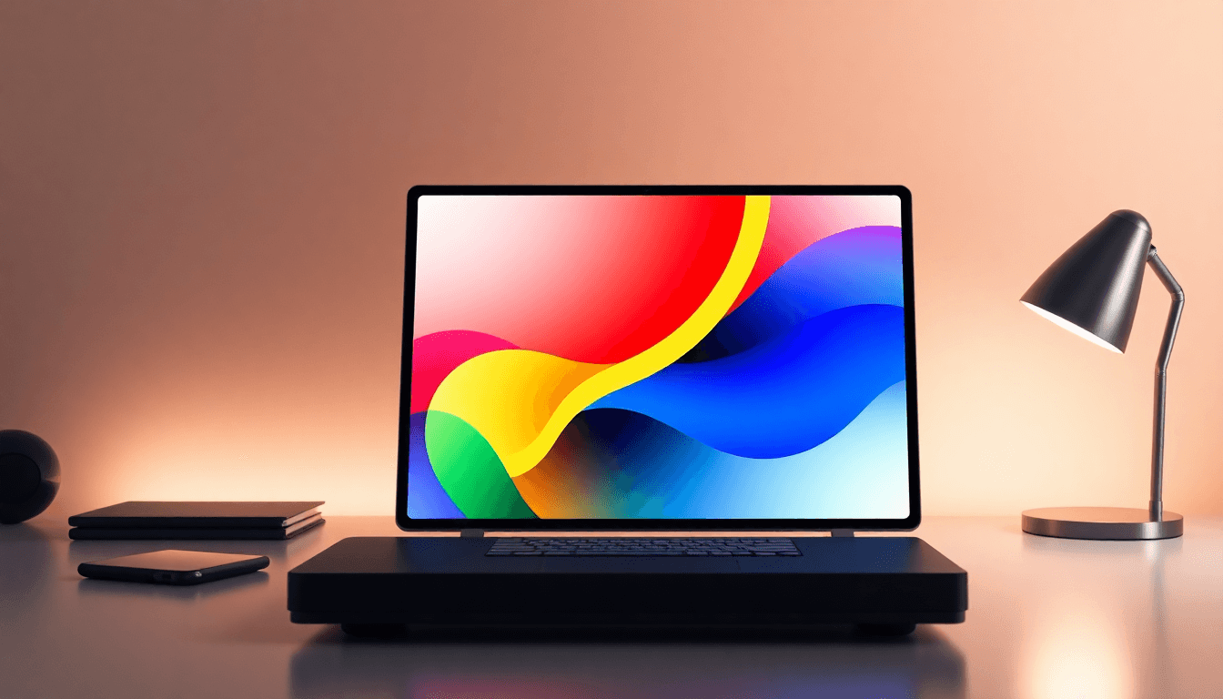
1. Use Bold, Large Typography to Make a Statement
Big, bold typography is still the most reliable way to get attention—especially because most browsing happens fast. People don’t “read” covers; they scan them.
Here’s what I look for when I’m judging a cover’s typography from a distance:
- Title dominance: if the title isn’t instantly the biggest readable element, the cover usually feels generic.
- Shorter title advantage: long titles often need tighter line breaks. Two lines can work better than one long line that turns into a smear.
- Letterform clarity: bold doesn’t mean thick-and-mushy. You want bold weights that keep counters (the enclosed spaces like “O” and “A”) open.
In my experience, a good starting point is this hierarchy: Title > Subtitle (if you have one) > Author name. If your subtitle is louder than your author name, that’s usually fine—unless you’re in a genre where the author brand is the main draw.
Font choice matters too. Bold sans-serif typefaces, condensed display fonts, and experimental oversized lettering all show up for a reason: they survive small sizes better than thin, delicate fonts.
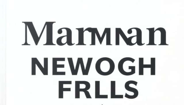
Practical test: export a thumbnail-sized version and check it at a glance. If you can’t read at least the first 2–3 words of the title (or the full title if it’s short), the type is too small or contrast is too low.
2. Design Minimalist Typography That Works in Small and Large Sizes
Minimalist typography works because it reduces the number of “things” your reader has to decode. Fewer distractions. Faster recognition.
What minimalist covers do well:
- They use white space on purpose. Not empty “accidentally.” The spacing is part of the design.
- They keep typography simple. Usually one primary font family for the title, plus a supporting font for subtitle/author.
- They rely on contrast. Dark text on light backgrounds, or light text on darker shapes—clearly separated from the background.
When you’re designing for both small and large formats, the big mistake is assuming “it looks fine on my canvas.” It might. Then you export and the thin strokes disappear.
Try this workflow (I use it constantly):
- Design your cover at the final working size (or close to it).
- Keep a safe margin so key text doesn’t get cropped by marketplace previews.
- Export at least two sizes: a high-res cover preview and a thumbnail version.
- Zoom out until the cover is roughly the size it appears on a phone screen. If your title turns into mush, increase font size or reduce background detail.
Minimalism also gives you flexibility. If you add texture, keep it subtle. Texture should support the type, not replace it.
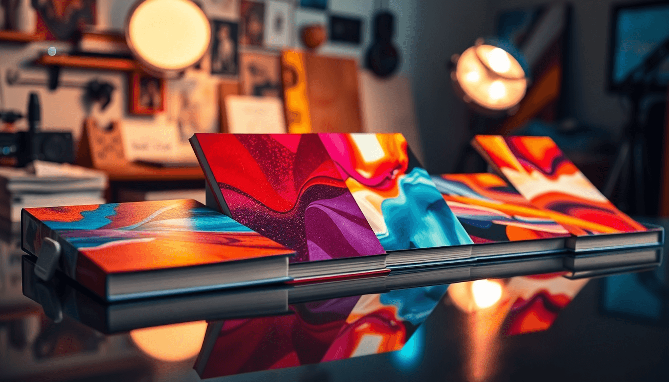
3. Choose Modern Fonts: Sans-Serif Dominance and Hand-Lettered Styles
Sans-serif fonts are everywhere on modern book covers because they’re dependable. They read cleanly, they scale well, and they look current without trying too hard.
Hand-lettered styles are the counterbalance. They bring warmth and personality—perfect when the genre calls for emotion, voice, or a more human feel.
Here’s the pairing logic I like (and that I see working):
- Primary: a bold sans-serif for the title (so it stays legible).
- Accent: hand-lettering only for a short phrase, a single word, or a small tagline.
- Limit the number of “typographic moods.” If everything is ornate, nothing reads as the main message.
Genre fit is real, but it’s not a rulebook. For example:
- For contemporary fiction, a geometric or neo-grotesk sans-serif can feel sharp and modern.
- For memoir or creative nonfiction, a slightly more expressive script (used sparingly) can signal introspection.
- For romance, hand-lettering can carry the emotion—just don’t let it shrink below thumbnail legibility.
If you’re wondering “how do I know if the script will survive small sizes?” Don’t guess. Export a thumbnail and see if the accent still reads as a word, not a decoration.
4. Make Typography the Focus of the Cover Design
If your cover feels “busy,” typography is usually the first thing to blame. Too many elements competing for attention. Too many colors. Too many weights.
Start by building the cover around the title, not around the background art. Choose your title font and size first. Only then do you decide what the rest should do.
Here are the constraints I recommend:
- Color contrast: keep the title text color strongly separated from the background. If you’re using a photo, add a shape or overlay behind the text so the type has a consistent backdrop.
- Fewer type sizes: don’t use 6 different font sizes. Usually 3 is enough: title, subtitle/tagline, author.
- Hierarchy rules: the title should read first, then the subtitle (if present), then the author.
- Thumbnail check: if it’s not readable at thumbnail scale, it’s not done.
And yes, thumbnails matter more than people want to admit. On most storefronts, you’ll see your cover at small sizes far more often than you’ll see it full-size.
Quick rule: if your title needs squinting on a phone, it’s going to get ignored. Increase font size, simplify the background behind the title, or switch to a more readable weight.
5. Combine Typography with Symbols and Illustrations
Symbols and minimalist illustrations can make a cover feel more “designed” without turning it into a collage. The key is that they should support the typography, not replace it.
What works well:
- One strong icon: a small arrow, star, heart, or geometric mark that reinforces the theme.
- Consistent visual weight: if your title is bold, the icon should be bold enough to match it—but not so detailed that it competes.
- Simple linework: line drawings, subtle textures, or a single shape behind the title.
For example, in a self-help book (as an example, not a universal law), a bold title paired with a small arrow motif can reinforce “progress” or “direction.” But I’d keep that icon small and low-contrast so the title stays the main readable element.
Here’s a concrete layout example you can copy:
- Title: bold sans-serif, centered or slightly offset to the left; big enough to read instantly.
- Subtitle/tagline: smaller sans-serif in uppercase or sentence case, spaced comfortably.
- Icon: a single-line arrow or heart placed near the subtitle—about the height of the subtitle text (not taller).
- Background treatment: a textured background is okay, but add a soft rectangle/gradient behind the title text so the letter edges stay crisp.
Overlays can help here too. Just don’t stack overlays on overlays until your type loses contrast. Keep it clean: one overlay shape behind the text, then stop.
6. Follow Practical Tips for Effective Book Cover Typography
At the end of the day, typography trends are only useful if they solve a real problem: readability and recognition.
Here’s a workflow that’s actually repeatable:
- 1) Pick your type system first: choose your title font, subtitle font, and author font. Don’t decide later when you’re already locked into colors and layout.
- 2) Use a safe canvas plan: leave padding around the edges so text doesn’t get clipped by storefront crop. If you’re using a template, respect its “safe zones.”
- 3) Export for thumbnails early: don’t wait until the end. Export a thumbnail-style preview (or resize your cover preview to around 300px wide) and check it.
- 4) Check contrast like you mean it: if your background is busy, your type needs a simpler backdrop (shape/overlay) behind it.
- 5) Tune spacing: if lines are too close, the title becomes a single block. If they’re too far apart, the hierarchy breaks and the design feels disconnected.
Now, about fonts: you don’t need to “hunt” forever, but you do need to test. Two good starting places are Adobe Fonts and Google Fonts. I like them because you can quickly compare weights and see how a font behaves with different letter spacing.
Then mock up your cover in your design tool of choice (I’ve used Canva and Photoshop depending on the project). If you’re working from scratch, use these export sizes as a sanity check:
- Full cover preview: enough resolution for a crisp zoom (don’t export tiny and upscale).
- Thumbnail preview: resize to roughly 200–300px wide and evaluate readability.
- Print sanity check: zoom out and look at the cover like it’s on a shelf—are the proportions still right?
If you want a more evidence-based angle on why this matters, you can look at readability and visual perception research (for example, the general findings summarized in Information Design and typography/readability literature). Cover design is basically applied visual perception: fast recognition beats perfect detail.
FAQs
Use a bold, legible font at a large size, keep the title as the dominant element, and make sure there’s strong contrast between the text and its background. If the background is busy, add a shape/overlay behind the title so the letters stay crisp.
Stick to clean letterforms, avoid tiny thin strokes, and test early. Export a thumbnail-style preview (around 200–300px wide) and confirm the title is readable at a glance. Then check the same layout in a full-size preview so proportions still feel intentional.
Sans-serif fonts are common because they’re clear and modern. Hand-lettered styles also show up a lot because they add personality—just use them in a way that stays readable at thumbnail size.