Table of Contents
If you’ve ever stared at a blank carousel template and thought, “Great… now what do I even put in each slide?”, you’re not alone. I tested VDraw specifically to see if it actually makes carousel creation easier (and faster) or if it’s just another pretty interface with vague promises.
Here’s what I noticed after using it on my laptop (Windows 11, Chrome) for about an hour: VDraw really is beginner-friendly, and the drag-and-drop builder helps you assemble something polished without a ton of design know-how. I also used the AI features to generate slide copy and ideas. It didn’t magically make my brand voice perfect, but it did help me get unstuck quickly—which, honestly, is the whole point.

VDraw Review: What It’s Like to Build a Carousel From Scratch
I started with a simple goal: create a 7-slide carousel for Instagram (1080×1080) about “3 quick ways to improve your content hooks.” I didn’t have a brand kit ready, and I wasn’t trying to build anything super fancy—just something that looks like it came from a real marketing team.
Step-by-step, this is what helped me most:
- Templates first, editing second: I picked a template that already had good spacing and typography. Then I swapped the placeholder text and images. That alone cut down the “design paralysis” time.
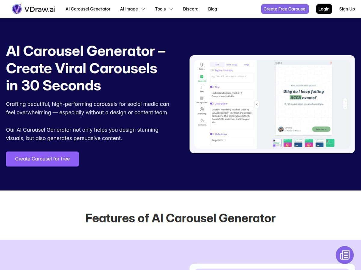
- Drag-and-drop editor: Moving elements around felt pretty direct. I could click a text box, edit it, and then drag it into place without fighting layers.
- Slide-by-slide workflow: I added slides in the middle of the set (not just at the end), which is something I often need when I realize a better order after writing the first few captions.
- AI-assisted ideas: I used the AI to generate hook variations and supporting points. What I liked: it gave me usable starting copy. What I didn’t love: a few suggestions sounded generic, so I had to tweak wording to make it feel more like “me.”
Time-wise, here’s my real-world estimate: from opening the editor to exporting a finished carousel took me about 12–15 minutes. If I were doing the same thing from scratch in a more design-heavy tool, it would’ve been closer to 35–45 minutes (mostly because of layout decisions and resizing).
One more thing: VDraw feels like it’s optimized for speed and consistency. The output looks cohesive because the template structure carries a lot of the design decisions for you. That’s a win if you’re posting regularly and don’t want to reinvent the wheel every time.
Key Features (and What I Actually Used)
1) Drag-and-drop editor for quick layout changes
I used this when I wanted to adjust the spacing between headings and body text. The editor made it easy to:
- move text blocks around
- swap images in the placeholders
- resize elements without everything breaking
What I noticed: It’s fast and intuitive, but if you’re used to pixel-perfect control (like fine kerning or complex layer management), you might feel limited compared to pro design software.
2) AI content + visual generation
I tried AI for two things: slide copy and “what should I say next.” For the hook carousel, I prompted with something like:
- “Write 3 hook options for a post about improving content hooks.”
- “Turn these points into short carousel slide text. Keep each slide under 12 words.”
Result: The AI gave me solid drafts quickly. I then edited the language so it didn’t sound like a template itself. In my experience, the AI is best treated like a co-writer, not a final author.
3) Over 100 ready-to-use templates
I started from a template instead of building a layout from scratch. That’s the difference between “I made a carousel” and “I made a carousel that looks intentional.”
Where it helped: The typography and spacing were already set up, so I mostly swapped content and adjusted colors.
4) Multiple card types (tips, quotes, lists)
This is one of the features I actually leaned on. I switched between card styles so the carousel didn’t feel repetitive.
- Tips cards: Great for short actionable statements.
- Quote cards: Useful for “one-line takeaway” slides.
- List cards: Perfect for step-by-step or “3 things” posts.
What I noticed: Card types help keep formatting consistent. If you try to force a list into a quote layout, it looks off—so it’s better to match the card type to the message.
5) One-click theme color customization
I tested theme colors by switching the palette to match a more brand-friendly look (slightly darker headings and a cleaner accent color). It was fast—no manual color hunting across every slide.
Limitation I hit: if you want very specific brand shades or custom gradients, you may end up doing extra tweaking slide-by-slide.
6) Convert carousels into short videos
I tried the “carousel to short video” option for a couple of slides. The main benefit for me was that I didn’t have to rebuild the design for a vertical video format.
What to expect: This is great for repurposing. But don’t assume it’ll replace a full video editor—think of it as “turn my carousel into motion,” not “make a cinematic reel.”
7) Supports platforms like Instagram, TikTok, and LinkedIn
I checked aspect ratios and export readiness for different platforms. For Instagram, the square layout worked well. For short video formats, the tool stayed focused on vertical-friendly output.
Tip: before you export, double-check that your text still reads well on smaller screens. Some carousel typography looks great on a desktop preview but can feel tight in a feed.
Pros and Cons (Based on My Test)
Pros
- Beginner-friendly: I didn’t need tutorials to get a working carousel together.
- Fast turnaround: I produced a complete carousel in roughly 12–15 minutes using templates.
- Consistent design output: Templates keep spacing and typography cohesive across slides.
- AI helps you start: It’s useful for generating hook options and short slide text, then refining manually.
- Repurposing is built in: Converting to short video is handy if you post across multiple formats.
Cons
- Internet-dependent experience: When my connection dipped, the editor felt slower. It’s not a dealbreaker, but it matters.
- Advanced design control isn’t the focus: I didn’t see the kind of deep typographic controls you’d expect in higher-end design tools (think more granular control over typography and complex layer workflows).
- Pricing transparency: I didn’t rely on assumptions here—pricing can change, and I recommend checking the official checkout page before committing.
Pricing Plans
I can’t promise exact pricing from memory because plans and amounts can shift. What I recommend (and what I did) is checking the live pricing on the official VDraw site right before you decide. If you’re comparing plans, look for the details that actually affect you:
- how many exports or downloads you get
- whether video conversion is included
- template access (and whether new templates unlock on higher tiers)
- team/brand features, if you’re managing multiple clients
If there’s a trial or demo available, take it. In my experience, seeing the editor speed and export options firsthand tells you more than any “starting at” marketing line.
Who VDraw is best for (and who should be cautious)
- Best for: marketers, small business owners, and content creators who need good-looking carousels regularly without spending hours designing.
- Maybe not ideal if: you need advanced typography control, complex design layering, or highly customized brand systems that go beyond what templates can handle.
Wrap-up
After testing VDraw, my take is pretty simple: it’s a practical carousel builder that helps you go from idea to polished slides fast. The templates do a lot of the heavy lifting, the drag-and-drop editor keeps things easy, and the AI features are genuinely helpful for getting words on the page. If you want speed and consistency over deep design tinkering, you’ll probably like it.