Table of Contents
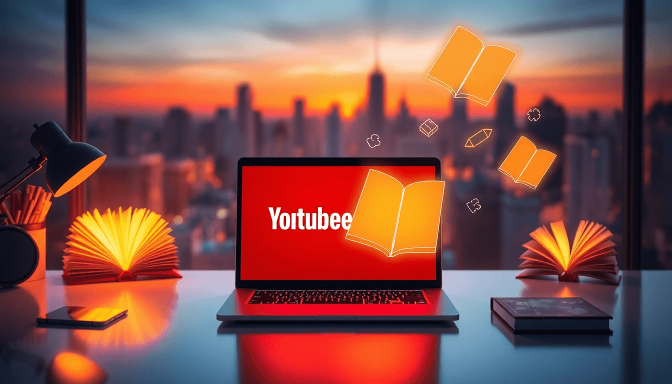
Here’s the uncomfortable truth: most people don’t “discover” your book channel—they decide in about a second whether to click. So yeah, your thumbnail matters.
I don’t want to toss out random stats I can’t back up, but I can tell you what I noticed when I paid closer attention to thumbnails on my own author videos: the ones with one clear focal point (cover or face), high contrast, and text that fits on a phone screen consistently got better clicks than the cluttered ones. And once I started treating thumbnails like a repeatable system instead of an afterthought, the results got easier to replicate.
Best YouTube Thumbnail Ideas for Authors (That Actually Get Clicks)
If you’re looking for “YouTube thumbnail ideas” that fit an author brand, start with three questions: What’s the video about? Who’s it for? What’s the one thing you want them to notice first?
Then build the thumbnail around that answer.
Using Book Covers Without Making Them Look Like an Ad
In my experience, the book cover is your strongest asset—use it, but make it readable. Don’t shrink it into the background.
- Keep the cover large and centered (or slightly offset for composition).
- Use a simple backing: a blurred version of the cover, a solid color, or a clean gradient.
- Overlay just 1–4 words that match the video promise (examples below).
Text overlay examples that tend to work for author channels: “Honest Review”, “Writing Tips”, “Plot Twist”, “Best Book Tools”, “Reader Secrets”.
Also—small but important—make sure the overlay text doesn’t fight with busy parts of the cover. If your title font blends into the artwork, you’ll lose the click on mobile.
Author Photos: Emotion Beats Generic Smiles
Faces work because they’re fast to interpret. But not all faces are equal.
What I’ve seen work best: close-up shots where the emotion matches the video. Think surprised (for reveals), serious/intense (for advice), or excited (for announcements).
- Use a high-contrast background (dark behind you, bright behind you—either is fine as long as you pop).
- Keep your face big enough to read on a phone (seriously, preview at small size).
- Pair the face with one short hook (example: “Don’t Do This” or “The Real Fix”).
One more thing: if you’re using a logo, make it subtle. A tiny logo in a consistent corner is great. A big logo competing with your hook? That’s where thumbnails start to fail.
Visual Storytelling Thumbnails (For Writing, Process, and “Behind the Book”)
If your videos are about writing, publishing, or the craft, you’ve got a cheat code: show the process.
Use simple props and imagery like:
- manuscript pages or a notebook
- writing tools (pen, keyboard, laptop with a document)
- book layout mockups
- cover design elements (fonts, color swatches, typography close-ups)
Then guide the eye with one visual cue—an arrow, a circle, or a highlight. Don’t add five different cues. One is enough.
It’s basically the difference between “I might watch this” and “I get it instantly.”

How to Create Engaging YouTube Thumbnails for Authors (A Simple Workflow)
I like to think of thumbnails as a mini poster you have to read at thumbnail size. So I design for the smallest screen first, then adjust upward.
Design Principles That Keep Your Thumbnail Readable
- One focal point: cover OR face OR prop. Not all three.
- High contrast: your subject should stand out from the background immediately.
- Short text: aim for 3–5 words max. If it takes longer than a breath to read, it won’t land on mobile.
- Bold sans-serif fonts (the kind that don’t look “thin” when scaled down).
And yes—clutter is a real killer. If you’ve got multiple objects, multiple colors, and multiple messages, viewers don’t “decode” it. They just scroll.
Color Schemes and Contrast Strategies (Without Overthinking It)
Try this approach: pick two dominant colors and one accent. For example:
- Black/white + one accent (red or yellow)
- Blue/teal background + white text
- Warm cover + cool text panel (or the reverse)
If your background is busy, blur it. If your subject is dark, add a light outline or soft glow so it doesn’t disappear.
For more thumbnail and video workflow ideas, you can check videoideas.
Branding and Consistency (What I’d Actually Do)
Consistency matters, but it has to be subtle. My rule: if a viewer can spot your thumbnail style in a crowded feed, you’re doing branding right.
- Use the same font style for your hook text.
- Keep a consistent placement (like bottom-left for the hook, top-right for a small logo).
- Stick to a repeatable background treatment (blurred cover, gradient panel, or a clean solid color).
Tools for Designing YouTube Thumbnails for Authors
You don’t need fancy software, but you do need something that makes resizing and exporting painless.
Photoshop vs. Canva (What’s Better for Authors?)
- Photoshop: best if you want custom layers, precise cutouts, and detailed edits. It’s powerful, but it can be overkill if you’re mostly placing cover art + text.
- Canva: great for templates, fast iteration, and consistent styling. If you’re publishing often, templates are a lifesaver.
I usually recommend Canva for most authors because you’ll actually use it every week. Photoshop is amazing, but only if you’re willing to spend time perfecting your workflow.
AI-Assisted Options (When You Have a Lot of Videos)
If you’re managing a steady publishing schedule, AI can help with speed and consistency—especially for layout suggestions and quick variations.
Automateed is worth a look if you want tools that help generate thumbnail drafts and keep your style consistent. You can also see the VideoIdeas.ai Review for an overview.
Thumbnail Text and Layout Ideas for Author Channels
Here’s where most author thumbnails get stuck: they either use no text (too vague) or they cram in too much (too noisy).
Pick one hook that matches the video promise.
Hook Ideas by Video Type
- Book reviews: “Honest Review”, “Worth It?”, “2 Truths”, “Not What I Expected”
- Writing tips: “Fix This”, “Writing Mistake”, “Plot Upgrade”, “Better Openings”
- Publishing/publishing advice: “Self-Pub Reality”, “Cover Mistakes”, “Pricing Guide”, “What Works”
- Interviews: “Writer to Writer”, “The Secret”, “Behind the Book”
Keep the text bold and centered on a contrasting panel if your background is busy.
Curiosity Without Clickbait
You can spark curiosity without being misleading. For example:
- “Don’t Start Here” (for a mistake you show in the video)
- “The Real Reason…” (for a process explanation)
- “What Nobody Tells You” (for a clear takeaway)
Use emotion carefully. A surprised face works for reveals. A calm, focused look works for tutorials.
Optimizing for Mobile and Small Screens
Most people will see your thumbnail at tiny size. So do this before you publish:
- Zoom out until your text is barely readable.
- If you can’t read it instantly, shorten the text or increase contrast.
- Make sure you’re not relying on thin fonts or light colors.

Realistic Thumbnail Examples (With What I’d Change)
I can’t responsibly invent “case studies” with fake metrics or pretend I have screenshots of other channels here. But I can show you the kind of before/after changes that usually make a difference—and what to look for when you test.
Example 1: Book Review Thumbnails (Cover + One Hook)
Version A (weaker): cover is small, background is busy, and the text is either too long or blends into the art.
Version B (stronger): cover fills more of the frame, background is blurred/clean, and the hook is 3–4 bold words on a contrasting panel.
What to watch: if you see higher clicks, it’s usually because the hook is readable and the cover pops instantly.
Example 2: Author Interviews/Writing Tips (Face + Writing Prop)
Version A (weaker): face is small, writing prop is competing for attention, and the text is placed over busy areas.
Version B (stronger): face is prominent, the writing prop is simplified in the background (or blurred), and the text sits in a clear empty space.
What to watch: does the thumbnail communicate “this is a tip/interview” without needing sound? If yes, you’re getting closer.
Design Principles for YouTube Thumbnails for Authors (The Stuff That Matters)
If you remember nothing else, remember this: thumbnails win when the viewer understands them fast.
Simplicity and Focus
- One main subject.
- One hook message.
- One clear visual path (your eye should land on the subject, then read the text).
If you want to learn more about your broader author growth strategy, you can also check book pricing strategies.
Consistency and Branding
Create a lightweight style guide for yourself:
- 2–3 fonts you always use
- 1–2 accent colors
- same placement for the hook text
- same logo size and corner
That consistency helps people recognize you faster, and recognition is basically free marketing.
Using Branding and Color Schemes in Thumbnails
Your thumbnail should look like it belongs to your channel. Not identical—just unmistakably you.
Establishing Your Visual Identity
- Use a consistent logo placement.
- Stick to the same “vibe” for backgrounds (blurred cover, gradient panel, or clean solid color).
- Keep your hook text style consistent (font + outline/shadow treatment).
Color Combinations That Stand Out
High-contrast combinations usually win:
- Yellow + black
- White + deep blue
- Red + white
Just don’t pick colors that clash with your cover art. If your cover already has chaos, your thumbnail design should calm it down—not add more chaos.

Thumbnail Size, Resolution, and Export Checklist (So It Doesn’t Get Blurry)
YouTube thumbnails are typically best at 1280 x 720 pixels (16:9). That’s the standard size, and it helps keep things crisp.
Now here’s the part people skip: how you export.
Optimal Dimensions and Format
- Canvas size: 1280 x 720
- Format: PNG for maximum clarity, JPEG if you need smaller files
- Text safety: leave padding around edges so nothing gets cropped in preview
Ensuring Quality Across Devices
Before you hit publish, preview your thumbnail on:
- mobile (the most important)
- desktop
- any “small grid” view you can
If your text only looks good when zoomed in, it’s not ready.
Common Mistakes to Avoid in Author YouTube Thumbnails
- Too many elements: if you can’t explain the thumbnail in one sentence, it’s probably cluttered.
- Low-resolution images: pixelated thumbnails feel cheap, even if your video is great.
- Tiny text: if you need to squint, viewers will scroll.
- Text over busy areas: always use contrast panels or outlines/shadows for readability.
In other words: keep it clear, keep it bold, keep it intentional.
Quick “Test and Improve” Plan for Better Thumbnails
If you want results, don’t change everything at once.
- Pick one thumbnail style you like (cover-first or face-first).
- Test two text hooks for 4–8 videos each (same topic style, similar audience).
- Keep your color system consistent so you can tell what actually changed.
After a couple weeks, you’ll start seeing patterns in what gets clicks—and you can build your next template from that.

FAQs
How do I make my YouTube thumbnails more attractive?
Use one clear focal point (cover or face), high contrast, and short bold text. Preview on mobile before publishing—if it’s not instantly readable there, fix it.
What are some creative thumbnail ideas for authors?
Try a cover-first layout with a 3–4 word hook, an emotional close-up author photo with one short message, or a “writing process” thumbnail using props like notebooks and manuscript pages.
Which tools are best for designing YouTube thumbnails?
Canva is great for fast, consistent templates. Photoshop is better for deeper editing. If you want AI-assisted drafting and consistency help, check VideoIdeas.ai Review.
How can authors improve their YouTube channel branding?
Pick a consistent font + color palette + placement for your hook text and logo. Keep the style recognizable across every video.
What size should my YouTube thumbnail be?
Use 1280 x 720 pixels (16:9). Export in a clear format (PNG or high-quality JPEG) and double-check text readability on mobile.