Table of Contents
Quick question: when someone scrolls past your book on Amazon, Etsy, or a bookstore Instagram page, what do they actually see first? Yep—your cover. And I’m not talking about “eventually.” I mean the first second. That’s why a book design website matters so much: it gives your cover context, your story a vibe, and your readers a simple path to buy.
⚡ TL;DR – Key Takeaways
- •Build your homepage like a cover “landing page”: bold typography, strong hierarchy, and textures/grain that look human (not plastic).
- •Use editorial layouts and scroll storytelling to guide attention—think magazine spreads, not generic hero banners.
- •Accessibility isn’t optional: high contrast, real font sizing, and keyboard/screen-reader checks directly impact conversions.
- •3D/AR can be awesome, but only if you keep performance tight and provide a fallback for unsupported devices.
- •Don’t “over-automate” your look. Licensing textures, doing human review, and avoiding repetitive AI patterns is the difference-maker.
Understanding the Top Web Design Books and Trends for 2026
I’ve been in the weeds with author sites and book landing pages long enough to notice a pattern: the “best” trend isn’t the flashiest one—it’s the one that makes your book easier to understand in under 10 seconds.
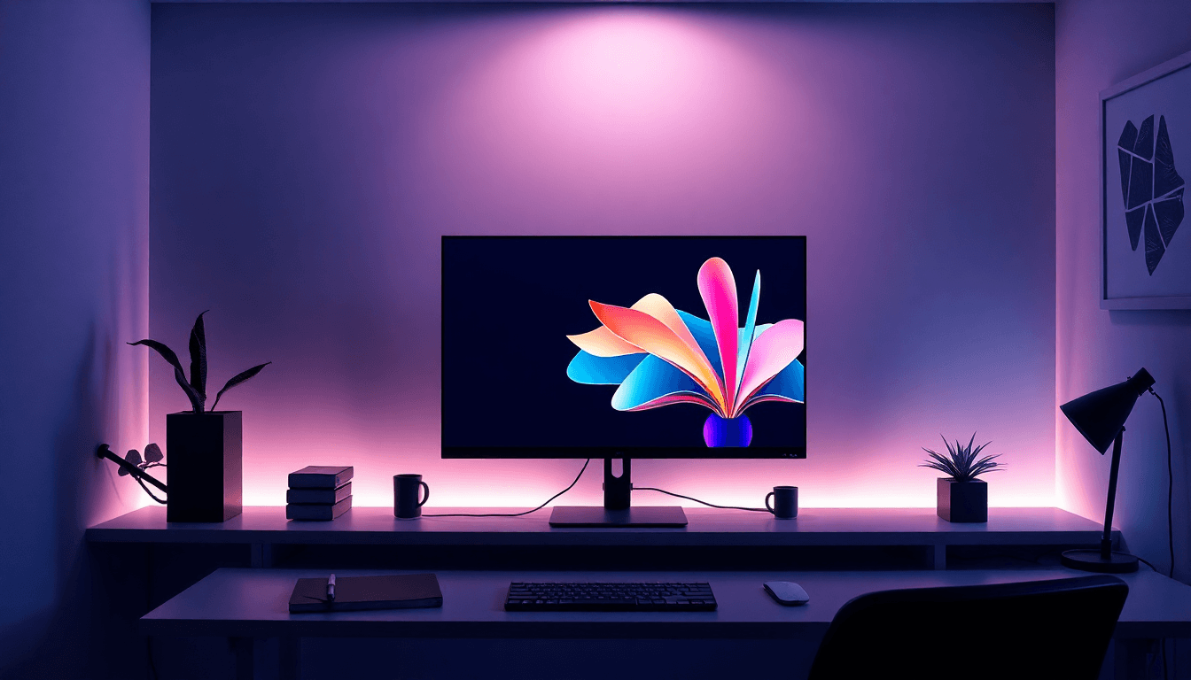
In 2026, that usually looks like oversized typography and high-contrast layouts. Not “loud for the sake of loud,” though. The win is clarity: a big headline that matches the genre promise, plus supporting text that doesn’t fight it. When I review sites, I look for one thing first—can I tell what the book is (and who it’s for) instantly?
Another trend I’m seeing more often: intentional anti-AI aesthetics. By that, I mean you’re not relying on generic “AI texture packs.” You’re using real, licensed textures (paper grain, scanned brush strokes, foil-like overlays) and pairing them with human-edited typography. The goal is to avoid that sterile, perfectly smooth look that makes everything feel interchangeable.
Editorial layouts are also sticking around. Asymmetry, magazine-style grids, and “scroll storytelling” sections (short, purposeful blocks) tend to work well for books because they mirror how people actually read online—scan first, then commit.
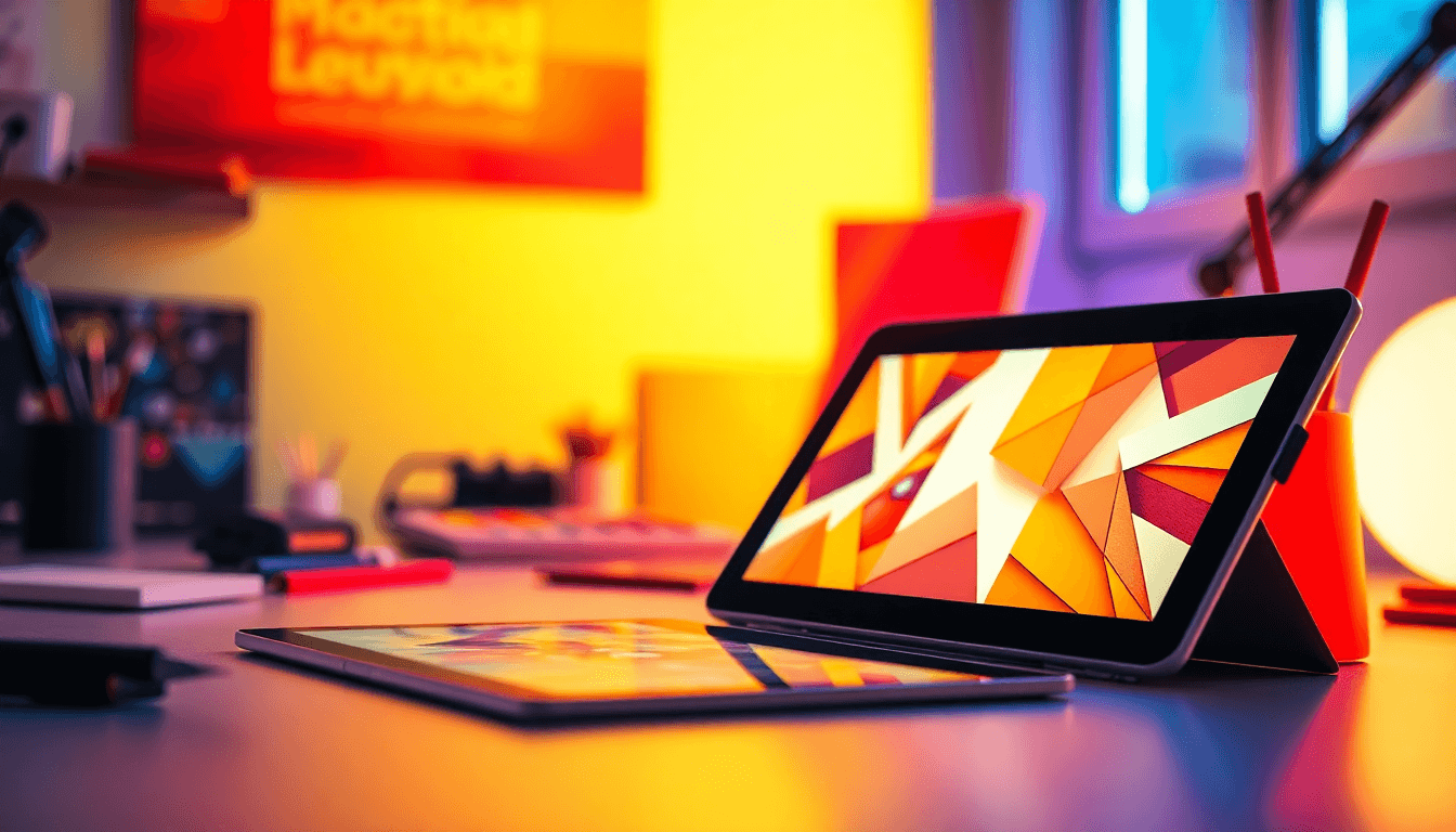
On the color side, Y2K nostalgia is still showing up in mockups and brand directions. But here’s my take: don’t just slap neon gradients everywhere. Use them like seasoning. For example, I’ve had better results using a limited palette (2–3 main colors) and reserving the brightest accent for the CTA button and one or two key labels (like “Read an excerpt” or “Buy the paperback”).
And yes—3D is growing. If you’re thinking about WebGL models or AR previews, you can absolutely make your cover feel more “alive.” Just don’t treat it like a requirement. Treat it like a tool: use it when it adds meaning (like showing texture, spine details, or special editions), not just because it’s cool.

Best Author Websites and Design Examples in 2026
I don’t just look at “pretty.” I look at what’s doing the work. For instance, Nicolette Seeback Ruggiero’s site for The Hounding is a good example of blending traditional art direction with modern web structure. What I’d copy from a site like that isn’t the exact visuals—it’s the discipline: consistent spacing, readable type, and a clear path from vibe → book info → action.
When you look at brands like Glossier and Samsung, the kinetic typography idea is worth stealing—carefully. The part that translates well to books is timing and restraint. If your hero text moves, it should move with purpose: a subtle entrance, a gentle hover effect, or a line-by-line reveal that matches how you want readers to “feel” the book. For a thriller, that might mean sharper timing and shorter motion. For literary fiction, slower transitions and more breathing room.
Wix’s “Tactile Maximalism” style is another direction I like—especially for authors who have strong cover texture, photography, or handcrafted art. The big lesson here is hierarchy in busy layouts. If everything is bold, nothing is. So when you borrow that tactile approach, keep the structure simple: one primary headline, one secondary message, and then your content blocks.
Also: every one of these examples has responsive design baked in. If your site looks “fine” on desktop but collapses on mobile, you’re losing the majority of your traffic. And if you’re using interactive elements (3D previews, scroll animations, micro-interactions), test them on a real phone—not just your browser’s dev tools.
If you want more practical guidance, I recommend starting with book design tips.
Top Website Templates for Books and Author Branding
Templates can be a lifesaver, but only if you choose the right ones for your book’s job to do. Here’s a selection framework I actually use when I’m helping authors decide what to build.
Template selection matrix (quick and practical)
- Genre / vibe Audience goal Layout traits Template features to look for Must-have sections
- Thriller / mystery Fast trust + urgency Dark theme, high contrast, tight spacing Bold hero typography, strong CTA buttons, sticky navigation Buy links + excerpt + reviews
- Romance Emotion + quick “is this my book?” Soft gradients, serif accents, warm imagery Gallery layout, quote blocks, “meet the author” section Blurb + tropes + newsletter opt-in
- Literary / nonfiction Credibility + depth Editorial grid, lots of whitespace, typographic hierarchy Long-form sections, easy-to-read typography scales About + credentials + press/media kit
- Fantasy / sci-fi World-building Layered visuals, section storytelling Parallax/scroll sections, image-heavy templates World map (optional), preview chapters, series navigation
What to check before you pick a template
- Typography controls: can you set responsive font sizes (not just desktop)?
- Contrast rules: does the template keep text readable over images?
- Image cropping: are cover images safe on mobile (no awkward zoom/cut)?
- Performance: does it avoid heavy animations on load?
- Accessibility: keyboard navigation + visible focus states?
- Integration: can you add WebGL/AR later without rebuilding everything?
As for platforms, you’ll see lots of book and author-friendly options on Creative Fabrica, Etsy, and Gumroad. Tangent Templates and Showit are also popular for more editorial-style customization. The best “template” isn’t the fanciest one—it’s the one that already matches your layout needs so you’re not fighting the design system.
If you want a starting point, here are a few template directions that tend to work well (and why):
- Editorial one-page layout (hero → excerpt → about → buy): great for authors who want to convert quickly without overwhelming visitors.
- Series-friendly template (cards for each book + “next in series”): ideal for fantasy/romance authors building a long runway of readers.
- Gallery + press kit template (image-heavy + media kit download): perfect for authors with strong photography, awards, or frequent press mentions.
Design Tools & Platforms for Creating Stunning Book Websites
My go-to tool for layout and typography is Figma. It’s fast for prototyping, and it makes collaboration easier when you’re working with a cover designer or editor. If you’re building a site with a team, you’ll thank yourself later.
For textured visuals that don’t look like they were generated by a random filter, tools like Kittl can help. The key is what you do after the effect: pick textures that match your brand, then adjust opacity and blend modes so the final result looks intentional—not “overlaid.”
On the automation side, I built Automateed to help authors generate and format professional assets faster. The real benefit I noticed is time savings: fewer manual steps when you’re producing consistent marketing visuals across a site, social posts, and email.
Now, about 3D and AR: WebGL is usually the more realistic “first step.” AR can be incredible, but it’s also where you’ll run into device support differences. If you do add 3D, keep a performance budget in mind. A good rule of thumb is to keep initial payloads small (compressed textures, optimized models) and lazy-load the heavy bits after the page is usable.
Also, don’t forget the fallback experience. If someone’s device can’t handle WebGL/AR, your site should still deliver value: a high-res cover image, a short video preview, and an excerpt/download link.

Author Website Features for 2026: What to Include
Here’s what I’d include on an author website if the goal is conversions (not just “branding”):
- Cover showcase with context: not just an image—add a short hook line under it (genre + promise).
- High-contrast typography: make sure the primary CTA is readable on mobile in less than a second.
- Clear buy links: link to where your readers already shop (Amazon, Gumroad, etc.). Don’t bury it.
- About page that answers “why trust you?” credentials, background, and a human note.
- Media kit (optional but powerful): a simple download with author bio + cover images + links.
- Excerpt or sample: PDF/HTML excerpt, or a “Read the first chapter” page.
- Behind-the-scenes: process shots, playlists, writing notes—anything that makes the reader feel included.
If you’re selling ebooks and want the site to do more than look good, check sell ebooks own.
Accessibility is another non-negotiable. I can’t stress this enough: if your text is hard to read, people bounce. For screen reader support and contrast guidance, WebAIM’s resources are solid. (And for your own site, run audits in tools like Lighthouse/axe and then manually test on keyboard.)
On sustainability: lighter pages tend to be faster and easier on resources. That said, don’t chase “green” for the sake of it—chase performance because it improves experience first, then you get the sustainability benefits as a side effect.
Web Design Tips for Creating Effective Book Websites
Let’s get specific. When I’m evaluating a book website, I start with typography and spacing.
1) Typography that survives thumbnails
- Make your primary message readable at small sizes. That means testing your headline at ~14–16px equivalent on a narrow mobile viewport.
- Use contrast that passes readability. If you’re putting text over images, add a dark/light overlay behind the text (even a subtle one).
- Keep font pairing simple: one display font + one body font. If you add three fonts, you’ll lose hierarchy fast.
2) Texture without the “AI sticker” look
- Use grain/brush/foil effects as a layer, not a replacement for real design.
- Match texture direction and scale to your layout. Too big = it looks like a filter. Too small = it becomes invisible.
- License your textures and document sources. (If you’re using scans or brushes, make sure you have the rights.)
3) Responsive layout that feels intentional
- Use a fluid grid (not fixed widths that break on phones).
- Test cover images in portrait and landscape. Covers often crop differently than you expect.
- Make sure CTAs stay thumb-friendly. If your button is smaller than ~44px tall, you’ll feel it immediately on mobile.
4) Motion that improves understanding
Scroll-triggered sections and subtle micro-interactions can be great—if they don’t distract. I like to use motion to reveal content progressively (excerpt first, then details, then buy). If a user has to wait for everything, you’ve gone too far.
If you’re adding WebGL/AR, keep it optional and provide a fallback. When the feature works, great. When it doesn’t, the page still sells the book.
Common Challenges and How to Overcome Them
Let’s talk about what usually goes wrong.
AI saturation (and how to avoid looking generic)
“Overusing AI-generated designs” often looks like this: repeating the same smooth gradients, the same grain overlay, the same stock-like typography choices, and the same layout patterns across multiple sites. It’s not that AI is evil—it’s that a lot of outputs look identical.
What helps: do a human pass. Adjust spacing, swap in real textures you own/licensed, and make sure your typography is actually matched to the genre tone. If your site feels like it could be any book, your reader won’t commit.
Thumbnail visibility
If your headline disappears on small screens, you’ll lose people before they even reach the “cool” parts. High-contrast type, simpler layouts, and a CTA that stays visible are your best friends. And textured details? They’re great—but don’t make them the only thing doing the work.
For more accessibility-focused guidance, see ebook design accessibility.
Trend vs readability
Trendy doesn’t have to mean unreadable. Use vibrant colors and bold fonts, but pair them with clear hierarchy. If everything is a “statement,” nothing stands out. The fix is simple: make one element the star (usually the headline or CTA), and let the rest support it.

Latest Industry Standards and Future Outlook for Book Design Websites
In 2026, the “standard” I care about most is concept + performance + accessibility. Not just aesthetics. If your site is gorgeous but slow or hard to read, it won’t convert.
Expect more emphasis on accessible patterns: proper semantic structure, ARIA where needed, keyboard navigation, and focus states you can actually see. Dark mode is also increasingly common, but the real question is: does your contrast stay strong in dark themes?
Looking ahead, I do think anti-AI motifs will keep growing. People want handcrafted vibes—grain, imperfect alignment, scanned textures—paired with modern UX. And immersive elements (3D, WebGL, AR) will become more normal, as long as creators keep performance in check and include fallbacks.
Conclusion: Elevate Your Book Marketing with the Right Web Design
If you want your book design website to work in 2026, don’t chase every new effect. Build a clear experience: bold typography, textured visuals that feel human, accessible design, and (only when it makes sense) interactive 3D/AR with solid fallbacks.
And if you want more practical ideas, start here: Book Design Tips for Self-Publishers: Essential Guidelines.
People Also Ask
How do I design a website for my book?
Start with your brand and visual identity, then choose a template that matches your genre tone. From there, focus on hierarchy: one strong headline, a clear excerpt/buy path, and readable typography on mobile. For more on this, see our guide on digital book publishing.
What are the best tools for creating author websites?
Figma is great for layout and typography. For building, Webflow is popular for UX/UI control, and many creators also use template-based platforms to move faster. If you’re producing lots of assets, Automateed can help generate and format visuals consistently so you’re not stuck doing repetitive design work.
How can I make my book website stand out?
Make your cover feel like part of the story. Use high-contrast typography, add real-texture layers (with proper licensing), and consider interactive previews like WebGL only if your performance stays strong. A standout site is one where readers instantly “get it.”
What should be included in a book author website?
At minimum: cover showcase, an about page, links to where people can buy, and a way to sample the book (excerpt, sample chapter, or preview). If you can, add behind-the-scenes content and a simple media kit.
Are there free templates for book websites?
Yes. Platforms like Creative Market and Etsy often have free and low-cost options, plus premium templates you can customize. Just make sure the template is responsive and readable—not just pretty.
How much does it cost to build a professional author website?
Costs vary a lot depending on what you need: a template + basic customization can be a few hundred dollars, while custom design, copywriting, and advanced integrations can run into the thousands. Templates and reusable design assets usually keep things affordable without sacrificing quality.