Table of Contents
When I’m laying out a picture book, I don’t start with “pretty pages.” I start with spreads—the way two pages work together when the book is open. And yeah, a strong children’s book spread really does change how fast kids understand what’s happening and how much they want to keep turning pages. It’s basically the rhythm section of the whole book.
⚡ TL;DR – Key Takeaways
- •For a 32-page picture book, you’ll usually plan around ~13 story spreads (plus front/back matter), which is why “spread planning” matters more than people think.
- •In my workflow, I map pacing by page-turn moments—especially right-page cliffhangers—so the story doesn’t drag in the middle.
- •Text readability improves when you block text first (sizes, lines, and gutters) and only then place illustrations.
- •Most “spread problems” come from predictable stuff: cramped type, wrong canvas/bleed, or art that fights with the story. Templates + test proofs fix a lot.
- •2026 trends lean hybrid (print + interactive cues), but the fundamentals—safe zones, consistent pacing, and clear page turns—still win.
Understanding Children's Book Spreads: The Foundation of Picture Book Design
What Is a Children's Book Spread?
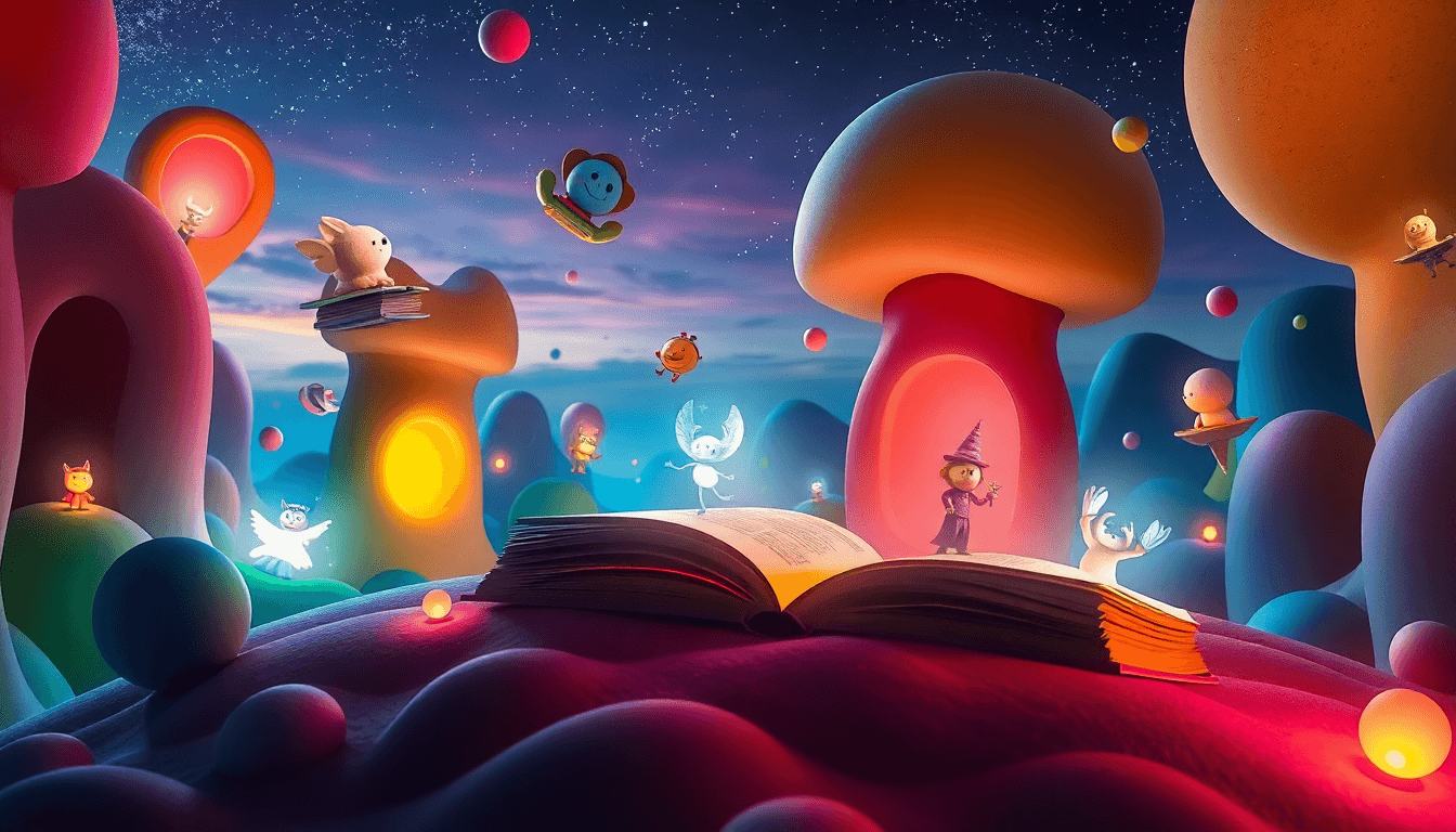
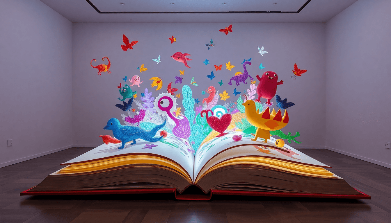
A children’s book spread is the two-page spread you see when the book is open—one left page and one right page. In picture books, that open “window” is where the story really happens. The art guides attention, the text supports comprehension, and the page turn creates emotion (surprise, relief, anticipation—whatever your story needs).
Most standard picture books are 32 pages. If you’re working in the common print format, that usually lands you at about 13 story spreads plus front matter and back matter. I’ve done this on multiple projects, and what I noticed is simple: when I plan around those spreads instead of treating pages like separate islands, the pacing stays smoother and the page turns feel intentional.
Why Spreads Matter in Children's Books
Kids don’t read picture books like adults. They scan, zoom in on details, and follow visual cause-and-effect. That’s why spreads matter: illustrations often carry meaning even when the text is minimal.
Spreads also control suspense. A good spread ends in a question, a near-miss, a “wait, what?” moment, or a visual hook that begs for the next page. For example, in The Snowy Day, the page-turn rhythm is part of the storytelling—each turn feels like stepping into the next moment of discovery rather than just continuing the same scene.

Best Practices for Designing Children's Book Spreads in 2026
Planning Your Story Around 13 Story Spreads (Plus Front/Back Matter)
Instead of thinking “I need 32 separate pages,” I plan the story in spread beats. For a 32-page book, that usually means mapping about 13 story spreads (with front/back matter handled separately). That number isn’t random—it matches how page-turn pacing naturally lands in the common format.
Here’s a sample spread plan I’ve used for a 32-page picture book (~300–700 words):
- Spread 1 (setup): Introduce the character + the problem in one clear visual.
- Spreads 2–4 (build): Show attempts and small changes. End each spread with a “next step” visual.
- Spreads 5–8 (challenge): Increase tension. Use right-page endings for cliffhangers or unanswered questions.
- Spreads 9–11 (turn): The solution begins, but don’t resolve too early—keep the kid curious.
- Spread 12 (resolution): Let the illustration do the “aha.”
- Spread 13 (wrap): Tie back to the opening image/theme.
Do I literally count spreads for every project? Not always. But when I’m working on adventure or nature-themed stories where pacing can get sluggish, this spread approach keeps the momentum. It also makes revision easier because you can move a beat to a different spread without rewriting everything.
Balancing Text and Illustration (Without the Clutter Spiral)
My rule: sketch the illustrations first, then place text where it won’t fight the art. That sounds obvious, but it’s the part people skip when they’re excited to “start designing.” When you place text too early, you end up cramming later. And kids notice cramming fast—they can’t track the story when the page looks stressful.
For type size, I generally aim for 18–24pt for most picture-book text (depending on your font and line length). If you use smaller type, you’ll feel it during read-alouds—parents and teachers start struggling, and that’s a real-world signal that the layout isn’t doing its job.
Also: respect the gutter. Even if your text is technically “inside the margins,” the gutter can swallow readability when the book is bound. If you want a quick refresher on platform costs that affect your production decisions, you can check our guide on much does cost.
Choosing Illustration Styles for Effective Spreads
Not every spread needs the same visual “weight.” I like mixing formats based on how much text is on the page:
- Full-spread art: Great for emotional moments, reveals, and big environmental context.
- Half-page art: Works when you need space for dialogue or multiple short lines.
- Spot illustrations: Ideal for wordier pages or when you want the text to carry most of the narrative.
What I noticed across projects is that illustration complexity should match pacing. For fast action, simpler shapes and clearer silhouettes read better. For contemplative scenes (like quiet nature observations), detailed visuals reward slow looking.
Technical Setup: Creating Spreads for Print and Digital
Canvas Sizes and Bleed Specifications (With a Worked Example)
Let’s get specific, because this is where a lot of “almost right” layouts fail at the print stage.
You’ll often see 18x9.5 inches at 300 DPI mentioned as a common spread-size reference. Just keep in mind: that number is typically a spread dimension reference (not a trim size by itself). The exact trim depends on the publisher and platform (for example, KDP vs. Ingram can differ in how they define trim and spread layout). So treat that “18x9.5” as a common working target you confirm against your platform template.
Bleed is usually around 0.125–0.25 inches depending on the printer/platform requirements. Here’s a quick example:
- Target trim for a single page: (example) 9.0 x 8.0 inches
- Spread trim (2 pages side-by-side): 18.0 x 8.0 inches
- Add bleed: 0.125 inches on all sides
- Final canvas size: (18.0 + 0.25) x (8.0 + 0.25) = 18.25 x 8.25 inches
- Safe zone: keep critical text/art away from trim by your platform’s recommended distance (often ~0.25–0.375 inches, but confirm)
In my workflow, I don’t “eyeball” this. I use the exact platform template and then verify the final PDF against it. Templates from the right source (KDP/Ingram) reduce errors because the safe zones and bleed behavior match the print pipeline.
Preparing Files for Self-Publishing & Print
Before you export your final files, do a quick checklist:
- Gutters: confirm text isn’t sitting too close to the spine
- Bleed: art reaches the bleed area (not just the trim line)
- Color: run a PDF check for obvious color shifts (especially for bright reds and skin tones)
- Layers: hide guides/safe-zone layers in the export
- Proof print: at least one hard proof before committing to a full run
On the tooling side: I’ve used Adobe InDesign for layout and Photoshop for art prep. In InDesign specifically, the “Bleed” and “Margins” settings tied to the document setup are the difference between a clean export and a painful rework. If you’re doing a lot of spreads across multiple books, templates + consistent document presets pay off quickly.
And yes, automation can help—just make sure it’s automation you can verify. I’m a fan of tools that take your input format and output a print-ready PDF with correct safe zones, not tools that “might work.” If you’re looking at production automation, sanity-check the output with a proof before trusting it completely.
Common Challenges in Children's Book Spread Design & Solutions
Managing Busy Art and Text Space
This is the classic problem: the art is gorgeous, but the text becomes hard to read because it’s sitting on top of high-detail areas.
My fix is practical: I block text as simple rectangles first (where the text will go), then I place the illustration shapes with “text clearance” in mind. If a spread needs lots of detail, I’ll shift the text to a lower-detail area or reduce lines per panel.
It’s also okay to accept that some spreads are more text-heavy. The trick is making those spreads visually calmer so the words aren’t competing with chaos. Half-page and spot illustrations are your friend when word count climbs.
Ensuring Correct Canvas Size and Bleed
Here’s what I do to avoid sizing issues: I verify three things in order—spread dimensions, bleed, then safe zones. If any one of those is wrong, you’ll see it in the final trim.
Double the spread size and apply the platform-specific bleed. Using standardized templates from Ingram or KDP helps because the coordinate system matches the printer’s expectations.
Also, don’t let “I think it’s right” be your plan. Run a proof. If you want production-related context, you can see our author facebook groups guide for community discussions where people share real printer and template gotchas.
Enhancing Pacing and Engagement
Pacing in picture books is mostly page-turn design. One of my favorite methods is simple: put the “tension beat” on the right page and end it with a visual or question that pulls you forward.
Example layout idea:
- Left page: show the setup (what’s happening now)
- Right page: show the problem getting worse—or the character noticing something new
And if you’re not sure whether your pacing works, dummy books help. I’ve used them like a test reader’s chair: flip through fast, then slow. If the story feels like it “halts” between spreads, that’s usually a sign you need to tighten the beat distribution.

Latest Trends and Industry Standards in 2026
The Enduring 32-Page Format (And Why It Still Wins)
The 32-page picture book format is still the default for a reason: it’s cost-effective to print and it fits kids’ attention spans. Most of these books land around 13 story spreads, with front and back matter rounding things out.
Separate-end books (where ends are on different paper) can add a premium feel. I’ve seen publishers use this to elevate the experience—especially for collectible titles. And yes, it also gives you extra design real estate for textured or illustrated endpapers that match the story world.
Digital and Interactive Trends
Hybrid layouts are getting more common. Think: print pages with cues that sync to digital versions, or interactive spots that encourage tapping in app-based reading.
Self-publishing platforms are making that easier for authors who want to experiment with trims and digital features. But I’ll say this plainly: interactive elements should never replace clarity. If the print spread already works, the digital layer becomes a bonus—not a distraction.
On the tool side, AI-assisted workflows are showing up more and more. In Adobe Photoshop and Adobe InDesign, you’ll see features that help with layout suggestions and quicker asset prep (like automated image adjustments and faster production steps). The best time-saver I’ve personally noticed is in repeated tasks—consistent spacing, repeated style application, and faster export setup—rather than “AI magically creates the spread.”
Expert Tips and Tools for Creating Effective Children's Book Spreads
Using Templates and Software (So You Don’t Rebuild Everything)
My go-to stack is usually:
- Adobe InDesign: page/spread layout, margins, gutters, export settings
- Photoshop: art cleanup, bleed prep, image sizing
- Procreate: sketching and illustration drafts
Where templates really help is consistency. If you’re making a 32-page book, you don’t want to reinvent the same margin and text styles 13 times. Reusable templates speed things up and reduce “small but fatal” mistakes.
If you want a production-focused walkthrough, you can check publishing childrens books.
One small habit that saves me hours: I keep guides and layer names visible during layout, then I hide them before final export. It sounds minor, but it prevents accidental “guide lines in the PDF” moments.
Story and Illustration Workflow (The Order Matters)
I start with thumbnails because they’re fast and they force decisions. You can’t argue with a thumbnail spread that feels slow.
Then I adjust illustration complexity based on text density. If a spread has a lot of dialogue, I simplify backgrounds and reduce busy micro-details. If it’s a quiet moment, I let the art breathe.
Finally, I involve early feedback—either beta readers using a dummy book or a quick internal flip test. When pacing is critical (adventure, nature exploration, mystery-beat stories), this catches issues before you finalize full artwork.
Finalizing for Print & Digital
Before you hit “publish,” do a proof print and check:
- Are any letters too close to the gutter/spine?
- Did anything get trimmed (especially thin highlights or border art)?
- Do colors look right under normal lighting (not just your screen)?
- Does the page turn land where you intended (does it create suspense)?
Consistency across spreads is what makes a book feel “pro.” Not fancy effects—just reliable spacing, readable type, and page-turn rhythm kids can follow.
Common Mistakes to Avoid in Children's Book Spread Design
Overcrowding Spreads with Art or Text
If the edges are packed with details, you’re gambling with trimming and clipping. Leave safe margins and keep important elements away from the trim line—especially near the gutter.
Planning text placement before you finalize illustrations prevents the “everything is important” problem. If your spread is getting too busy, switch one of these:
- Use spot art instead of full art
- Move a sentence to the next spread
- Reduce background detail behind the text
Incorrect Sizing and Bleed Issues
White edges and cropped art usually come from incorrect bleed or incorrect spread dimensions. The fix is straightforward: confirm your spread canvas size, add platform-specific bleed, and use the template that matches your printer.
Don’t skip proofing. A cheap test print can save you from re-exporting and redoing artwork.
Poor Pacing and Suspense Loss
If suspense disappears, it’s usually because the page-turn moment isn’t doing enough work. End right pages with a hook—an unanswered question, a visual reveal, or a change in emotion.
Dummy books are the easiest way to detect pacing problems. Flip through quickly. If you feel bored or confused, the layout is telling you where to tighten.
For writing-side support that pairs well with spread planning, you can also see our guide on write childrens book.
Balancing action and resolution across spreads keeps kids engaged from start to finish. It’s not about “more stuff.” It’s about the story moving.

Conclusion: Mastering Children's Book Spreads for 2026
Designing children’s book spreads is part storytelling, part production craft. When you plan around spreads, block text intelligently, and export with the right bleed and safe zones, the book reads smoother—and the page turns actually feel like page turns.
If you want a practical next step: use a simple 6-step workflow before exporting your print files—(1) thumbnail the 13 story spreads, (2) block text areas, (3) place art with text clearance, (4) confirm gutter/safe zones, (5) export a proof PDF, (6) run a hard proof and correct anything that trims or shifts.
FAQs
What are the most popular children's books?
Popular titles range from classics like Where the Wild Things Are to newer favorites like The Very Hungry Caterpillar. The common thread is strong illustration storytelling—kids can follow the plot even when they’re not reading every word.
How do I choose the best picture books for kids?
Pick based on age, interests, and reading level. If you’re choosing for reluctant readers, nature and adventure themes tend to pull kids in—especially when the visuals clearly match the text.
What are current trends in children's books?
Right now, you’ll see more hybrid print/digital experiences, more diverse themes, and more books built around social-emotional learning. AI tools are also speeding up certain production steps, but the spreads still have to be readable and paced well.
Which children's books are best for learning about nature?
The Snowy Day and works by authors like Oliver Jeffers are great examples. They combine playful visuals with real-world observation, so kids learn while they’re having fun.
How many words should a children's book have?
It depends on age, but many picture books for kids around 3–7 land roughly between 300–800 words. Keep the text concise so it supports the illustrations instead of competing with them.