Table of Contents
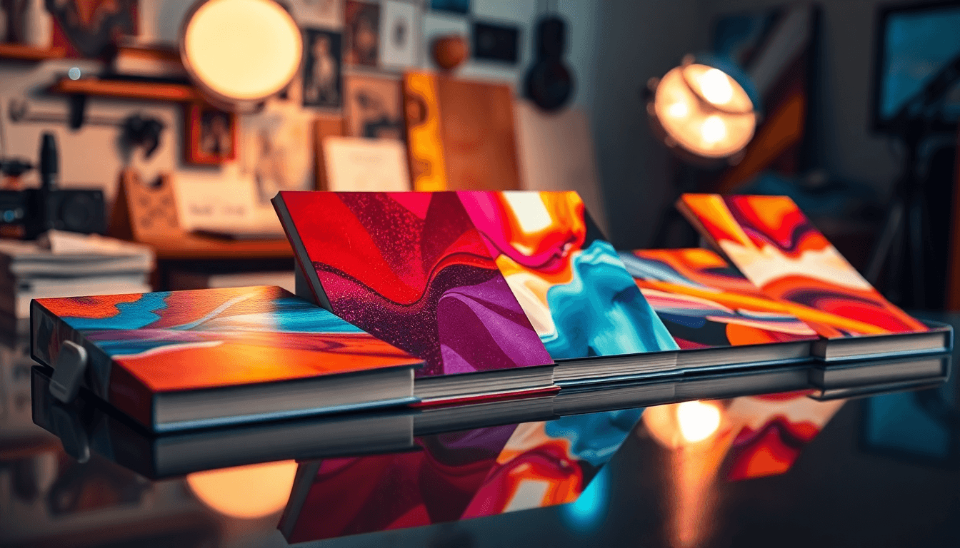
Typography is basically running the show on book covers right now—and if you’re not leaning into it, you’re making your job harder. I’ve been looking closely at what’s working across Amazon/Goodreads thumbnails and actual print listings, and the pattern is clear: the title is doing the heavy lifting, and it has to work at tiny sizes.
⚡ TL;DR – Key Takeaways
- •Make the title the hero: in thumbnail tests, the title should take up roughly 55–75% of the cover’s usable width (not counting spine/bleed), so it’s still readable at 200–300px.
- •Genre tells you the type strategy: use condensed, heavy weights for thrillers/fantasy; use clean serif/sans pairings for literary fiction/nonfiction. Don’t mix “vibes” with no plan.
- •Pick fonts for legibility first: keep to 2 font families max (3 if you must), and avoid “pretty but fussy” letterforms that fall apart at small sizes.
- •Use contrast rules: aim for a minimum contrast ratio of 4.5:1 between text and background when possible (or at least “clearly readable” on a phone screen). Test with grayscale too.
- •Texture is fine—if it doesn’t fight the letters: keep grain/noise overlays at about 10–25% opacity and blur them slightly so they don’t break counters (the holes in letters).
Why Typographic Covers Keep Winning (and What I’d Copy in 2026)
Book covers have shifted from “cool illustration” to “type that reads fast.” The biggest reason is simple: most people discover books through thumbnails. And when the cover is tiny, the only details that survive are shape, weight, spacing, and contrast.
I don’t think it’s that illustrations are dead. It’s that typography has become the structure. The title isn’t decoration anymore—it’s the layout system.
What Changed: From Decorative to Structural Typography
Earlier cover trends leaned on elaborate imagery and ornate lettering. Now the best covers treat typography like architecture: it sets hierarchy, creates rhythm, and tells you genre immediately.
On covers I’ve reviewed recently, I keep seeing a consistent layout behavior: the title dominates the composition, the author name sits confidently (usually smaller, but still crisp), and the rest of the information is either minimal or typographically “contained” so it doesn’t clutter the thumbnail.
Why Typography Dominates in the Digital Age
Here’s the reality check: if your title can’t be read at thumbnail size, it doesn’t matter how beautiful your full-size design is. In my workflow, I treat thumbnail readability like a requirement, not a suggestion.
One cover example I keep coming back to is Dark Matter by Blake Crouch. The type is bold and minimal, and the hierarchy is obvious even when you’re scrolling quickly. If you break it down visually, you’ll notice the title is doing the “recognition job” while the surrounding elements stay restrained—exactly what you want for digital browsing.

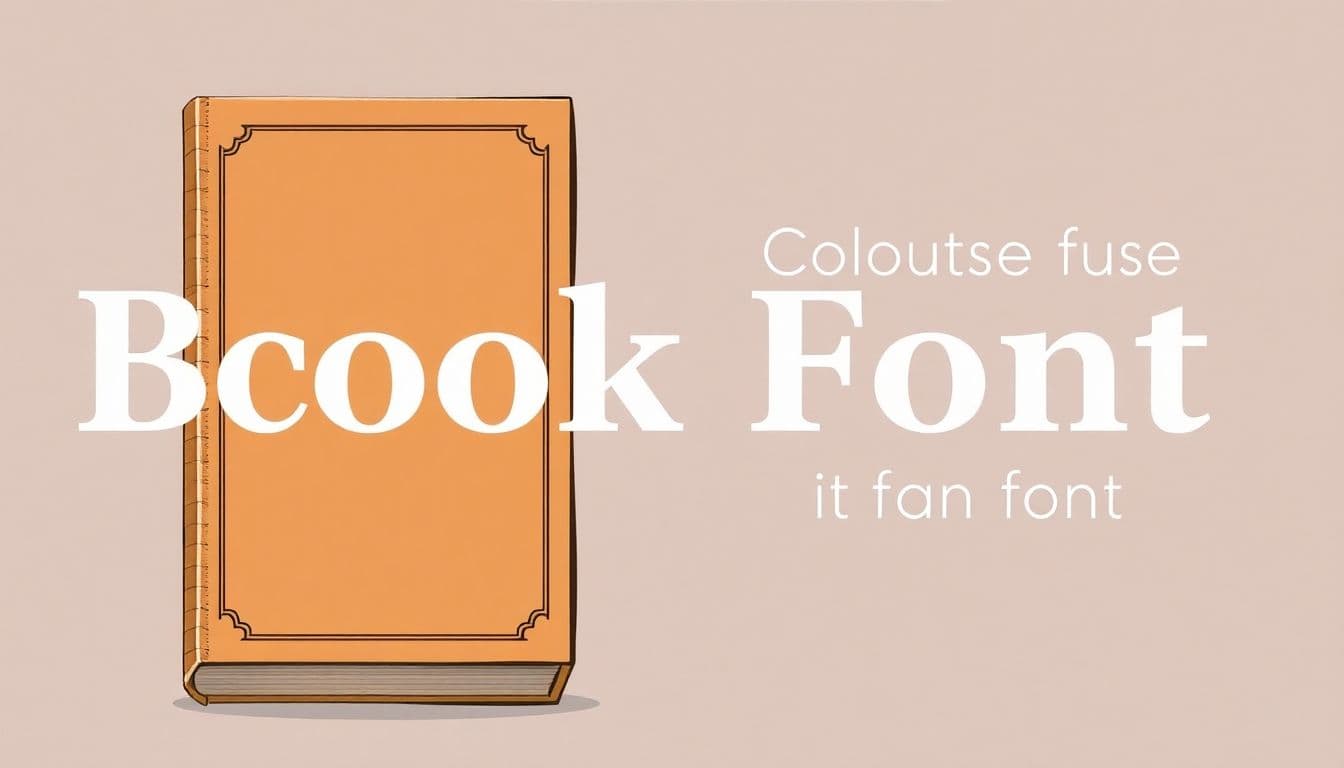
Core Principles of Effective Typographic Book Covers
If you want typographic covers that actually perform, you need a few dependable rules. Not “design vibes.” Rules you can repeat.
From working with authors and iterating on cover drafts, the biggest difference between “looks good” and “works” is that the typography is engineered for quick reading.
Font Selection and Legibility (Not Just Aesthetics)
Choose typefaces that survive small sizes. That means:
- Go heavy enough: if the title weight is too light, it collapses into a gray blob at thumbnail size.
- Watch x-height: fonts with better x-height tend to stay readable when scaled down.
- Spacing matters: don’t leave default tracking if you’re using condensed or display fonts—tight letters can turn into noise.
- Limit families: stick to 2 font families in most cases. Use weights/styles inside the family to keep things cohesive.
Pairing serif + sans is still one of my favorite “safe but stylish” moves. For instance: a sturdy serif for the title and a clean sans for the author line and subtitle. It gives you contrast without turning the cover into a typographic collage.
For a deeper walkthrough of typography choices, you can use this as a starting point: design book covers.
Color, Contrast, and Visual Hierarchy
Color can absolutely boost clicks—but only if it supports readability. Jewel tones are popular for a reason (they look rich), but they’re also where designers get sloppy.
Decision rule I use: if your background color is dark and your text is also dark, you’re going to lose the title at small sizes. Pick one: either the text is light against a dark field, or the text is dark against a light field. Don’t split the difference.
Here’s a concrete palette example that works well for typographic covers:
- Background: deep emerald (#0E3B2E)
- Primary text: near-white (#F4F1EA)
- Accent: crimson highlight (#C1121F) for subtitle or key words
- Secondary text: muted gold (#C8A96A) at reduced opacity
Also—don’t skip the grayscale check. If it doesn’t read in black-and-white, it won’t read when someone’s scrolling at 20% brightness on a phone.
Integration with Imagery and Texture (How to Add “Edge” Without Blurring Letters)
Texture is a great way to make typographic covers feel tactile and modern. But texture is also a readability killer if you let it fight the type.
What I’ve found works in practice:
- Keep overlays subtle: grain/noise at about 10–25% opacity.
- Blur the texture just enough: if you can see individual noise specks inside the letters, it’s too sharp.
- Protect counters: the “holes” in letters (like o, a, e) should stay open and clear.
- Use texture as a background layer: let the type sit on top with clean edges.
Try this composition formula: textured background → low-opacity grain layer → solid color or gradient plate behind the title → title text with a crisp edge (no heavy glow). That way you get tactile energy without sacrificing readability.

Genre-Specific Typographic Strategies (So You Don’t Guess)
Genres have “typographic expectations.” Readers might not consciously notice them, but they feel them. If your typography contradicts the genre, you can end up with a cover that looks generic—or worse, off-brand.
In my experience, literary fiction and nonfiction covers tend to reward calm confidence: clean type, fewer elements, and hierarchy that feels deliberate. Meanwhile, thrillers and fantasy often use condensed, heavy, attention-grabbing letterforms to communicate urgency or wonder.
Literary Fiction and Nonfiction
For these genres, I’d keep the typographic voice refined:
- Use fewer effects: subtle texture is fine, but avoid loud neon overlays.
- Choose readable contrast: a solid serif title paired with a clean sans author line works because it’s clear and timeless.
- Let white space breathe: don’t cram the subtitle into every empty corner.
Elegant typography signals seriousness, and minimal imagery keeps the message direct. If you want more practical layout ideas, this guide is helpful: design book covers.
Thrillers and Fantasy
Thrillers and fantasy can get louder—and that’s the point. What matters is that the title stays legible while the style sells the mood.
- Use condensed or display-heavy weights for urgency.
- Let the title do the drama: you don’t need multiple gimmicks if the typography is strong.
- Ornate display type = artwork role: treat it like a visual centerpiece, not a secondary label.
When you pair bold condensed type with a textured or dramatic background, you get that “I know what this book is” feeling fast—which is exactly what you want on a crowded digital shelf.
Best Practices and Technical Guidelines for 2026
Designing for both thumbnail and physical formats is basically a two-stage problem: first you win the scroll, then you earn the close-up.
Here’s my practical workflow:
- Block in hierarchy first: title size, author placement, subtitle placement.
- Export a thumbnail test early: don’t wait until everything is “finished.”
- Check letterforms at small size: is the title still readable? Do thin strokes disappear?
- Only then add texture/effects: glow, grain, neon, foil-like looks—those are polish, not structure.
Designing for Both Thumbnails and Physical Copies
At thumbnail size, you need big, simple shapes. At physical size, you can afford details that reward readers who slow down.
Try this quick protocol:
- Export test sizes: 800px wide and 300px wide (plus whatever your marketplace uses, if you know it).
- Test on real devices: at least one Android phone and one iPhone (or use browser emulation if you must).
- Check these specific things: title readability, spacing between title and author, stroke thickness, and whether the subtitle becomes illegible.
For physical versions, textures and finishes can add value. Just keep them behind the typography so the letters remain the loudest element.
Avoiding Common Mistakes (The Stuff That Quietly Ruins Covers)
This is where most typographic covers fall apart:
- Overdoing effects: heavy glow + bevel + shadow stacks usually make the title muddy.
- Non-proportional scaling: squished or stretched letters look “cheap” fast and can harm readability.
- Competing layers: if imagery is high-contrast and typography is high-contrast, they can fight for attention.
- Too many typographic voices: more than 2–3 families starts to feel chaotic instead of intentional.
Less is often more—especially when your goal is clarity at small sizes.
Emerging Aesthetic Movements in Typographic Covers
Two trends keep showing up: human-centered texture and nostalgic visual language. The common thread is authenticity. People are tired of everything looking perfectly sterile.
That doesn’t mean you should copy retro styles blindly. It means you can borrow the approach: imperfect textures, analog-inspired color, and typographic choices that feel lived-in.
Human-Centered and Nostalgic Design
Textures like grain and imperfect finishes can make a cover feel more tactile—like it belongs in the real world, not just a design template.
If you’re going for nostalgia, draw inspiration from specific eras (without turning your cover into a costume): 1950s ad typography, 1970s protest poster energy, 1980s comic-style punch. Then keep the typography readable first. Always.
Textured and Tactile Elements (Where It Works Best)
Hand-painted or slightly imperfect lettering can look amazing on physical covers. On digital covers, the trick is to keep those imperfections from turning into visual noise.
One safe approach: use texture behind the title and keep the title itself crisp. If you want emboss/foil vibes, simulate it with subtle highlights rather than thick outlines.
Done right, texture increases perceived craftsmanship and makes people want to zoom in.
Design Strategies for Success in 2026 (A Workflow You Can Actually Use)
The best typographic covers balance two things at once: instant recognition and enough visual depth to reward a closer look.
Here’s how I’d structure the process so you don’t end up redesigning everything at the end.
Balancing Impact and Detail
Start with the “stop the scroll” version:
- Title big enough to read at 300px.
- High contrast between title and background.
- Author name placed consistently (usually near the lower third, but whatever you choose, keep it intentional).
Then add detail for the “close inspection” version:
- Subtle grain/noise.
- Textured background gradients.
- Carefully limited accents (one accent color, one highlight area).
If you want more font pairing ideas that work well for modern typographic covers, check: best fonts book.
Tools and Resources (What I’d Look For, Feature-Wise)
Tools can speed things up—just make sure they’re actually helping you make decisions, not just producing options. When I evaluate platforms, I look for features like:
- Batch formatting: quick resizing and placement to match common cover specs.
- Typography previews: seeing how fonts render at thumbnail size, not only full resolution.
- Style variation: controlled experiments (different title sizes/weights) so you can compare, not just spam variants.
- Export options: clean exports you can drop into your listing workflow without extra cleanup.
If you’re using Automateed, focus on the output you’ll actually benefit from: faster iteration on layout and clearer typography decisions. (If a tool can’t show you thumbnail readability, it’s missing the point.)
Final Checklist: Typographic Cover Scorecard (Use This Before You Export)
Before you finalize, run this quick scoring pass. If you score low on multiple items, fix those first—don’t start adding more effects.
- Thumbnail readability: title readable at 300px (yes/no).
- Contrast: title/background still clear in grayscale (yes/no).
- Hierarchy: you can tell title vs author vs subtitle instantly (yes/no).
- Typography count: 2–3 families max (yes/no).
- Texture safety: grain/noise doesn’t break letter counters (yes/no).
- Effect restraint: no stacked glow/bevel/shadow clutter (yes/no).
If you want a cover that performs in 2026, build it like a system: typography first, then polish.

Frequently Asked Questions
What are the best typographic book covers?
The best typographic covers are the ones where the title is readable instantly and the hierarchy feels intentional. Think bold, high-contrast typography with clean spacing, and an author line that doesn’t get lost. Covers like Dark Matter are a good reference point because the typography does the recognition work even at small sizes.
How do you design a typographic cover?
I’d start by choosing a typeface family for the title that holds up at small sizes, then build the hierarchy: title first, author second, subtitle last. After that, test at thumbnail size early. If the title isn’t clear at 300px, everything else is basically cosmetic.
What makes a book cover visually appealing?
Strong typography plus a concept that matches the genre. When color, contrast, and spacing are doing their job, you can add texture and tactile details without losing clarity. The best covers feel “designed,” not decorated.
What are popular typography trends for book covers?
Oversized title typography, high-contrast type styles, textured/tactile finishes, and nostalgic visual language are all common right now. The key is using these trends in a way that preserves legibility—especially when the cover is viewed as a thumbnail.
How can typography enhance a book's theme?
Typography reinforces theme through tone. Heavy condensed type can signal tension and speed. Elegant minimal type can signal seriousness and intellect. Layout choices—like tight vs airy spacing and bold vs restrained weights—also communicate mood even before someone reads the blurb.