Table of Contents
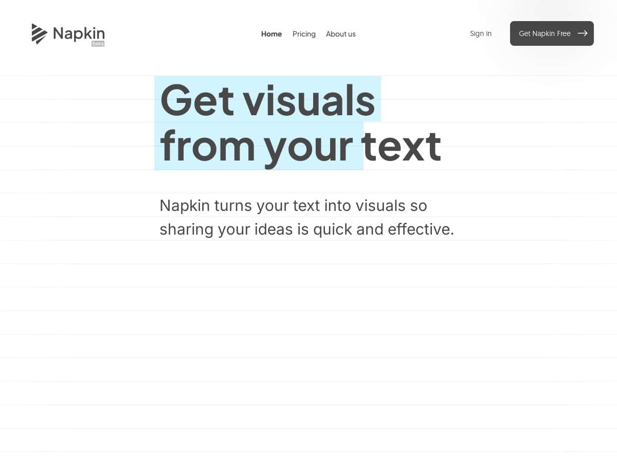
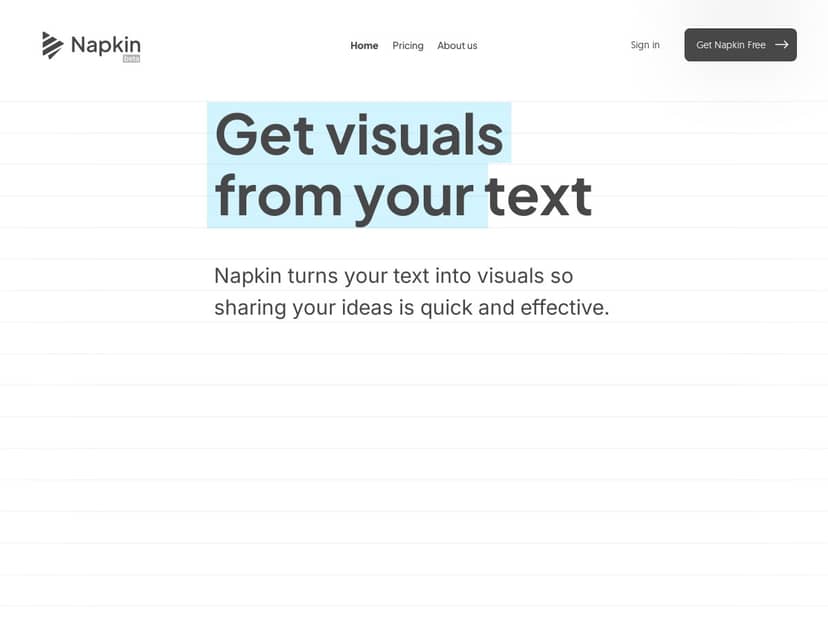
If you’ve ever stared at a blank slide and thought, “Why does turning text into visuals take so long?”—yeah, same. I tested Napkin AI on desktop to see how well it really turns writing into diagrams, charts, and presentation-ready graphics. I’m not going to pretend it’s magic, but it did save me time. Below is what I tried (with the exact kind of input), what it generated, what took longer than expected, and where I think it fits best.
Napkin Review
Quick context on my test: I used Napkin AI on desktop in a modern Chrome browser (Windows). I tried it on a mix of “clean” text and messier, more realistic notes—because that’s usually what I’m working from at 11:47pm before a meeting.
Example 1: Turning bullet points into a process diagram
I pasted a short workflow like:
“Customer submits request → Support triage → If urgent, escalate to engineering → Engineering investigates → Fix is tested → Deploy to production → Notify customer.”
What I noticed: the output was a flow-style diagram with labeled steps that matched my wording closely. The first draft wasn’t perfect (one step got slightly rephrased), but I could quickly tweak node text and spacing. Time-wise, I spent about 6–8 minutes from paste to something I’d actually show in a meeting.
Example 2: Converting a structured outline into an infographic/chart
Next, I tried a mini “stats + takeaway” outline:
“Q1: 120 leads, 18% conversion. Q2: 150 leads, 22% conversion. Q3: 170 leads, 20% conversion. Takeaway: conversion improved in Q2, dipped slightly in Q3.”
What I noticed: it generated a visual that felt chart-like (not just text blocks). I liked that it highlighted the trend in a way that was easy to scan. However, the biggest limitation showed up here—when my numbers weren’t in a consistent format, the chart labels needed manual cleanup. Expect 10–15 minutes if you want it “presentation smooth.”
Example 3: Text-to-PPT workflow check
I also tested exporting for slides. After generating the diagram, I exported to PPT and checked whether the layout stayed intact. The good news: the elements generally landed where I expected, and fonts didn’t look wildly off. The not-so-good news: small spacing differences showed up, especially around longer labels. So if you’re very picky about pixel-perfect alignment, you’ll still spend a few minutes adjusting after export.
One limitation I ran into (real talk): If you feed it vague sentences, you’ll get vague visuals. It can only “understand” what you give it. For best results, I found that tightening your input into clear steps, categories, or measurable statements makes the output noticeably better. Also, advanced styling takes a bit more fiddling than the marketing implies—nothing crazy, just not fully hands-off.
Key Features
- Text-to-Visual AI conversion for diagrams, charts, and infographic-style layouts
- Customization (colors, icons, layout/styling tweaks) so it doesn’t look like a generic template
- Export formats including PNG, PDF, SVG, and PPT depending on what you’re making
- Team collaboration with editing and comments (useful when you’re iterating with coworkers)
- Language support for visuals (the docs/feature set mentions 60+ languages)
- Import from PPT, DOC, PDF, HTML, and Markdown so you can reuse existing content
- Branding options like custom fonts/styles on paid plans
What I used most (and why it mattered)
In my case, the biggest win wasn’t “cool visuals.” It was speed. I could go from rough notes to a readable diagram fast, then spend my time improving clarity instead of building everything from scratch.
Also, collaboration is underrated. If you’ve ever had to “send the updated file” back and forth, comments inside the document reduce that friction. I tested a simple edit-review loop and it was easy to see what changed without hunting through versions.
Export reality check (so you don’t get surprised)
- PPT exports: generally good for slide decks, but longer labels can shift slightly—plan for a quick pass after export.
- PNG/PDF: good for sharing externally; visuals look consistent for most use cases.
- SVG: helpful if you want to drop assets into design tools later.
Note: I didn’t see a “magic” way to guarantee perfect layout in every scenario—text length and font rendering still matter.
Pros and Cons
Pros
- Fast from text to visuals—my first drafts were usable within minutes
- Good enough for professional work (especially for internal decks and social content)
- Customization is actually usable—you can adjust style without starting over
- Export options are flexible for different audiences and workflows
- Team collaboration with comments/editing helps when multiple people review
Cons
- Mobile editing is limited—fine for viewing or quick checks, not for serious edits
- English-first interface (even if visuals support many languages, the UI experience isn’t fully multilingual)
- Some features are paid, so you may hit limits on the free tier
- Advanced customization takes practice—you’ll want a minute to learn the controls
Pricing Plans
Napkin offers a free plan and paid tiers (commonly referenced as Plus and Pro). In my testing, the free tier was enough to validate the workflow, but you’ll likely want paid if you’re exporting often, using branding, or collaborating with a team.
Pricing snapshot (what I saw referenced):
- Pro: starts around $12/month (pricing can change, so double-check at checkout)
- Plus: sits between free and Pro (exact cost varies by billing cycle)
Free vs paid—what changes in real life:
- Exports and outputs: paid plans typically remove/expand limits
- Branding: custom fonts/styles are usually reserved for paid tiers
- Team features: collaboration is smoother when you’re on an appropriate plan
How it stacks up (quick comparison)
I’m not claiming Napkin is the only tool you’ll ever need, so here’s how I’d think about it compared to other popular “text-to-diagram” options:
- Versus generic diagram tools: Napkin wins on speed from messy text → first draft diagram. Tools like traditional diagram editors win if you already know exactly what you want and want full manual control.
- Versus slide-first design tools: Napkin is better when your starting point is raw text/notes. If you’re already designing in a layout-first environment, you may not need the AI step.
- Versus other AI diagram generators: Napkin felt more consistent for presentation-style outputs (especially when exporting to PPT), but it still depends heavily on how structured your input is.
Wrap up
Here’s my honest take: Napkin AI is one of those tools that earns its keep when you have text and you need visuals quickly. My process went from “notes on a doc” to “something slide-ready” fast—especially for flow/process diagrams and structured summaries.
If you need PPT-ready diagrams in under 10–15 minutes, Napkin is a solid choice—just expect a quick cleanup pass for longer labels and formatting. If you’re mostly editing on mobile or you want absolute pixel-perfect layouts without any tweaks, you might still prefer a more manual design workflow.
For me, the best part was time saved on the first draft. Then I could spend my energy on clarity instead of wrestling with shapes.