Table of Contents
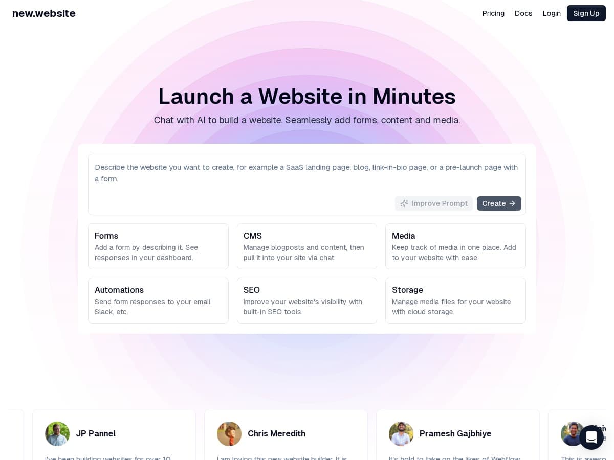
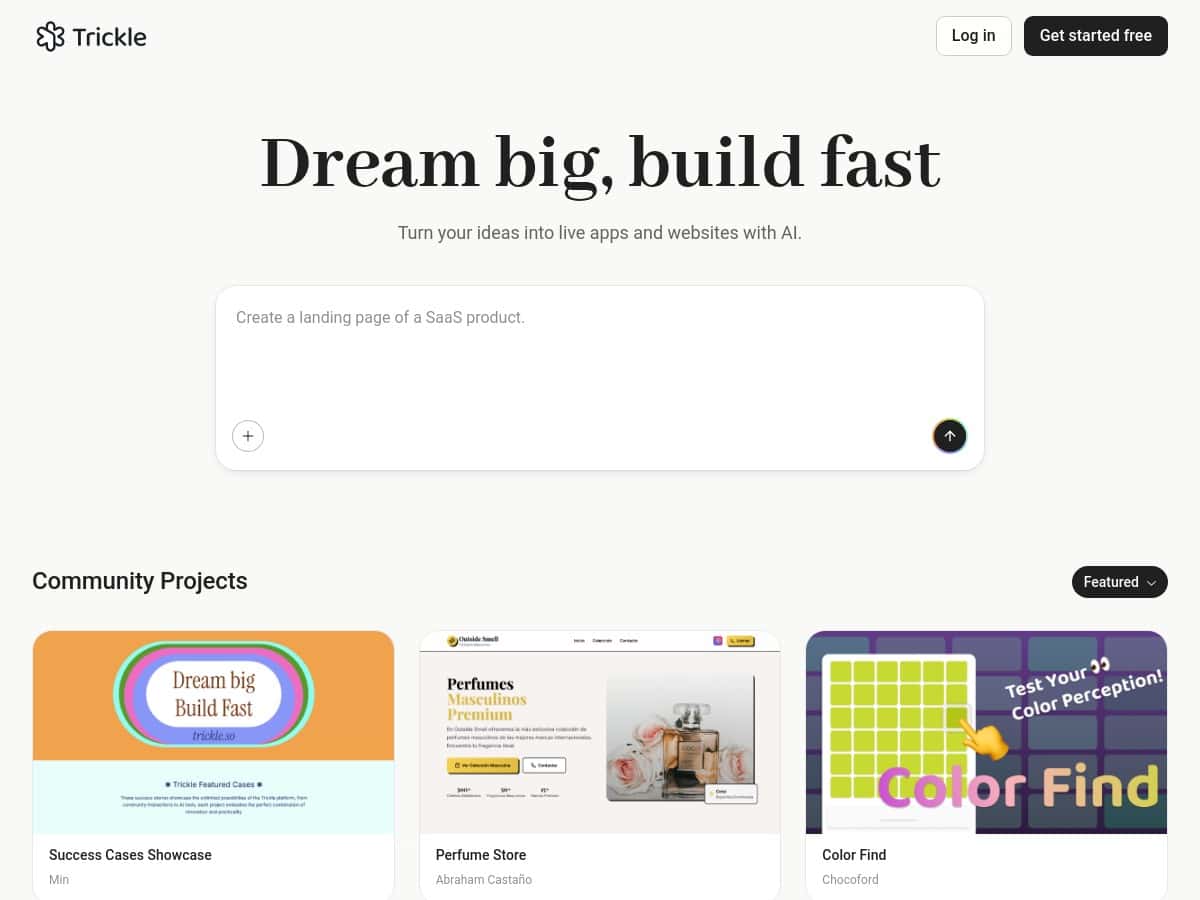
If you want to build a website (or a simple app) without writing code, Trickle is one of those tools that immediately gets your attention. I decided to test it myself to see if it’s actually useful—or if it’s just another “type a prompt, get a site” demo.
What I noticed right away: the interface doesn’t feel intimidating. It’s clean, the steps are pretty obvious, and I didn’t have to hunt through menus just to get started. I’m always skeptical of claims like “working website in minutes,” but in my case, that part checked out—at least for the first draft.

Trickle Review: Can It Really Build a Site Without Code?
I signed up and jumped straight into building a small “starter” project so I could judge it the way a normal person would. No fancy requirements. Just something that looks real: a landing page, a services section, and a basic contact form. I wanted to see how much I’d have to correct after the AI generated the first version.
Here’s what I did, step-by-step:
- Step 1: Describe the project in plain English. I typed a prompt like: “Create a simple website for a small photography studio. Include a hero section, services (3 cards), a portfolio preview (6 thumbnails), and a contact form with name, email, and message. Use a clean modern style and a light color palette.”
- Step 2: Pick a theme. Trickle didn’t drown me in choices. I selected a clean theme that matched the “light + modern” vibe.
- Step 3: Generate the site draft. In my testing, I got a first working draft quickly—fast enough that I was able to review structure and content without feeling like I’d been waiting forever. (Think “minutes,” not “hours.”)
- Step 4: Tweak the visuals. I used the visual editor to adjust spacing, swap text, and update the service card copy. This is where it starts to feel less like “AI magic” and more like a real builder.
- Step 5: Add content and check functionality. I tested the contact form fields and made sure the page didn’t break when I edited the content.
- Step 6: Deploy. I clicked the deployment option and published the site. Hosting seemed included as part of the workflow, which is what I expected—no separate hosting setup marathon.
What I liked: the experience felt approachable. What I didn’t love: some of the “generated” structure needed cleanup if you’re picky about layout. The AI gets you to a usable starting point, but you’ll still do a bit of editing if you want it to look polished.
Key Features I Tested (and what they mean in practice)
- AI-powered development through natural language prompts
- I didn’t have to translate my ideas into technical specs. I could describe sections (hero, services, portfolio, contact) and get a draft that matched the intent. That said, prompts that are vague tend to produce generic layouts—so you’ll get better results with specific section requests and example wording.
- Built-in database for managing data easily
- In practice, this is useful when you want more than static pages. For example, if you’re building something like a listing page (products, blog posts, appointments), the database layer is what supports that. I found it easiest to think of it like “forms + stored entries,” not like a developer database you’d manage manually.
- One-click deployment and hosting
- Deployment was simple enough that I didn’t have to Google extra steps. I clicked publish and the site went live. The main thing I checked was whether edits require extra setup—most changes felt like they stayed inside the same project flow.
- Customizable design resources and themes
- The theme selection helped a lot. I didn’t have to build typography and spacing from scratch. Where this matters: if you’re trying to launch quickly, themes get you 80% there. If you’re trying to match a very specific brand, you’ll spend more time fine-tuning.
- Analytics for tracking performance and engagement
- Analytics is one of those “nice to have” features until you actually want to answer a question like, “Are people clicking the contact form?” I looked for basic engagement indicators and found it more practical than exporting raw data and guessing.
- Community projects for collaboration
- This is great if you learn by example. If you’re building something and want to borrow layout patterns or see how others structure pages, community projects can save time.
- Visual editing tools for precise customizations
- This is where Trickle stops being purely “prompt-based.” I could adjust elements visually instead of rewriting everything through another AI prompt. It made iterations less painful.
Pros and Cons: What Worked Best (and what felt limiting)
Pros
- Beginner-friendly, but not totally dumb. It’s easy to start, and the results are understandable. I didn’t feel like I needed a computer science degree to get a draft live.
- Fast path from idea to a usable site. My first version wasn’t perfect, but it was functional enough to review structure and make edits without starting over.
- Visual editing helps you converge. Instead of constantly re-prompting, I could tweak layout and copy directly.
- Hosting + deployment are part of the workflow. That’s a big deal compared to tools that make you set up hosting separately.
- Database support makes “simple apps” realistic. If you want stored entries or interactive pages, you’re not stuck with static HTML only.
Cons
- Advanced customization isn’t the main strength. If you’re used to Webflow-level control or coding clean custom logic, you may bump into walls. You’ll likely work within what Trickle offers rather than going totally custom.
- Some generated layouts need cleanup. The AI can place sections correctly, but spacing, font sizes, and alignment may require a few rounds of adjustments.
- You’re more dependent on Trickle’s ecosystem. That’s not automatically bad—just know you’re building inside their system, not exporting everything like a fully portable codebase.
- Pricing details can be vague until you check the plan page. I could see the plan tiers, but the “what exactly do I get” details (limits, message counts, and what’s included) are best confirmed directly on their website.
Pricing Plans: What I Found and What to Double-Check
Trickle has multiple tiers, including:
- Free option (limited features)
- Pro plan at $20/month (more “messages,” database capacity, and custom domains)
- Premium plan at $50/month (full hosting and higher/maximum access)
One thing I always do with tools like this: I check the plan page for the exact wording around limits. “Messages” can mean different things depending on the platform (generation requests, AI runs, edits, etc.). So if you’re planning to build more than one site or iterate heavily, it’s worth confirming how those limits work before you commit.
My Test Process: Prompts, Iterations, and What Actually Broke (if anything)
I kept my test pretty grounded. I didn’t ask for a complex SaaS. I wanted to know if Trickle can handle the kind of website most people actually build first.
Iteration 1 (first draft): I generated the photography studio landing page using the prompt described above. Result: a working structure with the sections I requested, plus a clean look based on the theme.
Iteration 2 (content + layout tightening): I changed the services copy and adjusted the spacing on the hero section so the headline wasn’t cramped. This is where I noticed Trickle responds better when you reference the section directly (for example: “make the hero headline larger” or “reduce padding above the services cards”).
Iteration 3 (form check): I edited the contact form labels and verified the fields. In my testing, the contact form didn’t feel fragile—edits were reflected without causing weird page behavior.
Deployment check: Publishing was straightforward, and I didn’t have to jump through extra setup steps. If you’re coming from Wix/Framer-type workflows, the general “publish when ready” mindset will feel familiar.
Did everything come out perfect on the first try? No. But that’s normal. The difference is that Trickle got me to a real starting point quickly, and then I could refine without rebuilding from scratch.
Who Trickle Is For (and who it isn’t)
Trickle makes the most sense if:
- You’re a beginner and want a website you can actually publish without coding.
- You’re a small business owner who needs a clean landing page fast (and doesn’t want to wrestle with dozens of settings).
- You want to experiment with “simple app” ideas—forms, listings, and interactive pages—without hiring a dev for every iteration.
It might not be the best fit if:
- You need deep, low-level customization or custom logic beyond what the platform exposes.
- You’re trying to export everything into a fully portable codebase (like you might with more developer-centric workflows).
- You’re extremely picky about pixel-perfect design and expect the first AI draft to match your brand standards immediately.
Compared to tools like Wix or Webflow, Trickle feels more “idea-to-site” and less “drag-and-drop from blank.” Compared to more developer-heavy platforms, it’s less flexible. Honestly, that trade-off is the whole point.
If you’re looking for a friendly AI website builder that gets you from prompt to publish without the usual headaches, Trickle is worth a serious look. Just go in with realistic expectations: the AI gets you moving, and you finish the polish.